 Home
Home Articles
 Twos Talks
 Videos
Underground Graphics in Wartime
The history of underground graphic design during World War II, and how resistance designers used secret posters, symbols, and printed materials to communicate across occupied Europe.
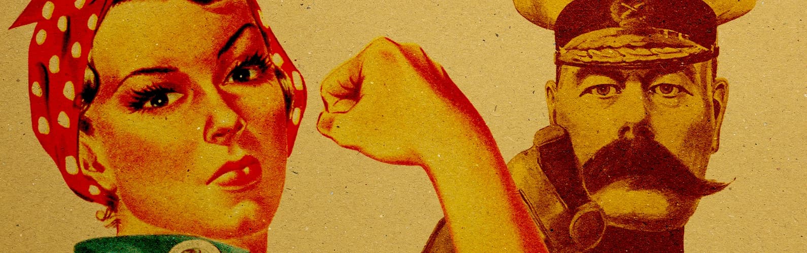
In occupied Europe, information became a battleground. Newspapers were censored, radio broadcasts monitored, and public messages carefully controlled by those in power. But in the shadows of cities, another form of communication began to take shape. Hidden print rooms, improvised tools, and determined designers produced secret posters, leaflets, and symbols. These small printed materials carried the language of resistance through the streets during World War II.
Information as a Weapon
During World War II, control of information became a central strategy across occupied Europe. After the German occupation of France in 1940, many independent newspapers were shut down or forced to operate under strict censorship. Similar restrictions spread across the continent. In occupied Poland, the publication of independent Polish newspapers was banned entirely.
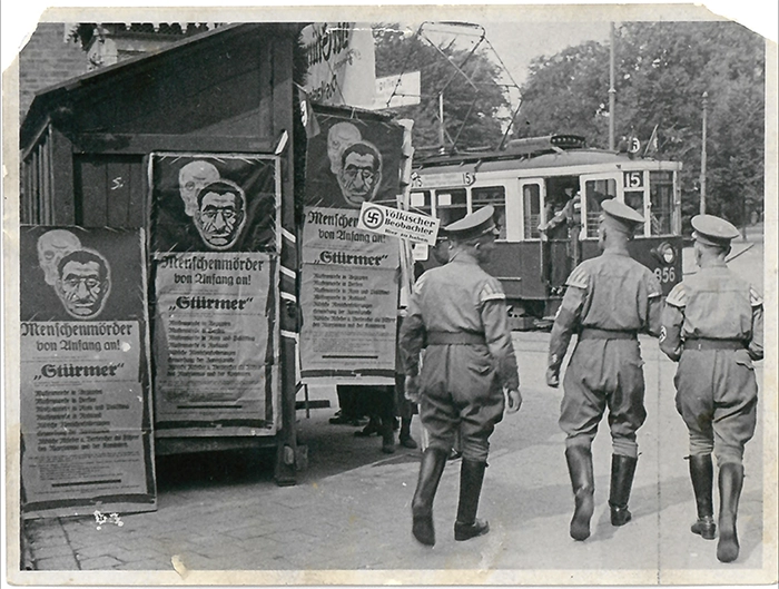
Public space quickly filled with official messaging. Propaganda posters appeared on walls, in train stations, and along city streets. Radio broadcasts were monitored, and in several regions listening to foreign stations such as the BBC could lead to punishment.
As official communication tightened its grip on everyday life, alternative voices were pushed out of public view. But they did not disappear. Instead, they moved underground.
The Birth of Underground Print Networks
With official channels silenced or tightly controlled, the need for independent information became urgent. Nowhere was this more evident than in occupied Poland, where the underground press became both a lifeline and a tool of resistance. The Polish resistance organized one of the largest clandestine publishing networks in wartime Europe, known as the Bibuła.
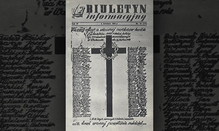
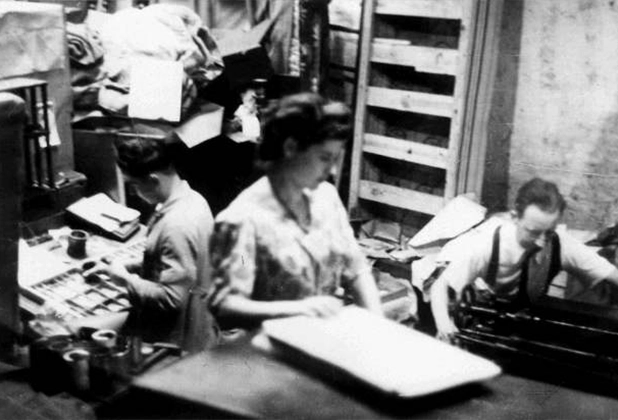
Secret printing rooms hidden in basements and attics began producing illegal newspapers, bulletins, and leaflets. The most well-known, Biuletyn Informacyjny (Information Bulletin), delivered news from the resistance, coded instructions, and messages of hope to tens of thousands across Warsaw. Every edition placed the lives of editors, designers, and couriers at risk as they distributed copies, often slipping them through cracks in walls or beneath shop counters.
The design of these underground publications was raw but intentional. Designers worked with limited materials and under constant secrecy, improvising with whatever paper, ink, and typesetting tools they could find. Layouts were simple, but symbols, typography, and even the placement of headlines became a form of visual resistance. For readers, a smuggled newspaper or a hand-printed poster was more than information. It was proof that resistance still existed.
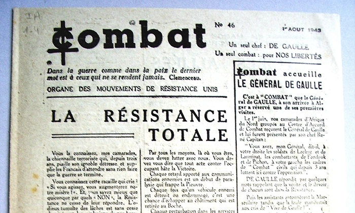
Similar networks appeared elsewhere. In France, the Combat newspaper and its graphic identity gave a visible form to underground movements, circulating messages of defiance while official presses served the occupiers. Each hidden press and each poster passed from hand to hand reinforced the same idea. Resistance was still active, even if it could not be spoken openly.
Underground Principles of Design
Creating underground graphics during World War II required more than artistic skill. Designers worked under constant pressure, with limited resources and the risk of arrest if their work was discovered. Every decision, from the size of a leaflet to the choice of type, had to balance clarity, speed, and secrecy.
Paper was scarce, forcing printers to use whatever materials they could obtain. Ink supplies were inconsistent, and professional printing presses were rarely available. Many underground publications relied on small hand presses, mimeograph machines, or improvised duplication methods that could be hidden quickly during a raid. These limitations shaped the visual language of underground graphic design. Layouts became compact, typography bold and direct, and illustrations simplified for fast reproduction.
Despite these constraints, designers still communicated powerful ideas. Symbols became essential. A single graphic, a stylized letter, or a recognizable emblem could deliver meaning instantly without requiring long explanations.
Speed was critical. Many pieces had to be designed, printed, and distributed within hours to avoid detection. As a result, underground graphics favored clarity over decoration. Headlines were immediate, messages concise, and compositions structured to be read quickly by someone passing in the street.
These were not just practical decisions. They formed a visual language defined by urgency, secrecy, and survival. What emerged from these hidden studios was not polished propaganda, but something more direct. Graphic design under pressure, carrying messages that needed to be seen and understood immediately.
Designing Resistance Symbols
Not every message required text. Simple visual symbols painted on walls, drawn on posters, or reproduced on leaflets became powerful signals that could be recognized instantly.
One of the most striking examples appeared in Poland. The Kotwica, or “Anchor,” combined the letters P and W for Polska Walcząca (Fighting Poland). Drawn quickly with paint or chalk, the symbol appeared across Warsaw on walls, street corners, and tram stops. For the occupiers it was an unfamiliar mark, but for Polish citizens it carried a clear meaning. Resistance was still alive.
Similar visual codes appeared across Europe. In the Netherlands and Belgium, small resistance symbols and improvised emblems were placed on walls or inserted into printed materials to signal solidarity and defiance. Because these graphics were easy to reproduce, they spread quickly without requiring large-scale printing operations.
What made these symbols effective was their simplicity. They could be drawn in seconds, remembered easily, and recognized from a distance. In a time when speaking openly was dangerous, these small visual signs turned public space into a silent communication system.
Over time, these graphics formed a shared visual identity for resistance movements, connecting individuals through symbols that moved quietly from wall to wall and from hand to hand.
Echoes of Underground Graphics
When the war ended, many underground presses disappeared, and the urgency that shaped their work faded. But the visual language they created remained.
Underground designers in wartime Europe demonstrated how powerful graphic design could be when clarity and meaning were essential. Bold symbols, direct typography, and messages designed to be understood instantly became defining features of resistance communication.
Today, these posters, symbols, and improvised publications remain as evidence that design is not only about aesthetics or style. In moments of crisis, it becomes something else. A tool for communication, solidarity, and courage.


