 Home
Home Articles
 Twos Talks
 Videos
Retro Rebranding: Why Brands Are Returning to Their Roots?
Have you noticed how some of the world's biggest brands are returning to their classic logos and retro designs?
Nostalgia sells, and brands are increasingly tapping into their heritage to create logos that resonate with Today's audiences. From classic color palettes to timeless typography, here's why vintage designs are making a powerful comeback in today's digital landscape.
Every year, a handful of famous companies go through the rebranding process. Recently, some of these brands have followed a retro approach, reviving older versions of their logos with a modern twist. By using vintage colors, styles, and fonts, they spark a sense of nostalgia for long-time fans while offering a fresh, appealing look that captures the attention of new customers.
This trend taps into a sense of authenticity and comfort, bridging the past with the present in a way that resonates deeply in the digital age.
How Does Going Retro Affect Customers?
The Retro Rebranding trend often emphasizes bold, flat colors, rounded typography, and iconic symbols. This style contrasts with the minimalist and ultra-sleek look of the last decade logo designs, appealing to consumers who appreciate transparency and heritage.
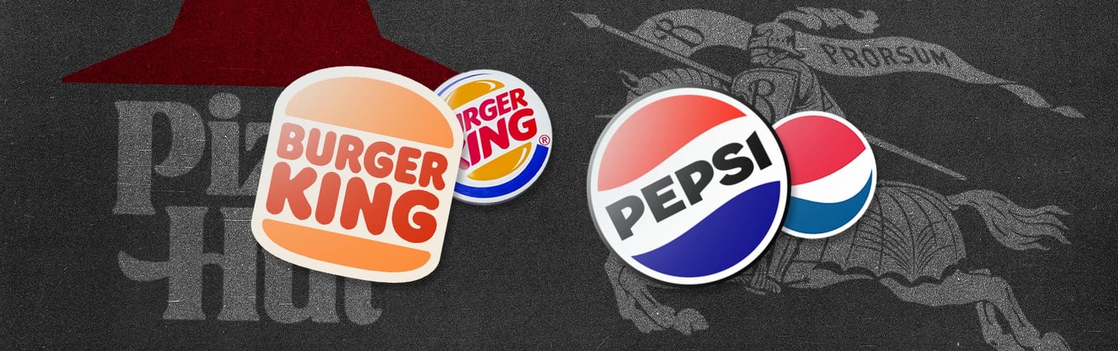
Retro Rebranding taps into familiar visual elements and color palettes inspired by the 70's, 80's, and 90's, sparking feelings of comfort, trust, and authenticity. Recently, brands like Burger King, Pepsi, and Kodak have championed this trend, revamping their logos with a vintage twist that feels refreshingly simple yet timeless.
Why Retro?
One key reason behind the popularity of retro rebrands is their strong emotional appeal. In a market where brand loyalty can be fleeting, these redesigned logos and aesthetics do more than just capture attention. They also help build deeper, more enduring connections with consumers.
Retro rebranding also helps brands stand out by offering something unique and memorable. The classic yet fresh look can make the brand feel distinct and recognizable. In a market where brand loyalty can be fleeting, these redesigned logos and aesthetics do more than just capture attention — they also help build deeper, more enduring connections with consumers.
Here are some of the most captivating retro rebranding efforts from recent years.
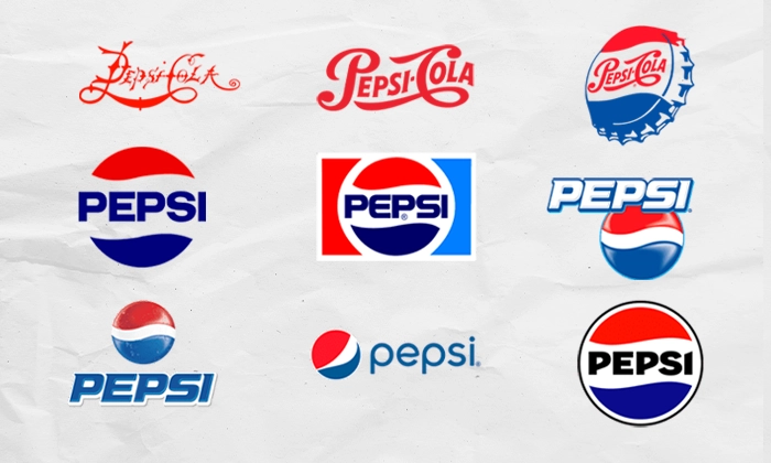
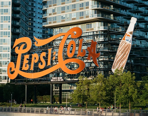
Pepsi(2023)
One key reason behind the popularity of retro rebrands is their strong emotional appeal. People sometimes look to the past for a sense of stability, and these vintage designs offer comfort and familiarity. Retro branding reinforces feelings of trustworthiness and reliability by recalling a brand’s roots.
Retro rebranding also helps brands stand out by offering something unique and memorable. The classic yet fresh look can make the brand feel distinct and recognizable. In a market where brand loyalty can be fleeting, these redesigned logos and aesthetics do more than just capture attention — they also help build deeper, more enduring connections with consumers.
Here are some of the most captivating retro rebranding efforts from recent years.
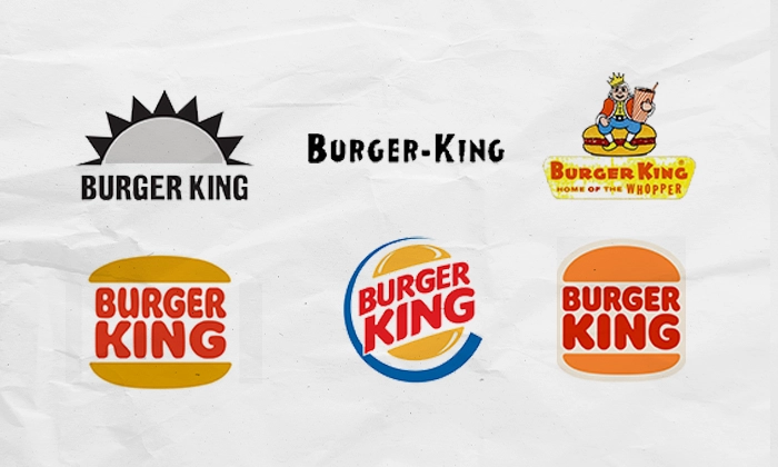
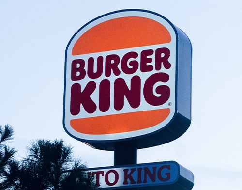
Burger King(2021)
In early 2021, Burger King introduced a retro rebrand, marking its first comprehensive redesign in over two decades. The new look brought back an updated version of its iconic 1969 logo, with the brand name nestled between two buns. This shift from the bold primary colors and dynamic curves of the 1999 logo adopted a flatter, bolder, and more simplified aesthetic, reconnecting with the brand’s original essence. The updated branding features a warmer color palette, including deep browns, oranges, reds, and greens, conjuring a nostalgic "retro" aesthetic that honors the brand’s heritage.
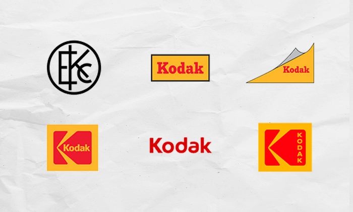
Kodak(2016)
In 2016, Kodak redesigned its logo for the first time in a decade, drawing inspiration from the iconic "Kodak K" of 1971, paired with a modern, sleek font. This redesign combines nostalgia with brand recognition, as research showed that customers immediately linked Kodak to its iconic logo shape.
The new design honored Kodak's legacy and its founder, George Eastman, marking a return to its photographic roots and working to strengthen its identity in the digital age.
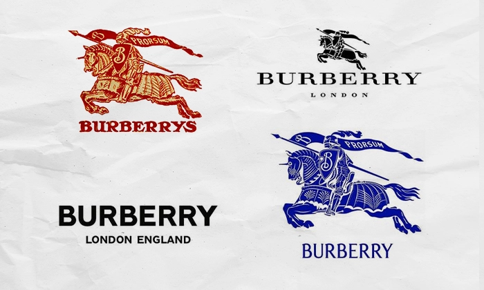
Burberry (2023)
Burberry's 2023 retro rebrand marks a bold return to the brand’s heritage under the creative direction of Daniel Lee. The rebranding introduces an archive-inspired logo featuring the iconic Equestrian Knight Design, originally created in 1901. Along with a new serif wordmark, the redesign reconnects the brand with its British roots while enhancing its visual identity.
Daniel Lee’s approach taps into a nostalgic aesthetic, reflecting on Burberry’s storied past while appealing to contemporary tastes. The revamped logo, which features the knight and horse, carries over 120 years of history, dating back to when the brand was known as "Burberrys."
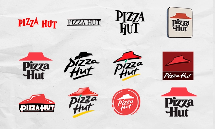
Pizza Hut (2019)
In 2019, Pizza Hut launched a nostalgic rebranding initiative by introducing "Pizza Hut Classic" locations that celebrate its retro roots from the 1970s. These retro-inspired restaurants bring back beloved elements from the past, such as red-and-white checked tablecloths, iconic red cups, and even the all-you-can-eat buffet, evoking a sense of warmth and familiarity.
The first of these retro-themed locations opened in Texas, featuring the classic logo and decor reminiscent of Pizza Hut's earlier days.


