 Home
Home Articles
 Twos Talks
 Videos
Best Movie Logos of All Time
How cinematic logos should look like

In the world of cinema, the magic doesn't just happen on screen; it begins with a logo that captures the essence of a film. Let's take a peek at some standout movie logos that tell their stories in style.

Star Wars
Remember when movies turned into iconic brands? "Star Wars" led the way, transforming film titles into recognized logos. Crafted by Suzy Rice, this classic logo paid homage to unexpected inspirations. Fans can't stop debating its origins; some say it was inspired by Helvetica Black, a 20th-century font known for its impact and readability. Others point to influences from typography used in classic science fiction magazines, reflecting George Lucas's love for the genre. According to Lucasfilm, the logo's design was a pivotal element in the branding strategy that made "Star Wars" a household name.

The Godfather
The fonts on the book cover and in the film were designed by Neil Fujita and are widely recognized as "The Godfather font." This iconic design is inspired by gothic and old-world typography, symbolizing the traditional values and the intricate, dark world of the mafia. It also reflects classic Italian signage, deeply rooted in the cultural heritage portrayed in the film and the legacies of its characters. The storyline of "The Godfather" portrays the titular character as a puppet-master who ultimately realizes his influence is subject to external forces.
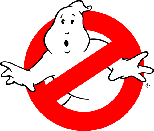
Ghostbusters
The Ghostbusters logo is iconic and serves as a masterclass in merging in-movie branding with merchandise. Michael C. Gross designed the emblem, featuring a mischievous ghost trapped inside a prohibition sign. It perfectly captures the movie's humorous take on the supernatural. This clever design made the logo a cultural phenomenon, appearing on everything from t-shirts to lunchboxes. Ivan Reitman, the film's director, praised the logo for its simplicity and perfection, highlighting its role as the iconic face of the film and a key component of its success.
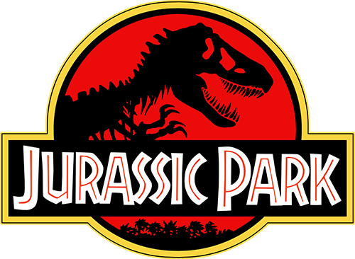
Jurassic Park
Chip Kidd, an American graphic designer, drew inspiration from dinosaur bone structures at the Museum of Natural History. His creative process was ignited by an illustration from "The Complete T-Rex" by paleontologist John Horner, which provided the visual accuracy needed for one of the most iconic movie logos we recognize today. The logo's T-Rex skeleton design not only captured scientific authenticity but also visually impressed audiences worldwide.
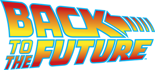
Back to the Future
The '80s classic Back to the Future boasts an iconic logo that defies time. Nina Saxon designed it with vibrant colors inspired by the era's pop culture, specifically red and yellow hues, comic-book fonts, and a clever backward arrow symbolizing time travel at 88mph. She drew from the film's dynamic narrative to create a design that became a symbol of the adventurous spirit and nostalgic charm of the beloved sci-fi adventure. This enduring logo remains a symbol of '80s cinema and continues to resonate with fans worldwide.

Dirty Dancing
The Dirty Dancing logo, created with brushwork aesthetics, mirrors the movie's raw emotions and genuine connections. The color palette, notably purple and pink, signifies passion and intimacy and effectively foreshadows heartfelt moments in the film. Paul Bacon designed the logo, carefully choosing the brushstroke style and colors to convey the film's themes of romance and sensuality.


