 Home
Home Articles
 Twos Talks
 Videos
Top 7 Iconic ’80s and ’90s NBA Logos
Discover seven of the most iconic ’80s and ’90s NBA logos, known for bold forms, memorable characters, and lasting identities.

The NBA of the 1980s and 1990s produced some of the most recognizable team identities in professional sports. As the league grew in scale and visibility, many franchises introduced bolder, more expressive logos that moved beyond traditional sports heraldry. Strong silhouettes, energetic typography, and character-driven forms gave teams clear visual identities and memorable symbols. Decades later, several of these marks remain effective because their design is built on simple structure, legibility, and ideas that translate well across uniforms, merchandise, and media.
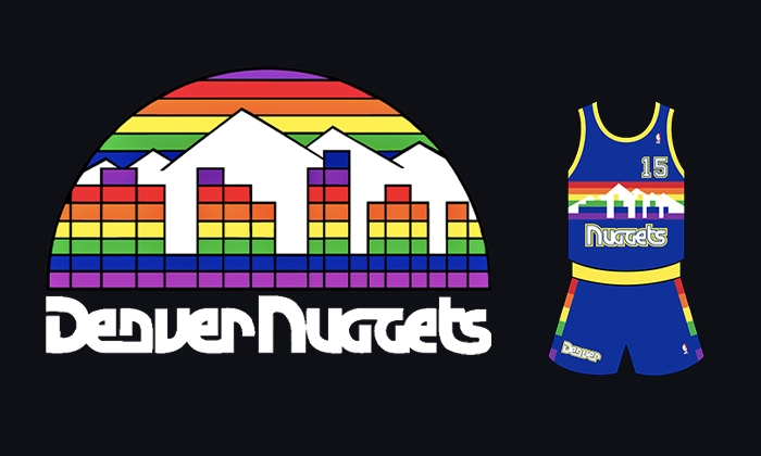
7. Denver Nuggets (1982–1993)
The Denver Nuggets logo introduced in the early 1980s is best known for its rainbow skyline and simplified mountain forms, a direct reference to Colorado’s geography and the team’s “Mile High” identity. The horizontal color bands created immediate visibility across uniforms and merchandise, while the triangular mountain shapes formed a stable and easily recognizable silhouette. Unlike many era-specific logos, the design avoided complex illustration and kept the typography secondary to the symbol. Its continued use in retro jerseys and court designs points to the strength of the concept, and the mountain abstraction and rainbow color system keep their clarity and recognizability decades later.
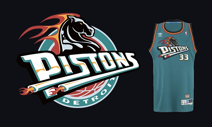
6. Detroit Pistons (1996–2001)
The Pistons’ mid 1990s logo broke away from the team’s standard red, white, and blue identity. It paired a flaming teal horse with a basketball, mirroring the league’s move toward aggressive, character-based branding at the time. Although the color palette ties the design to the 1990s, the logo functions well because of its dynamic silhouette and balanced parts. The horse head, flame shapes, and circular frame stay legible at small sizes, accounting for the logo’s frequent use in throwback collections despite its short initial run.
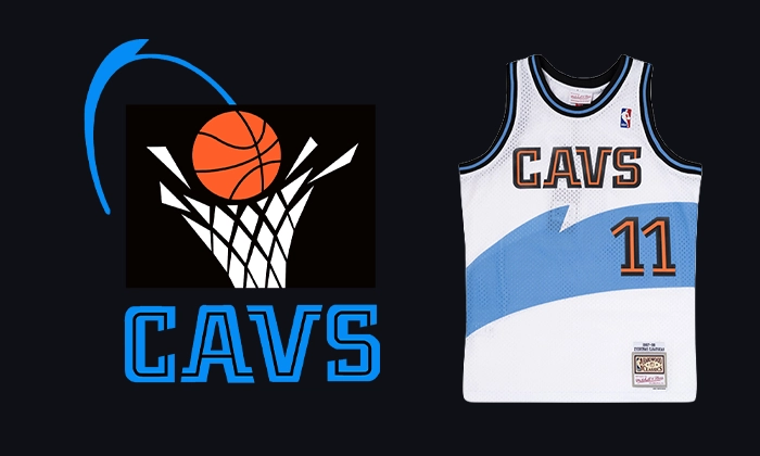
5. Cleveland Cavaliers (1994–2003)
Cleveland’s 1994 rebrand introduced a shield-based logo centered on a sword piercing a basketball, paired with deep navy, gold, and wine tones. The identity leaned on medieval symbolism, tying the Cavaliers name to direct visual cues instead of abstract forms. The logo works because of its disciplined geometry and clear layering. The sword, ball, and wordmark sit in distinct zones inside the shield, which helps the mark scale cleanly across uniforms and printed materials. Among NBA logos of the 1990s, it stands out for its structured layout and system-ready construction.
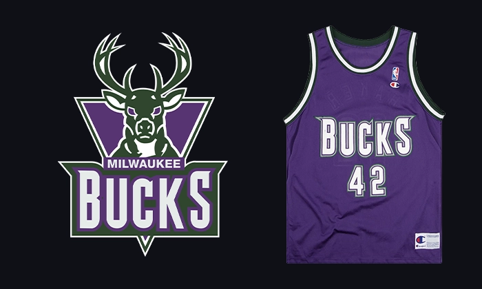
4. Milwaukee Bucks (1993–2006)
The purple-and-green Bucks logo introduced in the early 1990s placed a stylized deer head at the center of the identity, emphasizing symmetry, antler geometry, and strong negative space. Unlike earlier versions that leaned on realism, this mark simplified the animal into sharp angles and bold shapes. The result was a logo that translated cleanly across courts, jerseys, and promotional materials. Its continued popularity among fans and designers influenced the team’s 2015 redesign, which borrowed heavily from the same structural logic and visual restraint.
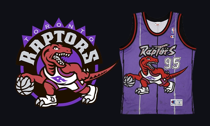
3. Toronto Raptors (1995–2008)
Toronto’s original Raptors logo is one of the most recognizable products of the NBA’s 1990s expansion. The logo features a dribbling dinosaur rendered in bold outlines and high-contrast colors, and it leans fully into character illustration at a time when the league was courting younger and international audiences. Despite its association with the era, the logo’s success comes from its clear focal point, strong contour lines, and expressive posture. The character reads instantly, even when simplified or recolored, which is why it continues to anchor throwback branding and alternate uniforms today.
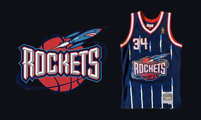
2. Houston Rockets (1995–2003)
The Rockets’ 1995 rebrand brought a sharply constructed “R” shaped like a launching rocket, paired with speed lines and a metallic red palette. Unlike many contemporaneous NBA logos, the design avoided mascots or literal objects and relied on typographic symbolism. Diagonal forms and negative space create a sense of motion without illustration. Its adaptability across uniforms, wordmarks, and secondary graphics made it one of the more system-driven NBA identities of the decade. Elements of the logo later carried into subsequent Rockets branding, including simplified modern revisions.
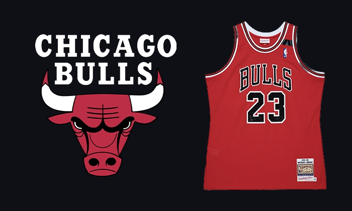
1. Chicago Bulls (1966–Present)
The Chicago Bulls logo first appeared in the 1960s and reached peak cultural visibility in the 1980s and 1990s. It was created by Dean P. Wessel and has stayed unchanged for decades, which is unusual in professional sports. Its strength comes from uncompromising simplicity: a symmetrical bull head, bold line work, a limited color palette, and a silhouette that is unmistakable at any scale. The logo uses no updates, no alternate versions, and no era-specific styling. It still functions as one of the most durable and recognizable visual identities in sports, not because of nostalgia, but because of structural clarity and disciplined design.


