Home
Home Articles
 Twos Talks
 Videos
Top 5 Best Fifa World Cup Logos Ever
A design analysis of top five best FIFA World Cup logo designs that turn simple ideas into iconic symbols.
Ranking World Cup logos can easily fall into nostalgia. Every tournament carries emotional weight for fans, which often blurs the line between design quality and personal memory. Here, the focus stays strictly on the logos themselves, not the broader branding systems, marketing campaigns, or tournament legacy. To evaluate these FIFA World Cup logos more objectively, four core design principles were used: concept clarity, formal cohesion, visual distinctiveness, and visual economy. In simple terms, the question is how clearly each logo communicates its idea, how well its elements work together, how memorable the mark becomes, and how efficiently it delivers meaning with minimal visual material.
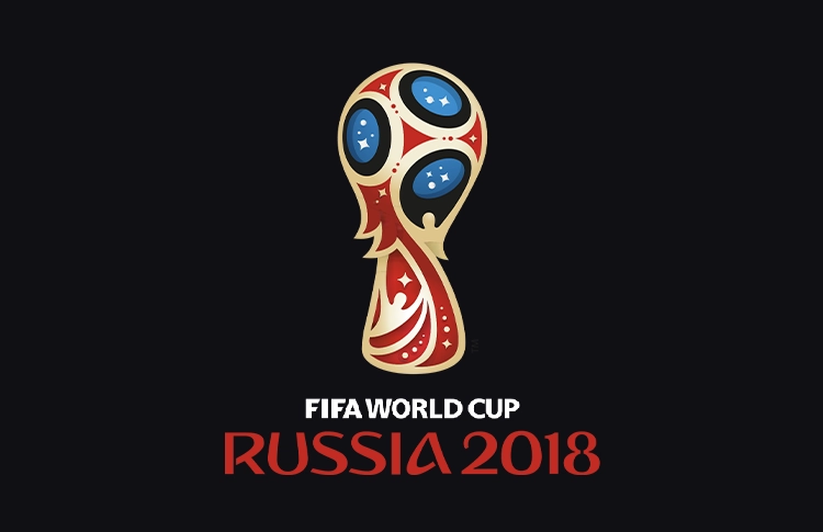
5. Russia 2018
The Russia 2018 logo succeeds largely because of its silhouette. Even at very small sizes, the outline of the World Cup trophy remains instantly recognizable. The design takes this familiar form and stylizes it into a symmetrical emblem that feels both decorative and structured. The detailing draws from Russian ornamental traditions without overwhelming the central shape. The glowing circular elements suggest footballs and celestial motifs, while the red and gold palette reinforces the sense of prestige associated with the tournament.
What keeps the logo effective is its balance. It carries ornamental character while maintaining a clean and readable core structure.
Design takeaway: A memorable silhouette often matters more than surface detail.
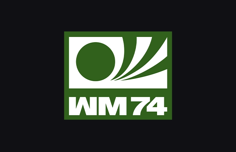
4. Germany 1974
Germany 1974 shows the influence of European modernist graphic design on sports identity. The logo reduces the idea of football to a set of flowing geometric curves that form a player kicking a ball. There is very little visual noise here. The forms are abstract yet immediately understandable. This level of reduction aligns with the modernist design thinking of the era, when clarity and functional simplicity were central values.
Because of this restraint, the mark translates extremely well across applications. Even decades later, it still feels precise and contemporary.
Design takeaway: Strong reduction can make a logo timeless.
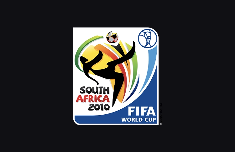
3. South Africa 2010
Few World Cup logos capture motion as convincingly as South Africa 2010. The sweeping lines of the figure create a dynamic sense of movement, almost like a brushstroke frozen mid-action. The composition also carries a strong sense of place. The color palette and graphic energy draw from visual traditions associated with African art and design without slipping into decorative pastiche.
The result is a mark that feels energetic and alive. It communicates the dynamism of football while maintaining a clear and coherent structure.
Design takeaway: Energy in a logo comes from directional form, not added effects.
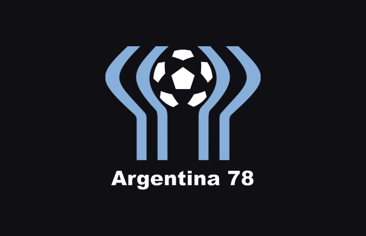
2. Argentina 1978
Argentina 1978 is one of the most conceptually strong logos in World Cup history. At first glance the mark appears to be a stylized group of figures raising their arms in celebration. A closer look reveals that the same forms also construct the shape of the World Cup trophy. This dual reading gives the logo a rare level of conceptual clarity. The geometry is simple and symmetrical, while the symbolism remains layered. The human figures, the trophy, and the act of celebration all merge into a single graphic gesture.
It is a clever solution executed with impressive visual economy.
Design takeaway: The best logos often communicate multiple ideas through one simple structure.
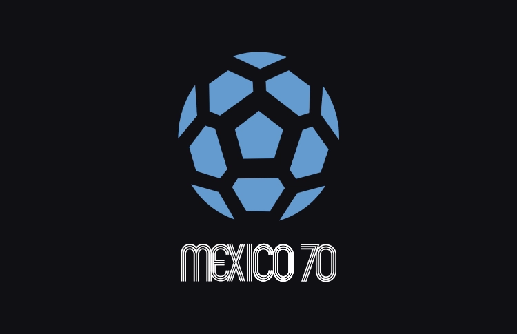
1. Mexico 1970
Mexico 1970 stands as one of the most influential works of sports graphic design. The identity centers on a typographic structure in which parallel lines run through the lettering, creating a rhythmic optical effect. The pattern draws from Op Art and the broader visual culture surrounding the Mexico 1968 Olympics, giving the logo a clear connection to its design context. The idea is carried out with careful control. The lines introduce motion, depth, and character while preserving the clarity of the typography. More importantly, the concept is fully unified. Typography, pattern, and composition all operate within the same visual rhythm.
That clarity of idea, combined with precise execution, makes Mexico 1970 the strongest World Cup logo from a pure design perspective.
Design takeaway: When a single graphic idea drives the entire form, a logo becomes iconic.