 Home
Home Articles
 Twos Talks
 Videos
The Logo That Never Stays the Same
When MTV launched in 1981, its logo broke one of branding’s biggest rules. Instead of staying consistent, it was designed to constantly change with music culture.

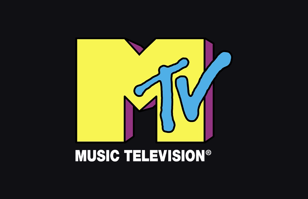
Few television brands have ever been as visually unpredictable as MTV. Throughout the 1980s and 1990s, its logo appeared in countless forms: splashed with graffiti, wrapped in animal prints, sculpted in clay or chrome, flickering in static or neon. Sometimes it melted. Sometimes it burst apart. Sometimes it looked like a doodle torn from a bored student’s notebook. Yet beneath all that experimentation, one thing remained constant: a blocky “M” paired with a graffiti-style “TV.” From the moment the channel debuted in 1981, the logo carried a quiet rebellion at its core, a mark built to shift with music culture rather than anchor it.
Ladies and Gentlemen, Rock and Roll!
In the late 1970s, the music industry was experimenting with a new idea: television dedicated entirely to music videos. At that time, the format was still more promotional oddity than mainstream entertainment. At Warner-Amex Satellite Entertainment Company (WASEC), a small team of executives and producers began developing a channel that would feel like radio reimagined for the cable era, made for young viewers, driven by pop culture, and constantly in motion.
That experiment would soon become MTV.
On August 1, 1981, the channel went live with the words “Ladies and gentlemen, rock and roll!” followed by the first music video broadcast on MTV: “Video Killed the Radio Star” by The Buggles.
But there was a problem. Music itself was moving too fast. Culture was splintering into punk, new wave, heavy metal, and emerging scenes such as early hip hop. A rigid, corporate logo would instantly feel out of step with that world. The channel needed a visual identity that could bend and shift as quickly as the music itself, something capable of reflecting the restless energy of the culture surrounding it.
MTV was not searching for a logo that would sit quietly in the corner of the screen. It wanted a logo that felt alive.
Designing the MTV Logo in Manhattan
The network turned to the New York design studio Manhattan Design, founded by Frank Olinsky, Pat Gorman, and Patti Rogoff, working closely with MTV creative director Fred Seibert. Seibert strongly promoted the vision that the logo should constantly change, a philosophy that later became central to MTV’s entire identity system.
Their solution was deceptively simple: a chunky, three-dimensional “M” paired with a loose, hand-drawn “TV.” The contrast between the two elements was intentional. The solid block letter felt almost corporate, while the scribbled “TV” captured the raw energy of street culture.
But the real innovation was not just the form of the logo. It was the system behind it. The structure of the mark would remain the same, yet its surface could constantly change through colors, patterns, textures, photography, or animation. MTV’s logo was designed to be endlessly reinvented.
A Logo That Could Be Anything
Instead of enforcing strict brand guidelines, MTV encouraged designers and animators to constantly reinterpret the mark.
The “M” could be filled with patterns, textures, illustrations, photographs, or animation. One moment it might look like chrome metal. The next it might resemble leopard skin. Or psychedelic paint. This flexibility allowed the logo to evolve alongside music culture itself. As new genres such as punk, hip hop, electronic music, and grunge emerged, the MTV identity absorbed their visual languages. The logo became less of a fixed symbol and more of a living system.
Television as a Motion Playground
On television, this idea came to life through motion. MTV aired hundreds of animated idents, short visual sequences that appeared between programs, showing the logo transforming, breaking apart, or reassembling in unexpected ways. Many young designers treated these moments as experimental playgrounds. The constantly shifting visuals turned MTV into one of the most dynamic branding systems ever seen on television.
For viewers, the unpredictability was part of the experience. Turning on MTV meant stepping into a shifting visual world where design, music, and youth culture collided.
Designed to Change
The MTV logo did not revolutionize typography or invent a new graphic system in the way some historic designs did. Its influence was cultural rather than purely formal. What it demonstrated was that a brand identity could be flexible without losing recognition. The silhouette of the “M” and the sprayed “TV” remained instantly recognizable even as colors, textures, and styles changed endlessly.
At a time when most companies protected their logos with strict consistency, MTV treated its identity as something alive. That attitude perfectly reflected the culture the channel represented: fast, experimental, rebellious, and constantly evolving.
Decades later, the MTV logo still stands as a reminder that the strongest identity systems are not always the ones that stay the same. Sometimes they are the ones designed to change.


