 Home
Home Articles
 Twos Talks
 Videos
The Hindu Goddess Behind the Rolling Stones’ Logo
The design story of the Tongue and Lips Logo, a symbol of rock rebellion. What many people do not know is that the logo’s roots trace back to Hindu iconography, specifically the goddess Kali.
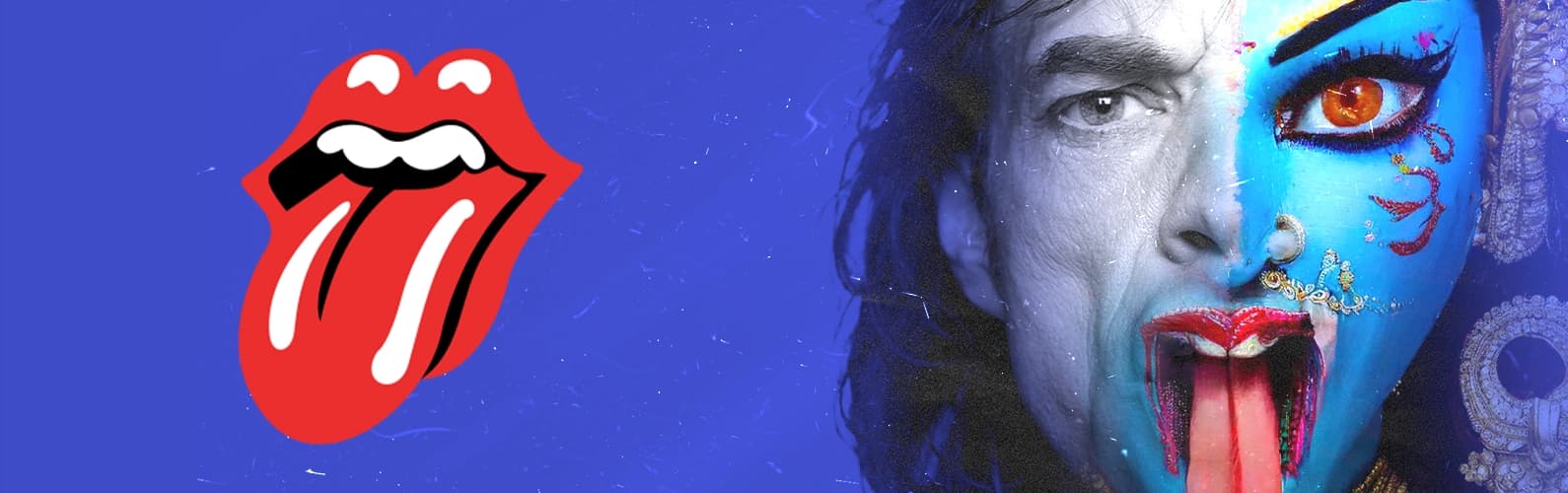
Few logos in music history are as instantly recognizable as the Rolling Stones’ tongue and lips. It is bold, provocative, and timeless, and has come to represent rebellion far beyond the band itself. What many people do not know is that the logo’s roots trace back to Hindu iconography, specifically the goddess Kali. This is the story of how art school, rock stardom, and ancient symbolism collided to create a cultural icon.
Mick Jagger Meets a Design Student
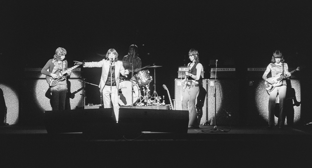
By 1970, the Rolling Stones were already giants of rock music. Eight years after forming, they had shaped the raw, blues-driven sound of the 1960s and stood alongside bands like The Beatles at the center of the British Invasion. As they prepared for their 1970 European Tour, the band needed a new poster.
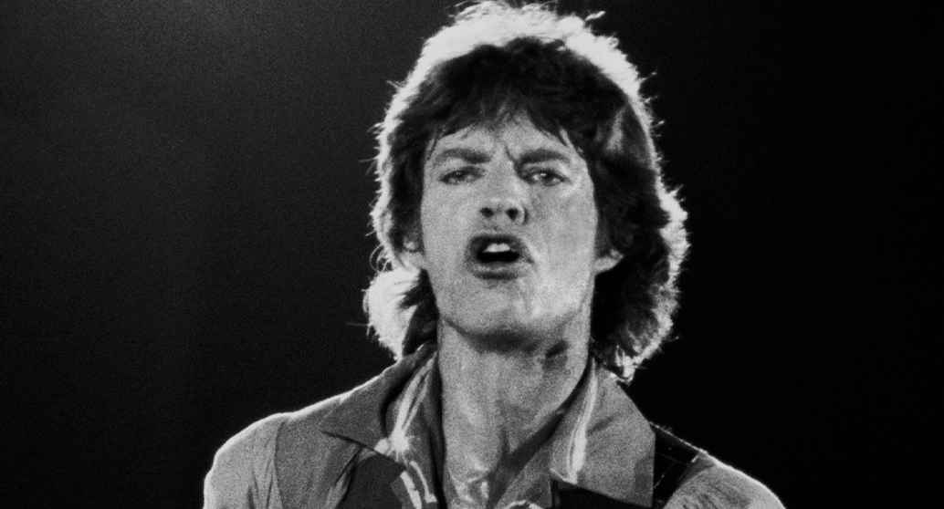
They were unhappy with the concepts provided by their record company. So, the Stones contacted the Royal College of Art in London with an unusual request: would a student be willing to meet Mick Jagger to discuss an upcoming tour’s poster design? A tutor recommended a final-year master’s student named John Pasche. That call would change his life.
Designing a Rolling Stones Tour Poster
Pasche met with Jagger to exchange ideas for a fresh tour poster. Both shared an admiration for illustrated posters from the 1930s and 1940s, especially French designs that relied on strong imagery rather than photography.
After several weeks, Pasche presented his first concepts. Jagger liked the direction but pushed him to go further. Rather than backing off, Pasche reworked his ideas and returned with a stronger design, which the band approved, officially beginning their collaboration.
Rolling Stones Needed a Logo
Following the success of the tour poster, the Stones approached Pasche again, this time with a bigger request. They had just launched Rolling Stones Records and wanted a logo that could stand on its own. Jagger invited Pasche to his home and explained that he wanted something simple, bold, and timeless, comparable to the Shell logo seen at petrol stations at the time.
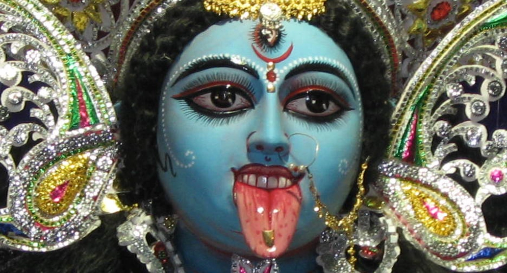
During the conversation, Jagger showed Pasche an image of the Hindu goddess Kali, her tongue extended. Jagger had reportedly found the image in a local newsagent, and that single reference became the catalyst for what followed.
Goddess Kali and the Power of the Tongue
Kali is one of the most powerful figures in Hindu mythology. She is associated with time, death, destruction, and the fierce protection of the innocent. Often depicted with multiple arms and standing over defeated demons, she embodies both terrifying power and maternal strength.
Her protruding tongue carries multiple meanings. In some interpretations, it represents uncontrollable energy and cosmic force. In others, it symbolizes a moment of shame after stepping on Shiva during her destructive dance. To Pasche, however, the tongue spoke a different visual language. He saw it as a symbol of anti-authority, bold femininity, and raw defiance. Those qualities aligned perfectly with the Rolling Stones’ attitude.
Pasche began sketching a tongue, exploring multiple versions before settling on one that felt youthful, confrontational, and visually striking. The vivid red color was chosen for its immediate impact. While many later assumed the logo was a stylized portrait of Mick Jagger’s lips, Pasche has consistently explained that this was never the intention. To him, it was simply a woman’s tongue and lips, meant to capture rebellion rather than a likeness.
An Iconic Logo for £50
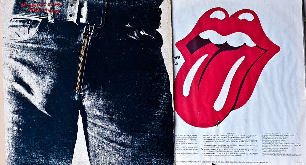
The tongue and lips logo first appeared in 1971 on the inner sleeve of the Rolling Stones’ album Sticky Fingers. From there, it spread everywhere. It appeared on T-shirts, badges, posters, and merchandise of every kind, quickly becoming the band’s permanent visual identity.
For the original logo, Pasche was paid £50. He later received £200 for additional work, including more tour posters. He continued collaborating with the Rolling Stones until 1974, contributing designs for major tours such as the 1972 American Tour and the 1973 European Tour.
Why the Logo Endures
The power of the tongue and lips goes far beyond its origins. Its strength lies in its adaptability. Over the decades, it has appeared on massive concert stages, animated visuals, digital platforms, and even as large-scale sculptures.
In 2012, to mark the band’s 50th anniversary, graphic designer Shepard Fairey reinterpreted the logo, placing it at the center of a celebratory design. Today, generations who were not alive when Sticky Fingers was released still wear the logo as a fashion statement.
More than half a century later, the Rolling Stones’ tongue continues to symbolize rebellion, attitude, and cultural resistance. It remains one of the clearest examples of how design, music, and mythology can intersect to create something truly timeless.


