 Home
Home Articles
 Twos Talks
 Videos
The Font That Scared the Dictator: Futura
History of Futura, the iconic typeface that shaped graphic design, from its Bauhaus origins to its use in Apollo 11 and global design culture.
Stories often have protagonists who overcome obstacles and change the world. In this story, the hero is not a person but a design: Futura, an iconic typeface that shaped graphic design history with a visual language rooted in clarity, geometry, and functional simplicity. It was developed in Germany during the late 1920s, and it reflected the ideals of the Bauhaus movement while quietly challenging traditional aesthetics and the authoritarian rule of Adolf Hitler. The typeface carried ideas and aspirations far beyond its origins, influencing design practices worldwide and leaving a mark that extended even to humanity’s first steps on the moon. Futura illustrates how thoughtful design can convey cultural values, inspire innovation, and endure across generations.
Fast Facts
Designer
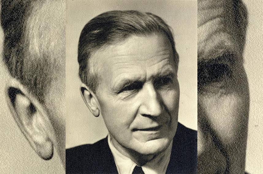
Paul Renner
Year Released
1927
Place of Origin
Germany
Foundry
Bauer Type Foundry
Era
Interwar modernism, Bauhaus, early 20th-century typographic revolution
Style Keywords
Geometric, minimalist, functional, forward-looking
Notable Uses
Apollo 11 lunar plaque, Stanley Kubrick’s 2001: A Space Odyssey, Wes Anderson’s The Royal Tenenbaums, Barbara Kruger artworks
Interwar Modernism
In the late 1920s, Europe was a crucible of artistic and ideological transformation. The Bauhaus movement found form in Germany in the aftermath of World War I, advocating a synthesis of art, craft, and technology. Its ethos rejected historical ornamentation and embraced functional design rooted in geometric forms.
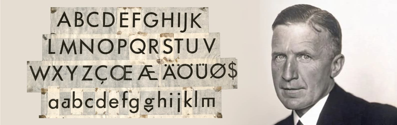
Amid this environment, German typographer Paul Renner began developing a typeface that embodied modernist ideals. The result was Futura, a geometric sans-serif defined by clean lines, circular forms, and minimalistic design. It was released in 1927 by the Bauer Type Foundry as part of the New Frankfurt project, which modernized urban design and communication.
Futura’s Graphic Innovation
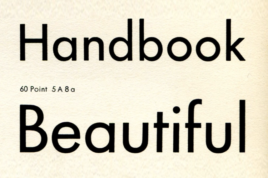
Futura’s geometric construction marked a radical departure from traditional serif typefaces and earlier sans-serifs. Its letters were constructed from perfect circles, triangles, and squares, creating harmony and balance that felt both modern and logical. The typeface featured a tall x-height, low stroke contrast, and open counters, giving it both legibility and a striking visual presence. Unlike many earlier fonts, which carried decorative or historical connotations, Futura’s shapes were stripped of ornamentation, allowing letters to communicate clearly at any size.
Its precision and functional elegance gave designers new tools for layout, rhythm, and hierarchy, particularly in posters, catalogs, and corporate communications. Designers could now create layouts where typography dictated rhythm and visual hierarchy, rather than relying on illustrations or embellishments. Its clarity signaled more than aesthetic innovation: it conveyed progress, rationality, and technological optimism.
For graphic designers of the era, using Futura was both an aesthetic and philosophical choice; a visual declaration of modernist ideals. Its clean, geometric forms quickly spread beyond Germany, appearing in avant-garde posters, corporate logos, book covers, and public signage, capturing the imagination of designers worldwide.
The Nazi Threat
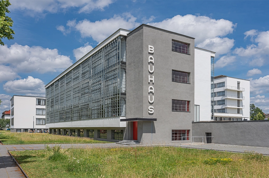
As Futura gained prominence, Nazi ideology spread through German society. The regime, led by Adolf Hitler, promoted traditional German values while condemning modernist movements as “degenerate.” The Bauhaus school, with its avant-garde approach, was among the first targets and was officially shut down in 1933 for clashing with Nazi cultural vision.
Renner, a vocal critic of Nazi cultural policies, faced direct repercussions. In 1933, he was arrested by the Gestapo and dismissed from his teaching position at the Munich Master School for Printers. Some sources suggest he emigrated to Switzerland, while others indicate he remained in Germany under censorship and professional isolation. Above all, he continued writing essays and books on typography, publishing works that circulated internationally despite restrictions.
Ironically, despite their opposition to modernist design, the Nazis later used Futura in some materials, a testament to its undeniable influence and visual power.
Futura's Journey Beyond Borders
While Renner faced persecution, Futura’s reach expanded internationally. Its clean, geometric forms resonated with designers worldwide, transcending national and political boundaries. In the United States, Futura became synonymous with modernity and innovation, appearing in corporate logos, advertising, political posters, and publications.
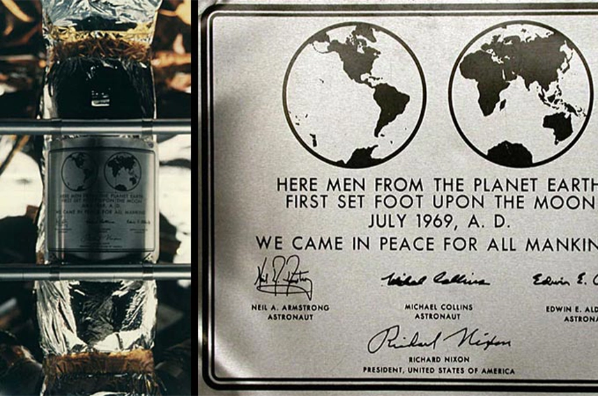
Notably, Futura was chosen for the commemorative plaque left on the Moon during the Apollo 11 mission in 1969, making it the first typeface to leave Earth. The plaque famously read, “We came in peace for all mankind” immortalizing Futura in one of history’s most iconic moments.
Notable Uses
Futura’s clean geometry and functional elegance helped it move from a modernist experiment into a cultural icon, impacting media, industries, and even outer space. Here are some of the most notable uses of Futura across the decades:
New Frankfurt Project (1927–1930s)
Applied to municipal signage, public communications, and urban modernization materials.
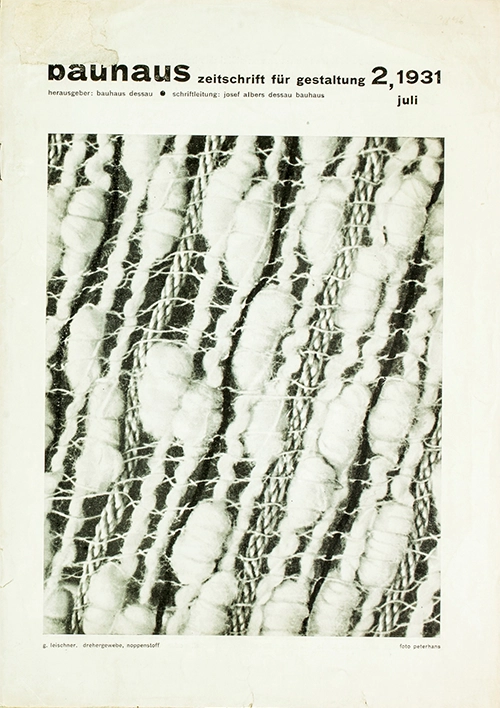
Bauhaus Publications (late 1920s–1930s)
Featured in catalogs, posters, and teaching materials, reflecting geometric clarity.
Volkswagen Advertising Campaigns (1960s–1970s)
Central to Think Small and Lemon, redefining modern advertising.
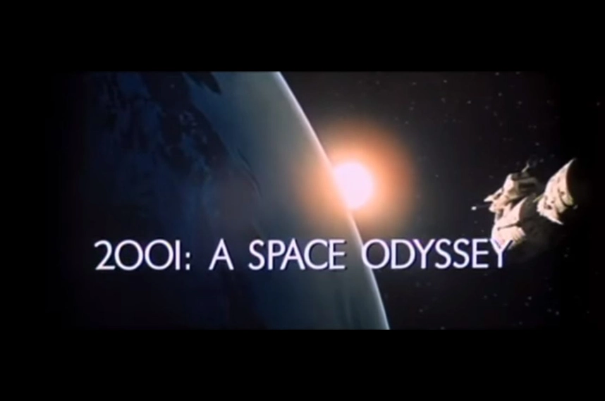
Stanley Kubrick’s 2001: A Space Odyssey (1968)
Chosen for futuristic clarity and neutrality.
Apollo 11 Lunar Plaque (1969)
The first typeface to leave Earth, reading “We came in peace for all mankind”
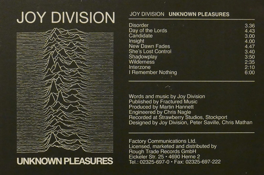
Joy Division – Unknown Pleasures Album (1979)
Linked the typeface to music and subculture.
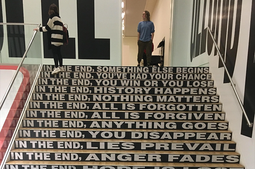
Barbara Kruger’s Artworks (1980s–present)
Geometric precision as a vehicle for political and cultural critique.
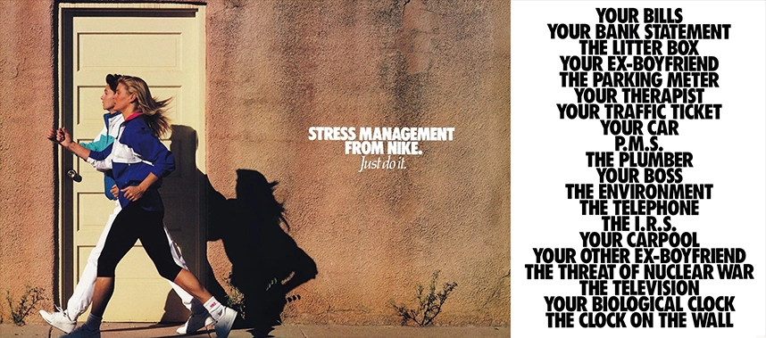
Nike Campaigns (1990s–2000s)
Futura Bold Condensed conveyed urgency and athletic energy.
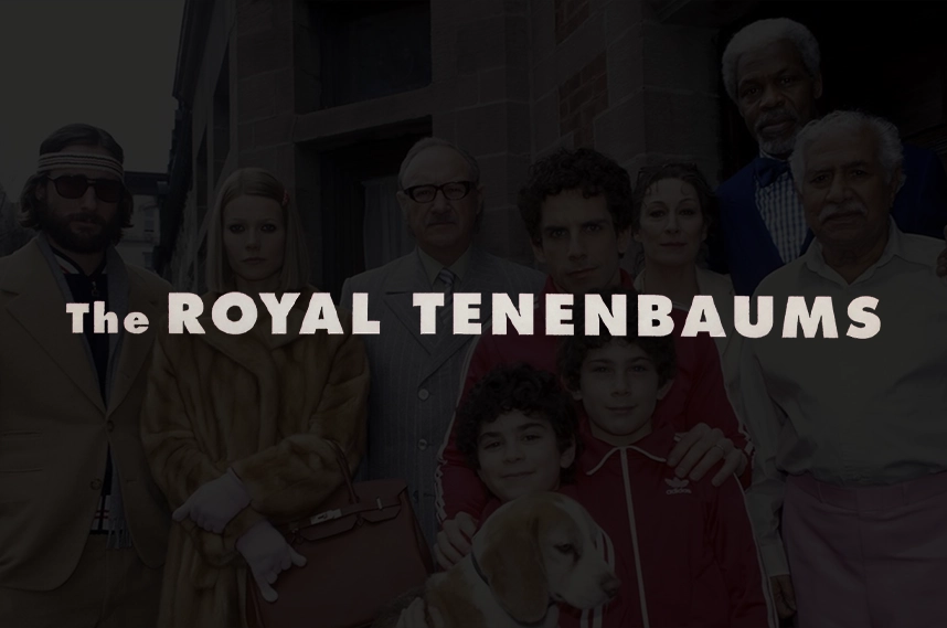
Wes Anderson’s Film Titles (1996–present)
Featured in films such as The Royal Tenenbaums and Moonrise Kingdom.
IKEA Branding (pre-2010)
Part of the global visual identity representing clarity and trust.
Why It Still Matters
Futura still matters because it embodies the promise of design that is both functional and visionary. Its story mirrors that of its creator, Paul Renner, as both were challenged by authoritarian power yet endured beyond borders and time. Nearly a century later, Futura’s precise geometry and adaptability continue to inspire designers across media, proving that clarity and simplicity can transcend political upheavals, cultural shifts, and changing tastes. More than a typeface, it remains a symbol of resilience, creativity, and design’s enduring power to shape cultural perception.


