 Home
Home Articles
 Twos Talks
 Videos
NASA’s 1970s Design: When Swiss Design Met Systems Thinking
A look at NASA’s 1970s design language, where Swiss Design, systems thinking and visual precision came together to form one of the most influential identity systems in science and technology.

In the 1970s, NASA found itself in a quieter era. The Moon landings were behind it, public attention was drifting, and the agency needed a new way to explain what remained: a complex, data-driven scientific enterprise.
Rather than rely on spectacle, NASA turned to structure, precision and a more systematic visual language influenced by the modernist thinking of the time. This shift set a new standard for how a scientific institution could communicate its mission to the world.
NASA After the Moon
By the early 1970s, NASA was no longer staging singular, history-defining spectacles. The Apollo missions had achieved their symbolic climax, and what followed was less cinematic but far more complex: orbital laboratories, satellite programs, deep space probes and long-term scientific research.
NASA was now managing an expanding network of centers, contractors, research divisions and technical documentation. Its outputs were increasingly data-driven, procedural and collaborative. Yet its public image was still anchored in the drama of rocket launches and moonwalks. The visual language surrounding the agency lacked coherence across applications: from stationery and vehicle markings to publications and environmental graphics.
Swiss Thinking Entered NASA
In 1974, NASA commissioned the New York design firm Danne & Blackburn to develop a unified graphics standards system. The designers treated the agency as a complex information environment. Their proposal drew heavily on Swiss modernist principles and introduced a clear structural framework for visual communication.
Key elements of the system included:
• a rational grid governing layout structure
• a strict typographic hierarchy
• Helvetica as the primary typeface
• consistent spacing and alignment rules
• removal of decorative or illustrative elements
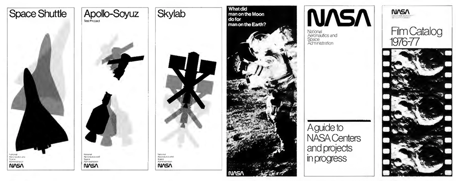
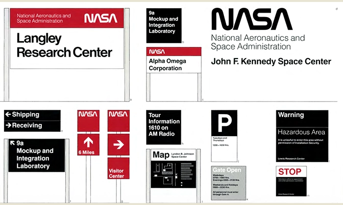
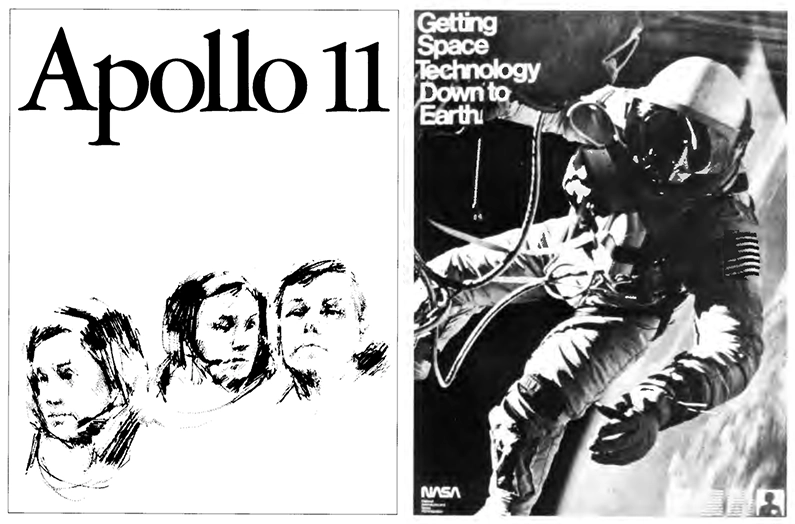
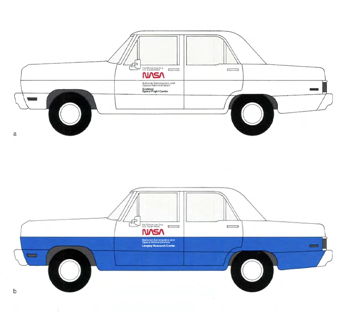
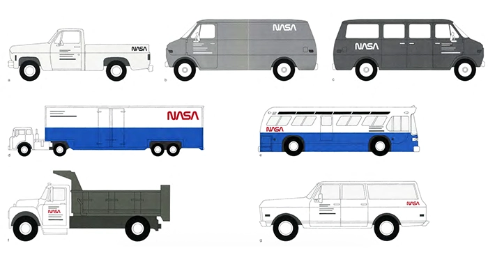
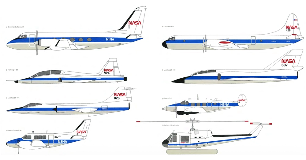
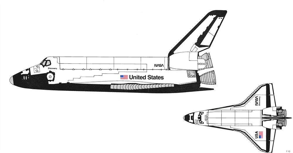
The goal was clarity and operational consistency. The system allowed documents, signage, vehicles and publications to share a common visual structure across the agency.
This approach matched NASA’s changing institutional structure. By the mid-1970s the agency operated as a distributed network of research centers, contractors and scientific programs. Communication needed stability across many formats and environments. The graphics standards manual provided that stability, establishing repeatable rules for how information appeared and circulated throughout the organization.
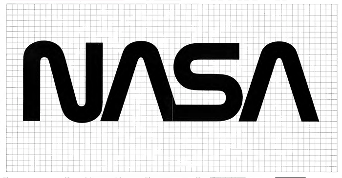
The Logotype as Infrastructure
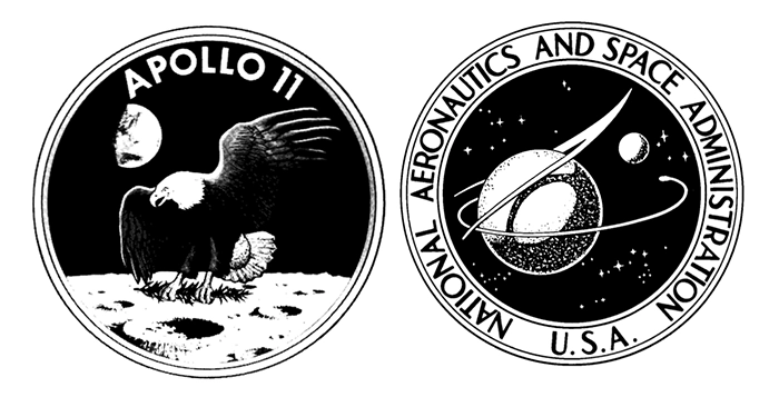
The most visible component of the 1974 system was a new logotype. It replaced the previous NASA seal, which featured a blue sphere, stars and a red vector. The new mark discarded these illustrative elements for a purely typographic solution.
The logotype followed specific geometric logic:
• a continuous, single-width stroke
• removal of the horizontal crossbars in the letter A
• rounded terminals suggesting fluid motion
• high legibility across various scales and materials
Rather than using the logotype as a symbol or a picture of space, the designers conceived it as technical equipment. It worked effectively on the side of a rocket and on official letterheads. This reduction changed the role of the mark. It functioned as infrastructure rather than ornament.
The Manual as a System
The 1974 graphics standards manual was the central document produced by Danne & Blackburn to formalize NASA’s new visual system. The manual translated visual decisions into operational rules. It specified how typography, color, scale and layout should function across documents, signage, vehicles and publications. The document read less like a style guide and more like an engineering manual. Each instruction addressed practical concerns such as legibility, reproduction quality and consistency across environments.
This structure allowed NASA’s many centers and contractors to produce communication materials that followed the same visual logic. The system reduced variation and made information easier to interpret across technical reports, public publications and physical environments.
The influence of the manual extends far beyond its original moment. In 2015, a reissue of the document was published through a Kickstarter campaign and reached its funding goal in less than an hour. The response revealed something unusual: a technical design manual had become an object of fascination for designers, engineers and the public alike.
Landing of NASA’s Worm
The design system introduced in the 1970s left a long shadow. It demonstrated how a scientific institution could communicate through structure rather than symbolism. The Worm logotype became a reference point for designers because it showed how reduction, geometry and consistency could operate as organizational tools.
NASA retired the Worm in 1992 and returned to the older Meatball insignia. The decision reflected a move toward tradition and wider public familiarity. Yet the Worm never disappeared from design culture. In 2020, NASA brought it back for the SpaceX Demo-2 mission, the agency’s first crewed launch from U.S. soil since 2011. Its return suggested that the systematic clarity of the agency’s 1970s modernist approach still had operational value: clear visual engineering could support complex, multi-partner missions.
Today, the system is studied not as a period style but as a model for how design can function as infrastructure. It continues to influence organizations that need their communication to behave predictably across distributed networks, technical teams and public audiences.


