 Home
Home Articles
 Twos Talks
 Videos
First Things First: The First Typeface in History
A short essay on the origins of the first typeface in history, and the moment letters became designed forms in typographic design.

We live with fonts so constantly that it is easy to forget how recently they appeared. Fonts influence how we read and how information appears, quiet tools that give form to language. Whether in a mobile app, on a storefront, or printed on a page, every letter we encounter is part of a designed system multiplied across countless uses.
But this idea is far newer than writing itself. For thousands of years, letters were handmade, inconsistent, and defined by the movement of the person who wrote them. The idea that the shapes of letters could be planned in advance, produced in metal, and reproduced with consistency became necessary only once printing required reliable and repeatable forms.
So where did the first typeface actually begin?
What Do We Mean by “Typeface”?
A typeface is a designed system of letters, numbers, punctuation marks, and symbols that can be reproduced mechanically or digitally. It is not handwriting or calligraphy, because those exist only at the moment they are made. A typeface is a planned set of forms built to be repeated with consistency.
Typefaces are:
• repeatable
• standardized
• reproducible at scale
• created as unified graphic systems with clear intent
This distinction matters. Ancient scripts introduced alphabets and writing conventions. Typefaces introduced design applied to letters, including proportion, rhythm, contrast, consistency, and purposeful structure.
Before Type
For millennia, letterforms developed through systems of writing rather than systems of type. The Sumerians inscribed cuneiform with styluses. Egyptian scribes produced hieroglyphs through established conventions. Greek and Roman stone-carvers created stable sets of capitals through consistent geometries. Medieval scribes introduced dense scripts such as Textura and more open ones such as Carolingian minuscule.
These were important advances in the history of writing. They were not typefaces. Their reproduction depended on individual hands, not standardized matrices or reusable forms.
The world had writing. It had style. It did not yet have typographic design. It would take a technical shift to transform writing into a repeatable visual system.

The Birth of Type: Gutenberg and the 42 Line Bible
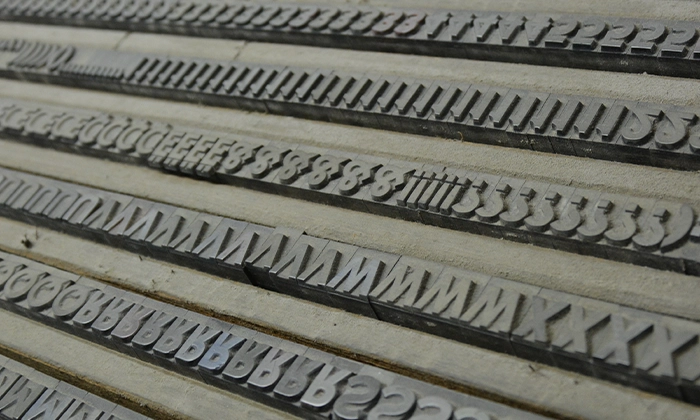
The fifteenth century in Europe created the conditions for a major shift in communication. Advances in metallurgy, wider access to paper, and rising literacy increased the demand for texts that could be reproduced with reliability. In Mainz, around 1454 to 1455, Johannes Gutenberg developed a method that answered this need: movable metal type.
Gutenberg’s typeface for the 42-line Bible, modeled on the Gothic script known as Textura, is widely regarded as the first typographic system in history.
Its significance appears in several breakthroughs:
• Unity: letters were conceived as coordinated forms, not improvised one by one.
• Engineering: each character was produced through a punch, a matrix, and a casting mould.
• Repeatability: once cast, letters could be arranged and reused without limit.
• Consistency: the printed result showed a regularity that handwriting could not achieve.
Although Gutenberg followed a script familiar to his time, converting it into metal changed its nature. His typeface was not a simple imitation of handwriting. It was the first alphabet engineered for production.
Nicolas Jenson and the First Readable Roman
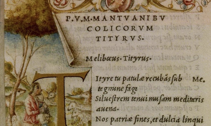
In the 1470s, only two decades after Gutenberg, a new direction in typographic thinking developed in Venice. Nicolas Jenson, a former French engraver working in the city’s expanding print industry, created what many consider the first fully realized Roman typeface.
Jenson did not continue the dense rhythm of Gothic writing. He studied humanist manuscripts and classical Roman inscriptions and translated their measured proportions and open internal spaces into metal. The result was a text face with moderate contrast, balanced structure, and a calm rhythm suited to extended reading.
Jenson’s work represents an early moment when type begins to behave as a designed system rather than an echo of handwriting. Many contemporary serif typefaces, especially within the Venetian old style tradition, still follow the principles he established.
Nicolas Jenson and the First Readable Roman
In the 1470s, only two decades after Gutenberg, a new direction in typographic thinking developed in Venice. Nicolas Jenson, a former French engraver working in the city’s expanding print industry, created what many consider the first fully realized Roman typeface.
Jenson did not continue the dense rhythm of Gothic writing. He studied humanist manuscripts and classical Roman inscriptions and translated their measured proportions and open internal spaces into metal. The result was a text face with moderate contrast, balanced structure, and a calm rhythm suited to extended reading.
Jenson’s work represents an early moment when type begins to behave as a designed system rather than an echo of handwriting. Many contemporary serif typefaces, especially within the Venetian old style tradition, still follow the principles he established.
Italic Innovation
In 1495, Venetian printer Aldus Manutius and punchcutter Francesco Griffo introduced a new development in type: the first italic. Their intention was practical. They wanted books that used less space, cost less to produce, and could be carried easily by scholars and students.
Griffo based the design on the slanted handwriting used in humanist circles, but he refined it for print. The result was a typeface that departed from the rigid vertical structure of Roman forms and offered a more compact rhythm on the page. Italic became a distinct category within typography, built to support efficient reading and economical composition. This innovation helped expand type into a system with multiple styles, each serving a different purpose. The relationship between Roman and Italic, later joined by bolder variants, set the foundation for the typographic families used today.
First Named Typefaces
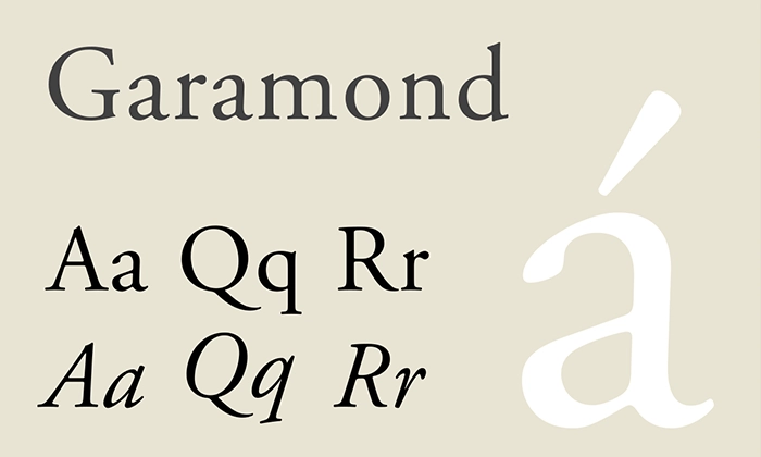
By the 1530s, Claude Garamond in Paris advanced type design from a largely technical activity toward an identifiable professional role. His Roman and Italic types became reference points for proportion, rhythm, and consistent structure.
Garamond gained importance through the way his work circulated across Europe. Printers purchased his punches, recognized his name, and reproduced his designs widely enough for readers to identify a distinct Garamond style.
This period introduced a new idea within typography. A typeface could now be linked to a particular designer and appreciated as a coherent work of authorship. This is the stage where the role of the type designer begins to take shape.
Three Definitions of the “First Typeface”
Defining “the first typeface” depends on the threshold one considers essential:
1. First mechanically cast typeface:
Gutenberg’s Textura (c.1454) — the technical origin of type.
2. First modern readable Roman typeface:
Jenson’s Roman (1470s) — the aesthetic and functional origin of type design.
3. First typeface associated with a named designer:
Garamond’s Romans and Italics (1530s) — the professional origin of type design.
When Letters Became Type
Printing introduced requirements that handwritten manuscripts could not meet at scale. Workshops needed systems that held together across long print runs and could support the pace of expanding readership and scholarship. These needs appeared in several areas:
• stable forms repeated across thousands of impressions
• reading comfort for audiences wider than the scribal world
• efficiency in preparation and production
• consistency that allowed printers and scholars in different cities to share knowledge without distortion
Typefaces answered these pressures. They turned writing into sets of letters planned in advance and produced with tools that allowed reliable repetition. Once letters could be reproduced as coordinated units, ideas moved faster, travelled farther, and reached communities well beyond the place where a page was first composed.
The materials of reproduction have shifted across centuries, yet the underlying logic remains unchanged. Metal punches, printed sheets, phototypesetting equipment, and pixel grids belong to different periods, but each supports the same intention. Typefaces provide stability for written language so information can move across mediums, devices, and eras with continuity and precision, carrying the same human intention that once gave form to the first letters in metal.


