Home
Home Articles
 Twos Talks
 Videos
Best Music Festival Logos
A design analysis of the top 7 festival identities after 2000, from Tomorrowland and Primavera Sound to Ultra, Sonar, and Bonnaroo.
Music festival logos do far more than label an event. They must remain effective across everything from mobile apps and tickets to massive stage screens and merchandise. While festivals like Coachella or Glastonbury have immense cultural weight, this ranking focuses strictly on the design quality of the logos themselves. Each mark is analyzed through the lens of concept clarity, formal cohesion, distinctiveness, and versatility. By stripping away marketing budgets and lineup fame, we can identify which identities actually succeed as pieces of visual communication.
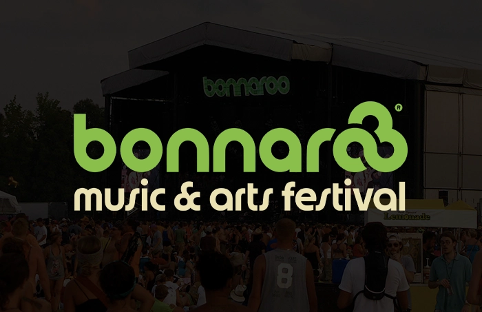
7. Bonnaroo
The Bonnaroo logo succeeds by capturing the communal and informal spirit of the event without becoming visually messy. Its rounded, interlocking letterforms and friendly silhouette create a sense of openness and accessibility. Unlike many corporate music identities, it feels lived-in and approachable. While it lacks the mathematical precision found in more minimal designs, its strength lies in how well its form matches the festival’s relaxed identity. It remains a recognizable mark that avoids the coldness of many modern digital brands.
Design takeaway: Expressive typography can carry a festival identity when the form stays recognizable and tonally consistent.
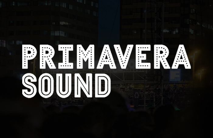
6. Primavera Sound
Primavera Sound uses a restrained typographic system to build a timeless and coherent identity. The logo avoids chasing fleeting design trends, opting instead for a stable and balanced wordmark. Its power lies in its discipline. The rhythm of the letters and the consistency of the entire visual system create a tone that is both professional and contemporary. It is a complete identity that does not need a separate symbol to maintain its strength or recognition.
Design takeaway: When typography is precise enough, it does not need symbolic support to build a strong identity.
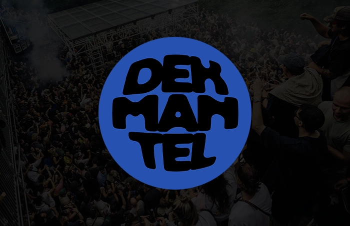
5. Dekmantel
Dekmantel represents a highly disciplined approach to festival branding. Its identity is built on a foundation of modular geometry and restraint, fitting the precise nature of contemporary electronic music. The logo does not rely on illustration or narrative. Instead, it creates distinction through its exact proportions and rhythmic repetition. This system-friendly design works exceptionally well in motion graphics and environmental signage. The controlled visual language prioritizes structure over emotional decoration.
Design takeaway: A logo can stand out by being exact, controlled, and system-friendly rather than loud.
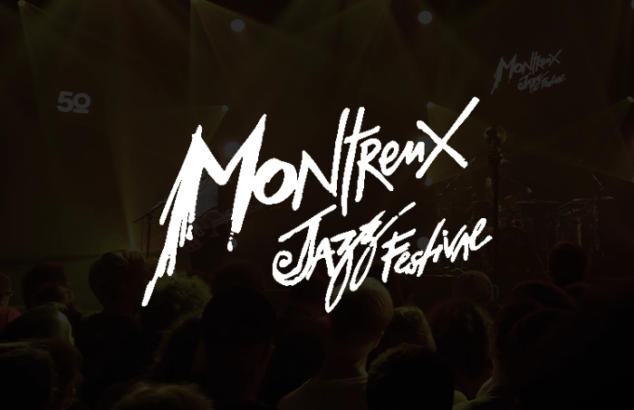
4. Montreux Jazz Festival
The Montreux Jazz Festival logo, redesigned in 2017 by Malika Favre, treats the festival name as a piece of visual art rather than a conventional wordmark. Its continuous, hand-drawn lettering forms a recognizable signature with a strong sense of rhythm. The complexity of the letterforms can reduce clarity at very small sizes, but the mark compensates with personality and authorship. In a landscape dominated by neutral sans-serif festival branding, Montreux stands apart through its expressive lettering.
Design takeaway: Custom letterforms can turn a name into a full identity, even when some scalability is sacrificed.
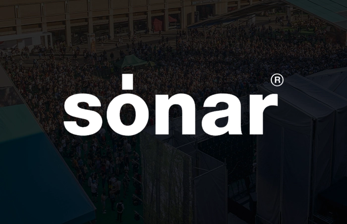
3. Sonar
Sonar is a masterclass in achieving impact through extreme reduction. The logo is conceptual without being obscure, using a stripped-back typographic approach that aligns with the experimental nature of its programming. Its strength comes from its refusal to over-explain itself. By focusing on clean lines and a self-assured stance, the logo becomes highly adaptable across different media and visual contexts. It proves that a minimalist mark can feel substantial when every detail is handled with precision.
Design takeaway: Minimal logos work best when reduction creates precision, not emptiness.
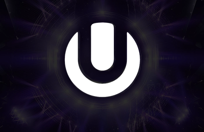
2. Ultra Music Festival
The circular symbol used by Ultra is one of the most efficient identity solutions in the festival world. Its geometric structure is built for high-visibility environments like stage screens and digital platforms. The symbol is immediate, highly legible, and performs perfectly across a variety of scales. While it does not aim for the same artistic depth as other entries, its functional success is undeniable. It solves the problem of festival identity with a level of clarity that is rare in the modern era.
Design takeaway: The strongest symbols often come from clarity and repeatability, not visual complexity.
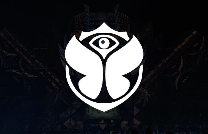
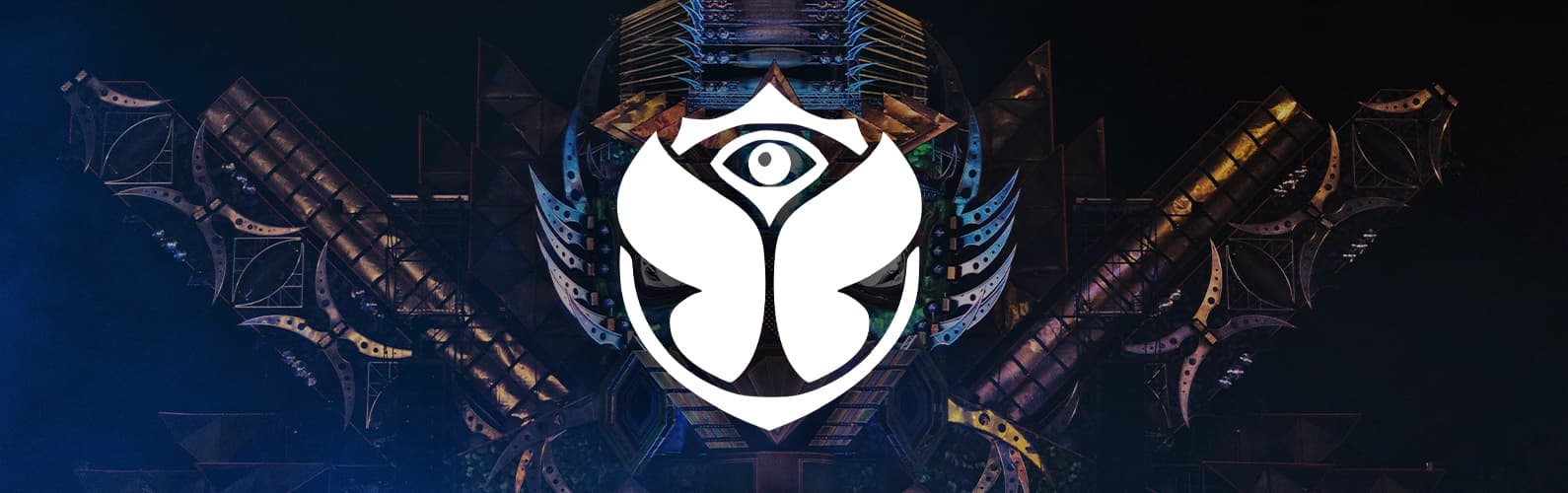
1. Tomorrowland
Tomorrowland holds the top position because it balances decorative symbolism with strong formal structure. The winged eye motif is intricate and highly detailed, yet it remains balanced through its symmetry and clear central concept. Many ornate logos collapse under their own complexity, but Tomorrowland maintains a clear silhouette and legibility even at high levels of detail. It is a rare example of a festival logo that builds a narrative world while still functioning effectively as a brand mark. It stands as one of the most resolved festival identities of the modern era.
Design takeaway: Complex logos succeed when detail is organized by a clear structure and a strong silhouette.