Home
Home Articles
 Twos Talks
 Videos
10 Times Logo Designs Went Horribly Wrong
Have you ever seen a logo and weren’t sure whether to laugh, cringe or be surprised? So… here we are. In this article you will find 10 logo design fails that will leave you with lots of questions.

ogos are like the Tinder profiles of branding. They’re the first thing people see, and once they make an impression, it’s nearly impossible to erase. A great logo can grab attention faster than a toddler in a candy store. But not every attention-grabbing logo is a winner. Some are so hilariously off-target that they turn into unintentional comedy gold.
From designs that make you scratch your head to ones that leave you rolling on the floor laughing, logo fails are a special kind of entertainment.

1. Catholic Church’s Archdiocesan Youth Commission
The Catholic Church’s Archdiocesan Youth Commission logo from 1973 is a classic example of how good intentions in design can go hilariously (and awkwardly) wrong. What makes the story even more intriguing is that, despite its infamous reputation today, the logo won an award from the Art Directors Club of Los Angeles! This design misstep has since become a staple in "worst logo" lists and a frequent meme in discussions of design fails.
2. Catholic Church’s Archdiocesan Youth Commission
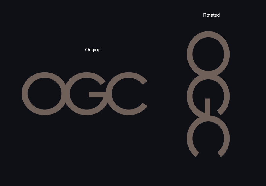
The Office of Government Commerce (OGC) logo is a proof that even the most serious institutions can accidentally take a detour into comedy. This logo featured a sleek, modern design with the letters "OGC" stacked vertically. Everything seemed perfectly fine at first glance. But then someone tilted their head sideways, and suddenly, the logo became... Well, let's just say, less government office and more "private matter". To make it even funnier, they spent a cool £14,000 on this design.
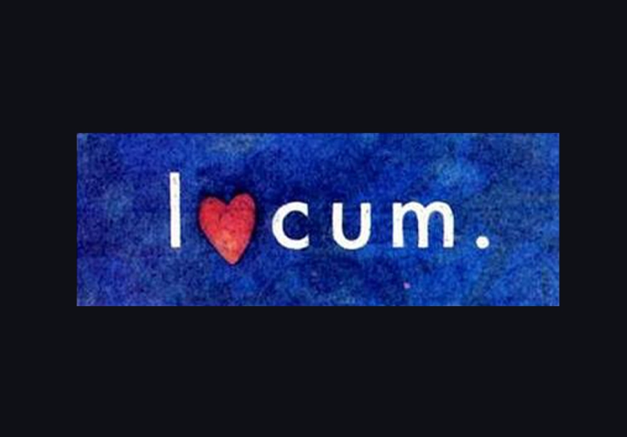
3. Locum
This logo is a perfect case study in why branding and holiday cheer don’t and shouldn't always mix. Back in the 1990s, this Swedish property management company decided to spread some festive goodwill by incorporating a red heart into their logo for a Christmas campaign. It was supposed to symbolize warmth, care, and the holiday spirit. Well… It looks like someone in the design department either missed this very awkward detail or was having a bit too much fun.

4. The Institute of Oriental Studies
This logo is one of those designs that can make you pause and wonder: "Did anyone proofread this with their eyes wide open?" Instead of a representation of a pagoda surrounded by sun (a nod to Eastern culture and knowledge) it became an unintentional masterpiece of optical humor.
This iconic fail has since become a staple in "What were they thinking?" design lists. Fortunately, The Brazilian University of Santa Catarina wasted no time once it realized the design had become the subject of widespread mockery and changed the logo.
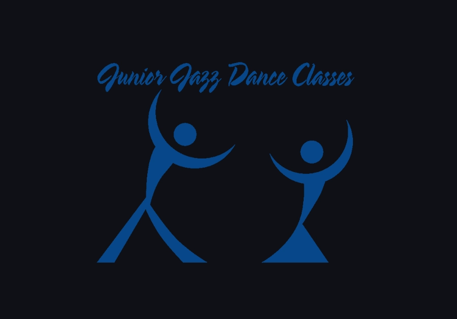
5. The Junior Jazz Dance Classes
Designed to promote kid's dance lessons, this logo aimed for something playful and energetic. Instead, it delivered a masterclass in accidental design hilarity. Let’s just say that the logo left a lot of people doing double-takes and asking, "Wait, this is for children?"
This design fail quickly became an internet infamy, serving as a cautionary tale for designers everywhere: FONTS MATTER. A LOT. And when designing for junior anything, maybe run it past someone who’s going to look at it like a suspicious parent.
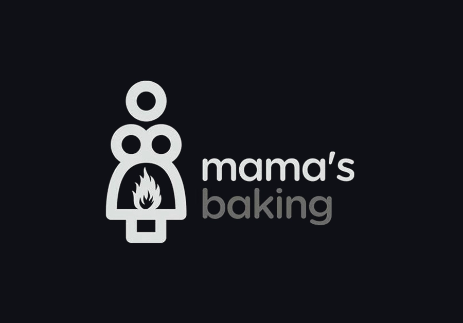
6. Mama's Baking
Mama's Baking has a design that definitely raises eyebrows. The logo depicts a silhouette of a vintage oven, which, at a glance, cleverly mirrors the shape of a woman with exaggerated curves. To add to the humor, flames seem to burst out from a rather awkward position in her "skirt". This unintentional optical illusion has earned it the label of being one of the "hottest" yet funniest logos in marketing fails.
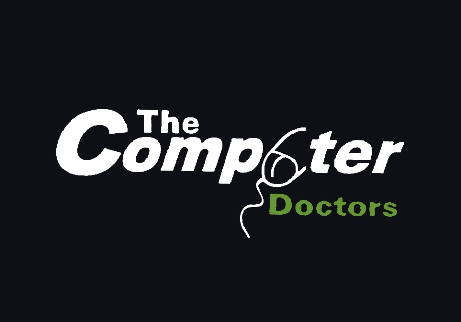
7. The Computer Doctors
While the intention of this logo was likely to represent a clean and professional image for a computer repair service, the design went a bit awry. The issue? A poorly placed mouse in the logo's layout makes the letter "U" in "Computer" resemble something much more..."anatomical". This visual disaster leads to a logo that could be mistaken for an ad in a very different industry!
Instead of inspiring trust in their technological Proficiency, this logo leaves potential customers giggling (and blushing) before they even pick up the phone.
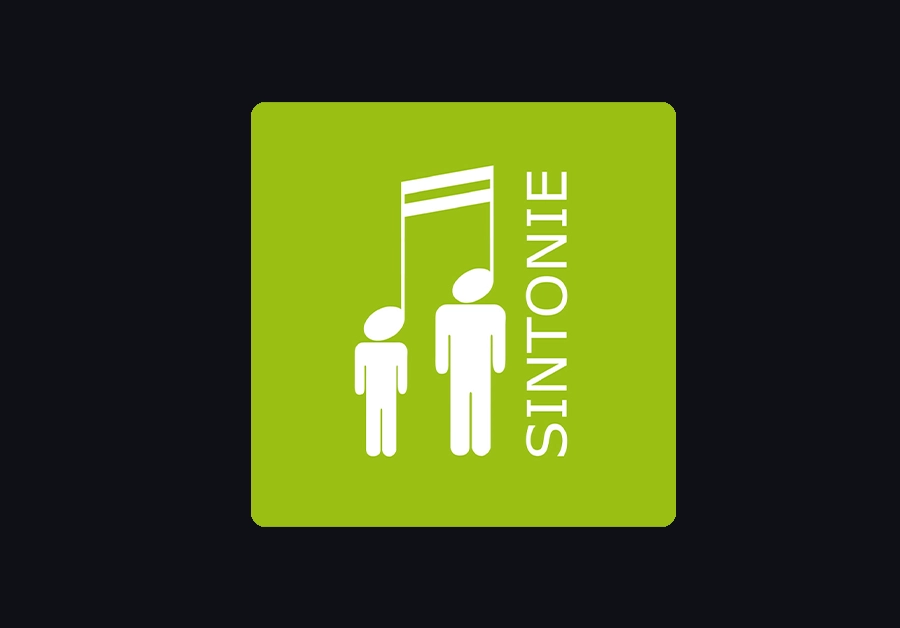
8. Sintonie Terni Music School
This logo is a gem of unintentional comedy, managing to capture a kind of graphic chaos that has made it a notable example of design gone hilariously wrong.
At first glance, you might think, "Sure, there’s a harmonious concept behind this!" But when you look deeply, it slowly becomes too Macabre. What really amplifies the humor is how they still use this logo, as though they confidently believe it’s a masterpiece.

9. National Safe Place
The " National Safe Place" logo shows how a well-intended design can completely miss the mark. At first, the concept seems simple enough. However, take a closer look and suddenly you’re wondering if the logo was meant for a very different kind of "safe place". It has a slightly, uncomfortable vibe, with the design unintentionally resembling a scene that no one would want to see anywhere near a child protection program.
To add fuel to the fire, the use of a yellow diamond, typically associated with warning signs, only adds to the confusion. Although this logo later changed, in comparison, the original one feels safer.

10. Arlington Pediatric Center
The Arlington Pediatric Center logo is one of those designs that made people stop, scratch their heads, and wonder, "What exactly is going on here?". At first glance, you might think it’s a caring symbol, but after a second look... you can't unsee it. The well-meaning organization, which provides care to children and families, ended up with a logo that made them seem more like, well…, it’s better not to talk about that.
There's no clear information on whether the company still uses the logo today, but Google search of "Arlington Pediatric Center" leads straight to images of that infamous logo. The logo has essentially become their signature. whether they like it or not.