Home
Home Articles
 Twos Talks
 Videos
Top 10 FIFA World Cup Kits: Nike vs Adidas
Five World Cup kits from Nike. Five from Adidas. One editorial ranking based on graphic design from the last ten FIFA World Cups. A design-focused ranking of the top 10 FIFA World Cup kits by Nike and Adidas, selected by Twos Studio based on graphic design, visual identity, and long-term design influence.
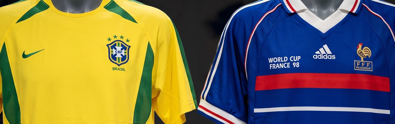
For decades, Adidas and Nike have shaped much of the visual identity of the FIFA World Cup. Their kits have appeared on some of football's biggest stages, but not every memorable design owes its reputation to the match or the team that wore it. Some have endured because of the design decisions behind them.
This ranking examines World Cup kits through the lens of graphic design rather than football performance. Instead of trophies, famous goals, or fan nostalgia, we focused on the visual qualities that make a kit distinctive as a piece of design.
To keep the comparison consistent, we limited our selection to the last ten FIFA World Cups, a period in which Adidas and Nike played a defining role in the evolution of football kit design. While other manufacturers have produced notable World Cup kits, these two brands have had the greatest and most sustained influence on the tournament's visual language over the past four decades.
Each selection reflects Twos Studio's editorial perspective and was evaluated using the same criteria: graphic originality, color composition, typography and numbering, integration of national identity, and long-term influence on football kit design.
While the latest World Cup kits introduce new ideas and references, such as Adidas' Germany 2026 kit drawing on classic visual codes and Nike's Nigeria 2026 kit continuing a tradition of bold cultural expression, true design icons require time. This ranking focuses on kits whose influence has already been tested beyond a single tournament.
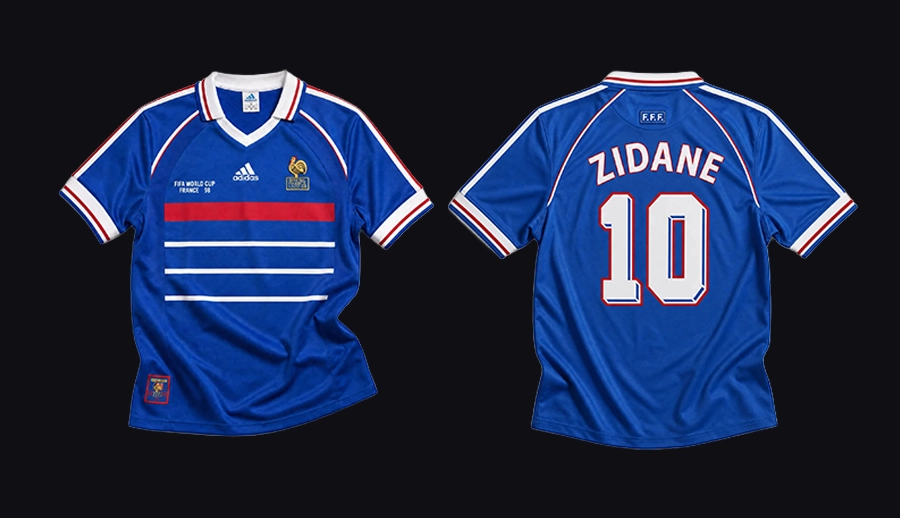
#5 Adidas: France 1998 Home Kit
The France 1998 World Cup kit showed Adidas' ability to create a strong national identity through simplicity and precision. The kit was designed around France's traditional blue color, adding subtle red and white details that reflected the national flag without disrupting the clean composition. The central red stripe and minimalist structure created a balanced visual system that felt modern while remaining connected to French football heritage. From a graphic design perspective, the strength of this kit came from restraint. Every element had a clear purpose, allowing color, proportion, and symbolism to work together effectively.
Design Takeaway: Strong identities are built through simplicity, balance, and intentional details.
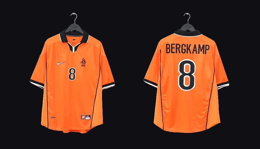
#5 Nike: Netherlands 1998 Home Kit
The Netherlands 1998 World Cup kit demonstrated Nike's ability to strengthen an established football identity through careful refinement. The design was built around the team's unmistakable orange color. The design introduced subtle black and white details, a modernized collar, and balanced proportions that gave the jersey a cleaner and more contemporary appearance. The design did not rely on bold graphics. Instead, Nike focused on clarity, proportion, and restraint. The outcome was a kit that respected one of football's most recognizable visual identities with confidence and restraint.
Design Takeaway: Strong design comes from refining an iconic identity instead of redefining it.
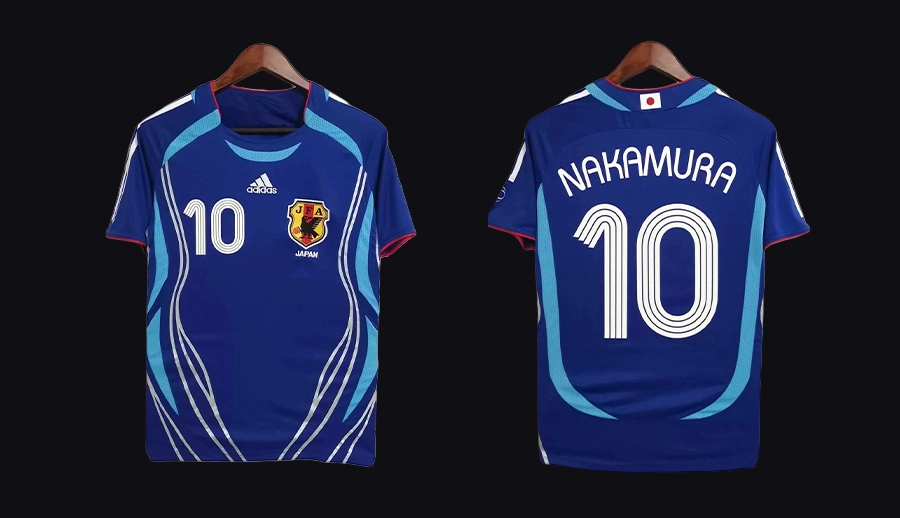
#4 Adidas: Japan 2006 Home Kit
The Japan 2006 World Cup kit combined cultural references with modern football design. It was inspired by Japan's traditional blue color palette and football heritage. The jersey used subtle details and graphic elements to create a connection between national identity and contemporary aesthetics. The design avoided excessive decoration and focused on balance to allow its cultural influences to become part of the overall visual language. The strength of this design came from creating a recognizable identity without relying on obvious symbols.
Design Takeaway: Cultural identity becomes stronger when it is integrated into the structure of a design.
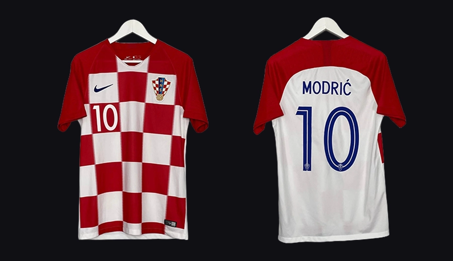
#4 Nike: Croatia 2018 Home Kit
This is an example of transforming a national symbol into a modern football identity. The design reinterpreted Croatia's iconic red and white checkerboard pattern through a larger, more dynamic graphic approach while preserving the element that makes the team instantly recognizable. The balance between tradition and contemporary design created a strong visual presence on the pitch. Adapting a powerful national symbol without losing its original character is one of the key strengths of the design.
Design Takeaway: A powerful symbol becomes a lasting identity when it is thoughtfully adapted.
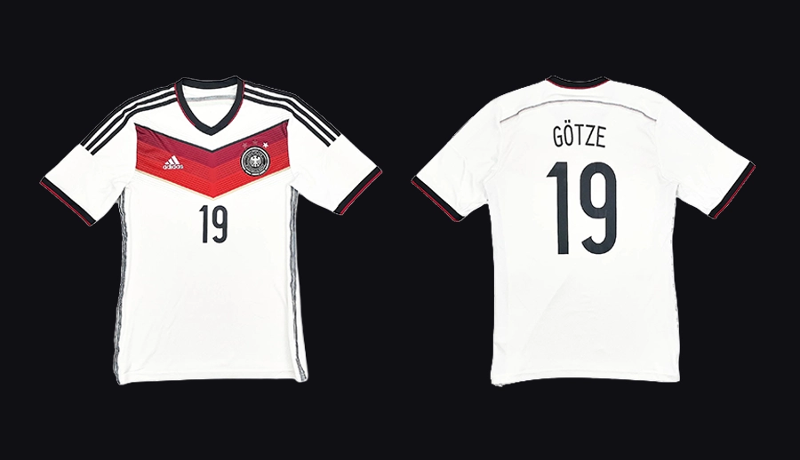
#3 Adidas: Germany 2014 Home Kit
The Germany 2014 World Cup kit represents Adidas' approach to modernizing a classic football identity. The design introduced a subtle black and white gradient across the chest, creating a contemporary interpretation of Germany's traditional colors. The design modernized the kit while maintaining the team's recognizable visual character. The simplicity of the composition allowed the graphic element to become the defining feature of the jersey without disrupting its clean structure. The strength of the design came from its balance between heritage and modern aesthetics. The lasting value of this design comes from the way it refreshed a historic identity for a new generation.
Design Takeaway: Strong identities evolve through thoughtful changes that respect their visual heritage.
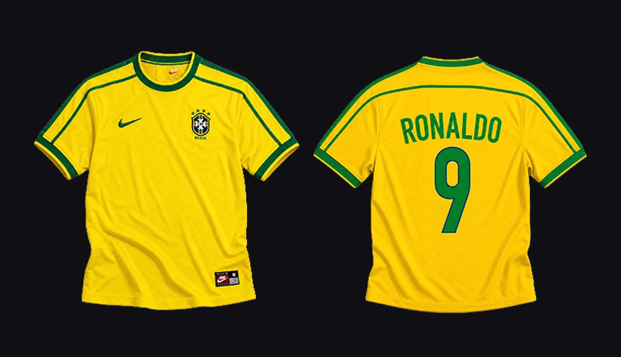
#3 Nike: Brazil 1998 Home Kit
The kit represents Nike’s early ability to refine one of football's most recognizable visual identities. The design focused on the team's iconic yellow and green palette to create a clean and balanced composition that felt both traditional and contemporary. The subtle details, including the collar design and carefully placed accents, added a modern character while preserving Brazil's historic football image. Every element of this kit design supported the overall identity and let the colors and simplicity of the design remain the central focus. The kit became an important reference point for Nike's approach to national team designs and is still one of the brand's most memorable World Cup creations.
Design Takeaway: A strong identity can become more powerful through careful refinement.
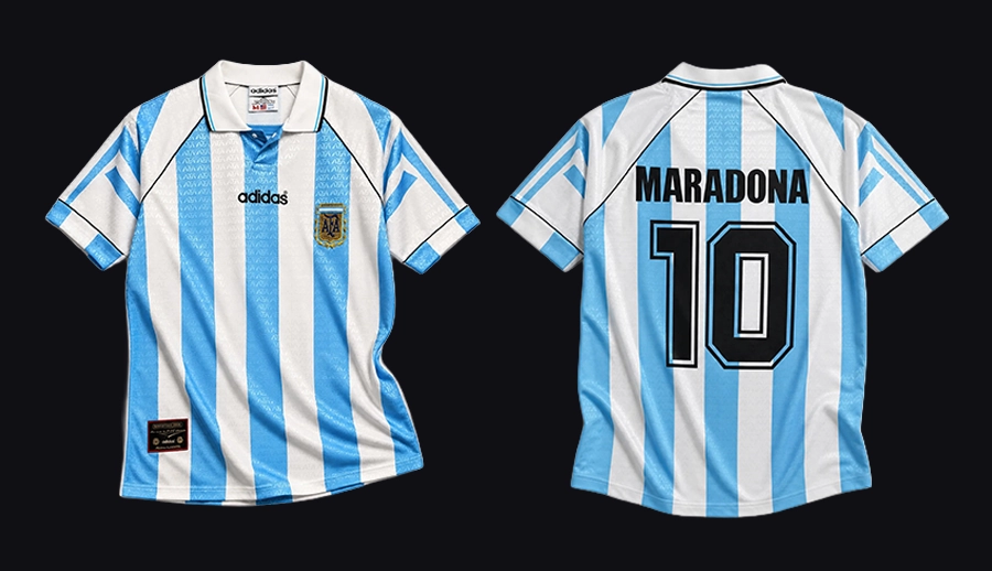
#2 Adidas: Argentina 1994 Home Kit
The Argentina 1994 World Cup kit is one of Adidas' most distinctive designs. The kit reinterpreted Argentina's iconic blue and white stripes with a bold geometric pattern to create a dynamic visual expression that also preserved the team's recognizable character. The layered graphic treatment created a new rhythm for the classic design and introduced a stronger sense of movement to the jersey. From a design perspective, its strength came from balancing experimentation with familiarity. The kit pushed the boundaries of national team design while keeping the elements that made Argentina instantly recognizable. Its influence can still be seen in how football brands approach the relationship between heritage and innovation.
Design Takeaway: Reimagining a classic identity requires a balance between recognition and experimentation.
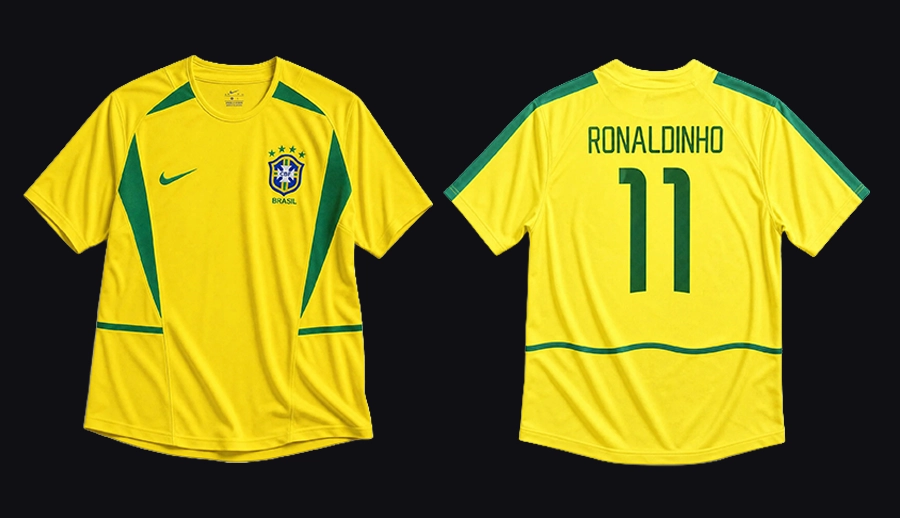
#2 Nike: Brazil 2002 Home Kit
Nike refined one of football's most established visual identities without changing its core character. The design preserved Brazil's iconic yellow and green palette while introducing subtle updates through its silhouette, collar, and details. The design avoided unnecessary graphic elements, focusing on proportion and balance to keep the jersey instantly recognizable while giving it a more contemporary feel. The result was a design that connected tradition with the visual language of modern football. Its lasting value comes from how effectively it refreshed a historic identity without losing what made it unique.
Design Takeaway: The best redesigns preserve the essence of an identity while allowing it to evolve.
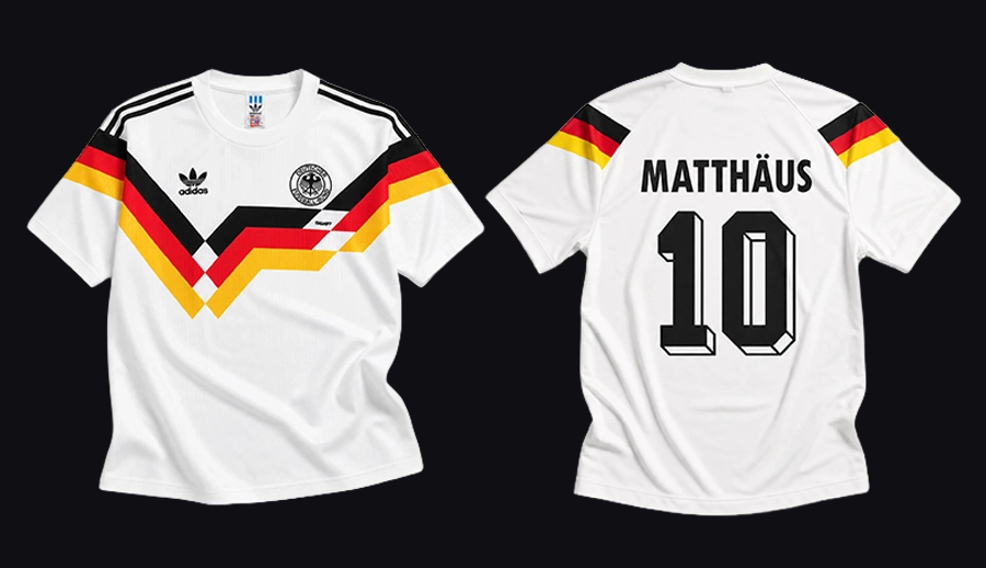
#1 Adidas: Germany 1990 Home Kit
Some football kits become associated with a tournament. Others become part of football's visual history. The Germany 1990 World Cup kit belongs to the second category. Its design combined the team's traditional white base with a bold graphic pattern inspired by the colors of the German flag, creating one of the most recognizable compositions in football kit history. The diagonal graphic treatment introduced movement and personality. It also maintained the clarity expected from a national team uniform. What made this design remarkable was its balance between simplicity and expression.
Design Takeaway: The strongest identities are built when every visual element serves a clear purpose.
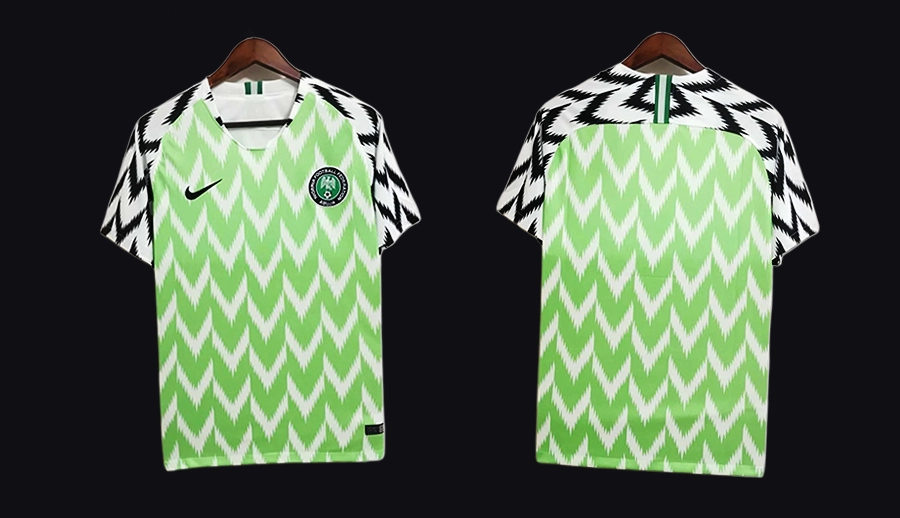
#1 Nike: Nigeria 2018 Home Kit
Released ahead of the 2018 FIFA World Cup, Nigeria's kit quickly became one of the most discussed football designs of its generation. Nike combined the team's traditional green and white palette with a bold graphic pattern inspired by Nigerian visual culture to create a jersey that moved beyond the boundaries of a sports uniform. The design balanced cultural references with a contemporary aesthetic, allowing the pattern, typography, and details to work together as a complete visual system. Its influence extended to fashion, street culture, and global football audiences, turning a national team kit into a wider cultural symbol.
Design Takeaway: The most influential designs create a visual language that extends beyond their original context.
Short Answers (FAQ)
What are the best FIFA World Cup kits of all time?
The best FIFA World Cup kits are designs that combine strong visual identity, cultural meaning, and lasting influence. Examples include Germany 1990, Nigeria 2018, Argentina 1994, Brazil 2002, France 1998, and several other kits featured in this ranking.
Which brand has designed the best FIFA World Cup kits, Nike or Adidas?
Nike and Adidas have both created iconic FIFA World Cup kits. Adidas has a longer history in the tournament, while Nike has produced some of the most influential modern designs, including Nigeria 2018.
What makes a FIFA World Cup kit iconic?
An iconic FIFA World Cup kit combines memorable visual elements, national identity, thoughtful graphic design, and an influence that extends beyond the tournament itself.