Home
Home Articles
 Twos Talks
 Videos
Top 10 FIFA World Cup Balls
Some World Cup balls remained in football fans’ memories because of the stories behind the matches. This ranking explores the balls that stayed in the minds of designers. The best FIFA World Cup balls of all time ranked by design, innovation, and impact.
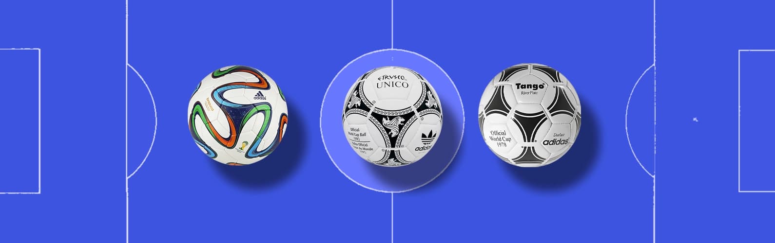
Every World Cup has its own visual language, and few objects capture that identity as clearly as the match ball. Its panels, colors, and construction reveal the era behind each design, showing changes in technology, culture, and the way designers approached the game.
The black-and-white geometry of Telstar, the flowing patterns of Tango, and the bold experiments that followed each introduced a new visual chapter to football. Beyond the matches they witnessed, these balls became references in the history of sports design. Today, that story continues with a new generation of match balls like Trionda, where visual identity meets smart technology and the ball itself becomes part of the digital side of the game.
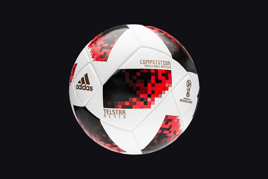
10. Telstar 18 (Russia 2018)
Brand: adidas
Almost five decades after the original Telstar became a visual symbol of football, adidas returned to the same icon for the 2018 FIFA World Cup. Telstar 18 revisited the famous black-and-white design through a pixelated graphic language and connected the simplicity of television-era football with the digital aesthetics of a new generation.
Some say the challenge of redesigning an icon is repetition, but the major challenge of redesign is interpretation. Telstar 18 kept the recognizable star pattern while transforming it into a contemporary visual system.
Telstar 18 was proof that designers can use nostalgia as a design resource, but only when the past is treated as inspiration, not as a template.
Design Takeaway
Great redesigns preserve the idea behind an icon, not just its appearance.
9. Jabulani (South Africa 2010)
Brand: adidas
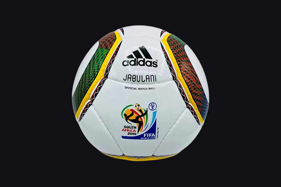
The 2010 FIFA World Cup introduced one of the most debated football designs in history. Jabulani represented a new direction for adidas by moving away from the traditional panel structures that had defined World Cup balls for decades.
The eight-panel construction of Jabulani created a smoother surface with fewer seams, while the graphic design combined eleven colors inspired by South Africa’s culture, landscape, and diversity. The result looked radically different from its predecessors and reflected a new era of football design.
Jabulani divided opinions. Players questioned its unpredictable movement, but from a design perspective, it marked an important moment at the intersection of visual identity, material innovation, and performance engineering.
Design Takeaway
Breaking a visual tradition always comes with the risk of challenging expectations.
8. Etrusco Unico (Italy 1990)
Brand: adidas
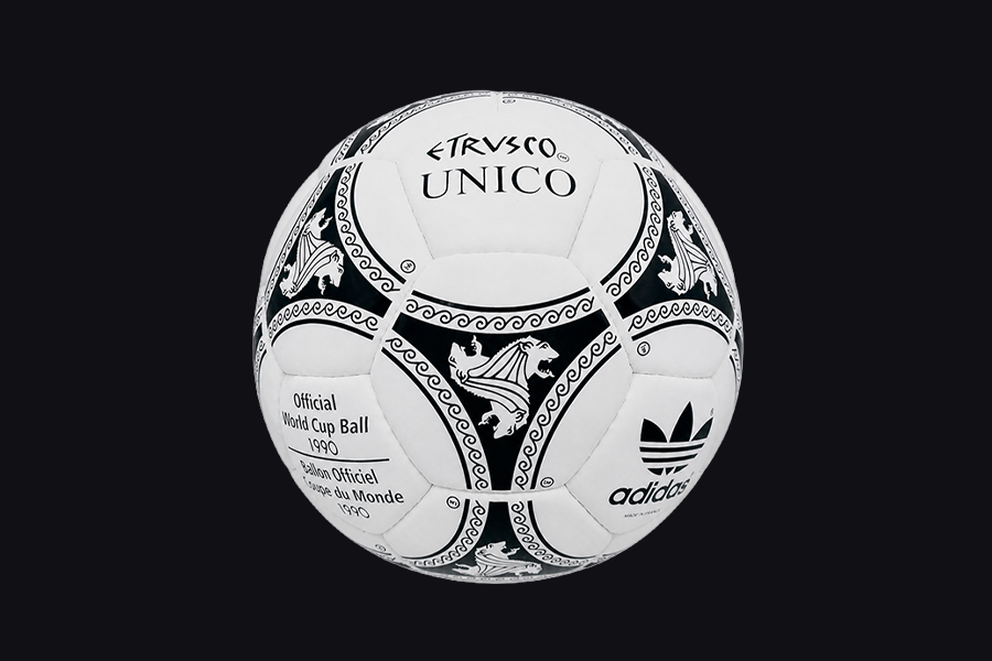
By 1990, the Tango pattern, first introduced at the 1978 World Cup, had already become the visual signature of World Cup football. adidas refined that identity by introducing three Etruscan lion heads inside the familiar triads. The lion heads drew inspiration from one of Italy's oldest civilizations.
The result respected a design language that football fans already recognized. It also gave the tournament a stronger local identity. Instead of competing with the original Tango concept, Etrusco Unico kept the well-established visual system fresh through thoughtful cultural references.
This design showed that continuity can be just as valuable when every new detail has a clear purpose.
Design Takeaway
Strong design systems can grow without abandoning the identity that made them recognizable.
7. Teamgeist (Germany 2006)
Brand: adidas
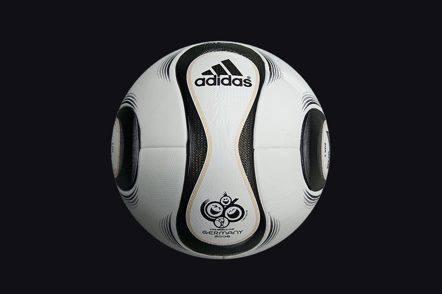
For decades, the familiar 32-panel football had defined the look of modern World Cup balls. Teamgeist quietly brought that era to an end. adidas replaced the traditional construction with a fourteen-panel design. This new approach gave the ball a cleaner surface and a noticeably different visual rhythm.
The graphics followed the same philosophy. Thin black curves flowed across the white surface without competing for attention, allowing the shape of the ball to become part of the design itself. Every element felt lighter, simpler, and more precise. This design proved that changing the structure of an object can change the way people experience it.
Design Takeaway
When form changes, graphic design changes with it.
6. Tricolore (France 1998)
Brand: adidas
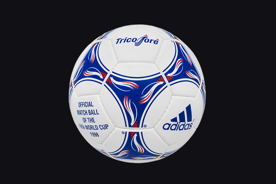
For the first time in World Cup history, national colors became a central part of a match ball's identity. Tricolore moved far beyond the familiar black-and-white formula by introducing blue, red, and black graphics inspired by the French flag. This addition made the ball a stronger visual presence without losing its balance.
The Tango structure remained, but the experience felt different. The added colors created a more expressive design while preserving the clarity that had made the pattern successful for years. It was a careful step toward a more contemporary visual language.
Design Takeaway
Color can transform a familiar design without changing its foundation.
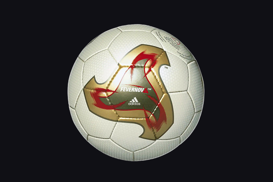
5. Fevernova (South Korea & Japan 2002)
Brand: adidas
After years of variations based on the Tango pattern, Fevernova introduced one of the biggest visual departures in World Cup ball history. The design moved away from the familiar triangular graphics and created a completely new visual language for the tournament.
The colorful graphic system combined gold, red, and black elements inspired by East Asian aesthetics and the energy of the first World Cup hosted in Asia. The design was bold, expressive, and instantly recognizable.
It showed that breaking away from a successful formula can create a new icon. Fevernova became a statement about where football design could go next.
Design Takeaway
A new visual language begins when designers are willing to leave familiar patterns behind.
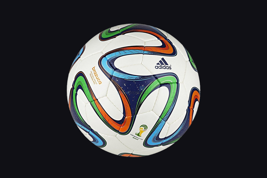
4. Brazuca (Brazil 2014)
Brand: adidas
Brazuca arrived at a time when World Cup design was searching for a stronger connection with local identity. adidas tried a new approach. Instead of relying on traditional symbols, it created a visual language inspired by Brazil’s colors, energy, and culture.
The six-panel construction gave the ball a unique appearance. The flowing ribbons and vibrant colors mirrored movement, celebration, and the rhythm of Brazilian football.
More than a football, Brazuca became a visual symbol of the 2014 tournament. Every element worked together to create a design that felt connected to its host country.
Design Takeaway
The strongest cultural designs communicate a feeling, not just a symbol.
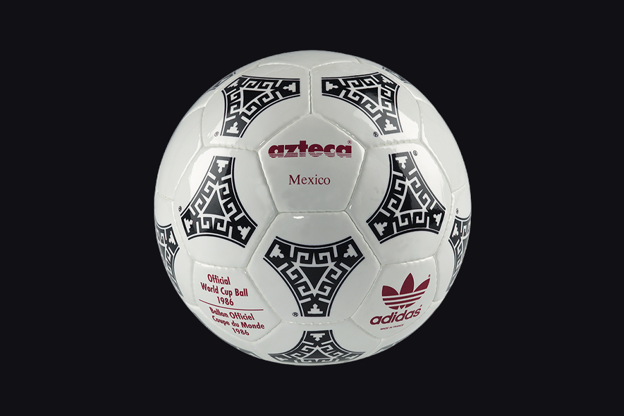
3. Azteca México (Mexico 1986)
Brand: adidas
After years of Tango-inspired designs, Azteca México introduced a new idea: a World Cup ball could carry the visual identity of its host nation. For the first time, adidas integrated cultural references directly into the graphic pattern of the ball.
The triangular details inspired by Aztec architecture transformed the familiar Tango structure into something deeply connected to Mexico’s heritage.
Azteca México opened a new chapter in sports design, where local culture could become a source of visual innovation. It proved that a football could tell a story before the first kick.
Design Takeaway
Great design turns cultural references into meaningful visual ideas.
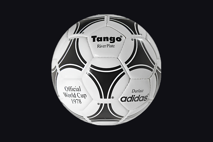
2. Tango (Argentina 1978)
Brand: adidas
Tango changed the way a World Cup ball could be recognized. The ball was introduced at the 1978 FIFA World Cup in Argentina. It replaced the simple black-and-white identity of earlier designs with a graphic system that created the illusion of movement across the surface.
The twelve triads formed by the intersecting shapes became one of the most recognizable visual languages in football history. More than a single design, Tango created a framework that influenced World Cup balls for the following decades, from Azteca México in 1986 to Tricolore in 1998.
The impact of the design came from simplicity. Tango became iconic by turning a simple idea into a memorable visual system.
Design Takeaway
The most influential designs create systems that can live beyond a single moment.
1. Telstar (Mexico 1970)
Brand: adidas
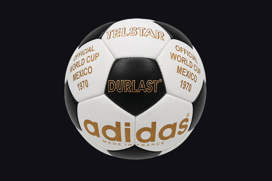
Telstar changed the way we saw football. The ball was introduced for the 1970 FIFA World Cup in Mexico. It became the first World Cup ball designed with television visibility as a major consideration, creating a new connection between football and the emerging world of television.
The black-and-white panel system created a powerful contrast that made the ball easier to follow on early television broadcasts. What began as a practical solution became a visual icon. The geometric pattern gave football a symbol that could be recognized far beyond the stadium.
Telstar brought function and visual identity into the same design language. Decades later, its black-and-white pattern remains one of the most recognizable symbols in sports design history.
Design Takeaway
Iconic designs emerge when practical solutions become memorable visual ideas.
Short Answers (FAQ)
1. What is the best FIFA World Cup ball of all time?
There is no official answer, but Telstar (1970) is widely considered one of the most iconic FIFA World Cup balls ever created. Its black-and-white graphic system connected design, technology, and television visibility, making it a lasting symbol in football history.
2. Which FIFA World Cup ball has the best design?
The best-designed FIFA World Cup ball depends on the criteria. From a graphic design perspective, iconic creations such as Telstar, Tango, Azteca México, and Brazuca stand out because of their visual identity, cultural influence, and impact on sports design.
3. What is the most famous FIFA World Cup ball?
Telstar from the 1970 FIFA World Cup is often considered the most famous FIFA World Cup ball. Its distinctive black-and-white pattern became one of the most recognizable designs in sports history and influenced the visual language of football for generations.