Home
Home Articles
 Twos Talks
 Videos
Top 10 Best Heavy Metal Band Logos
A curated list of the top 10 best heavy metal band logos and the design elements that make them instantly recognizable and iconic.
In heavy metal, a band’s logo can become as recognizable as the music itself. Some are built around sharp, aggressive lettering, while others push readability to the limit with dense and chaotic designs. Over time, these logos became closely tied to the identity of their bands and the different styles of metal they represent. This list examines ten of the best-designed heavy metal band logos, focusing on the typography, visual identity, and graphic details that made them stand out.
10. Dio
Logo introduced: 1983
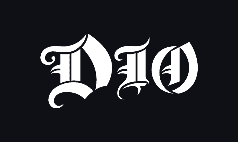
The Dio logo is one of the cleanest examples of how symmetry can strengthen a band identity. The logo is built around sharp, geometric letterforms and mirrored shapes that give it a theatrical feel without becoming overly complex. Its pointed serifs and angular construction also reflect the fantasy and dark imagery associated with Ronnie James Dio.
A long-running fan theory claims the logo can be flipped upside down to resemble “DEVIL,” though Ronnie James Dio denied designing it with that intention. Whether intentional or not, the rumor only made the logo even more recognizable among metal fans.
Design takeaway: Strong symmetry and simple angular forms can make a logo memorable without sacrificing readability.
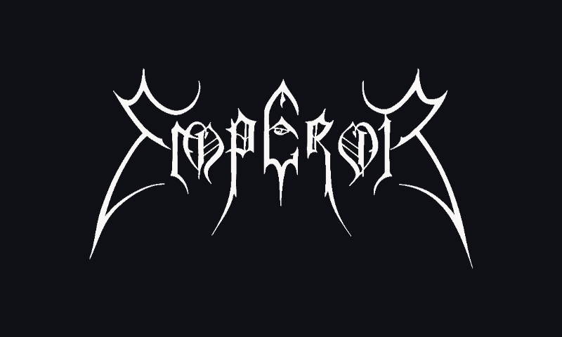
9. Emperor
Logo introduced: 1993
Unlike many black metal logos that became almost completely illegible, Emperor’s design maintains a balance between atmosphere and structure. The elongated spikes, dense linework, and gothic styling clearly place it within the black metal tradition, while the overall silhouette remains readable enough to reproduce clearly across album covers, merchandise, and posters.
The logo became closely associated with the visual style of Norwegian black metal in the 1990s, when increasingly intricate and hard-to-read marks became a defining part of the genre.
Design takeaway: A recognizable silhouette can preserve readability even in highly detailed designs.
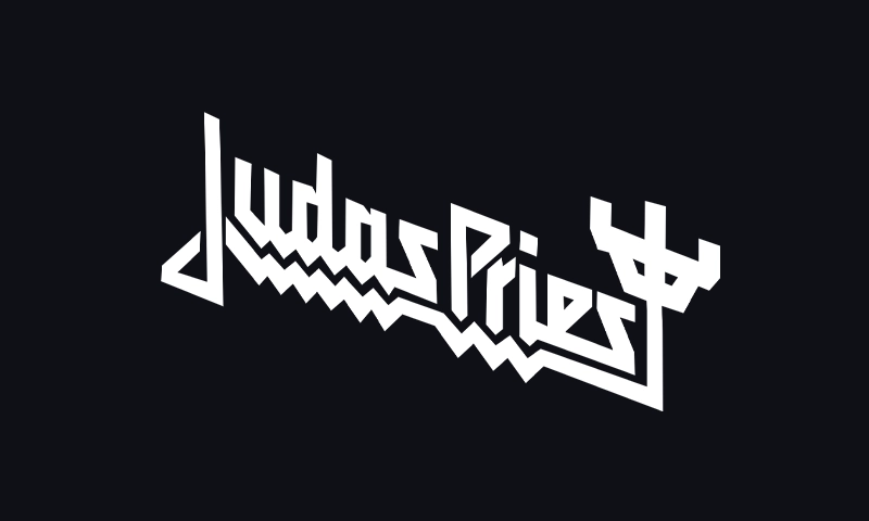
8. Judas Priest
Logo introduced: late 1970s
Judas Priest’s classic logo changed several times over decades, but the sharp metallic lettering introduced during the late 1970s became especially influential. The angled forms and chrome-like styling matched the futuristic aesthetic that later became closely associated with heavy metal itself.
Its streamlined construction also made it highly adaptable across album covers, stage sets, leather jackets, and merchandise.
Design takeaway: Consistent geometric styling helps a logo stay flexible across different visual formats.
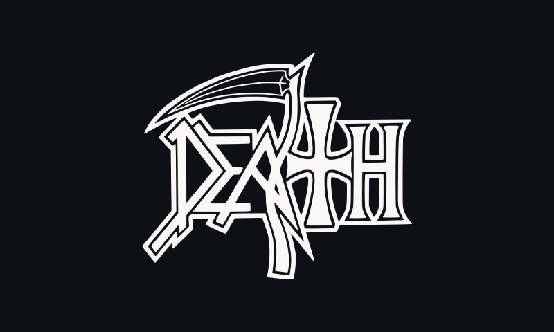
7. Death
Logo introduced: 1984
The original Death logo, designed by Chuck Schuldiner, became one of the recognizable visuals of death metal. The dripping details, spikes, chains, and inverted cross established many of the visual conventions later copied throughout the genre.
Over time, Schuldiner subtly modified the logo, including removing some of the more overt anti-religious imagery. Even with its complexity, the central wordmark stayed surprisingly legible compared to many later death metal logos.
Design takeaway: Detailed ornamentation works best when the core letter structure remains readable.
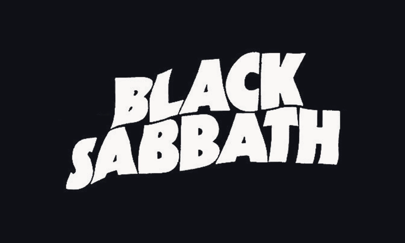
6. Black Sabbath
Logo introduced: 1971
Black Sabbath’s logo is notably restrained compared with most metal bands that followed. Early versions used simple serif lettering with wide spacing. The result is a stark, ominous presence without elaborate decoration.
Because the band emerged before many visual conventions of heavy metal had taken shape, the logo sits closer to late-1960s and early-1970s rock typography than the aggressive styles that later dominated the genre. That simplicity is also the reason it still looks timeless decades later.
Design takeaway: Simplicity can create longevity when the typography matches the tone of the music.
5. Megadeth
Logo introduced: 1985
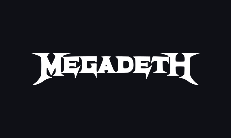
The Megadeth logo combines sharp angular typography with a sense of speed and aggression that perfectly fits thrash metal. The extended strokes and blade-like edges give the wordmark movement without making it difficult to read.
The logo became even more associated with the band through its repeated pairing with Vic Rattlehead, Megadeth’s skeletal mascot, across album artwork and merchandise.
Design takeaway: Aggressive typography works best when readability is preserved.
4. Motörhead
Logo introduced: 1975
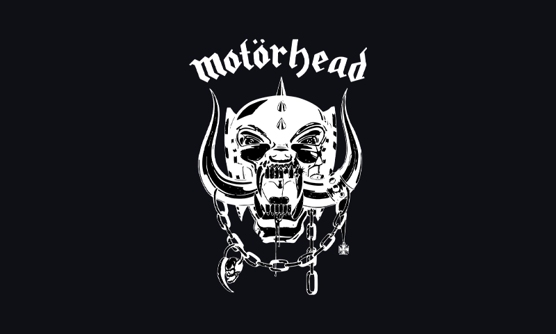
Artist Joe Petagno designed Motörhead’s iconic “Snaggletooth” mark, which became inseparable from the band’s logo. The gothic, blackletter-inspired wordmark sits above the fanged mascot, forming a visual pairing that has appeared consistently across album covers, stage backdrops, and merchandise for decades.
The umlaut in “Motörhead” also became one of the most famous examples of the so-called “metal umlaut,” a decorative detail later adopted by many metal bands.
Design takeaway: Pairing a distinctive wordmark with a strong mascot can anchor a band’s visual identity.
3. Slayer
Logo introduced: 1983
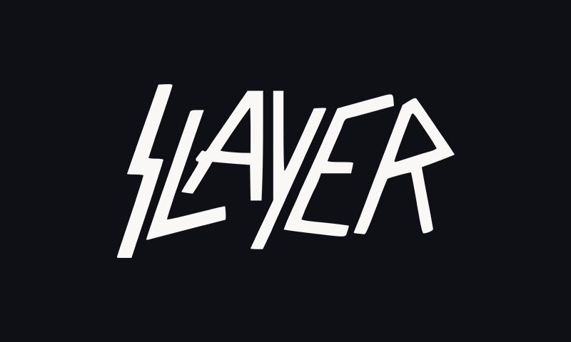
Few metal logos project aggression as clearly as Slayer’s. Jagged lettering and intersecting blade-like forms give the mark a sharp, weapon-like character that fits the band’s speed and intensity.
Its compact layout also allowed the logo to reproduce cleanly across album covers, banners, and T-shirts during thrash metal’s peak years.
Design takeaway: Sharp angles and compressed spacing can create visual intensity without excessive detail.
2. Iron Maiden
Logo introduced: 1979
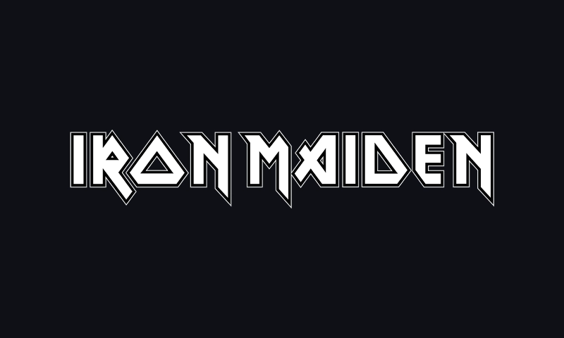
Iron Maiden’s logo is closely tied to artist Derek Riggs, whose album artwork shaped much of the band’s visual world. The blocky, extended lettering feels futuristic and aggressive while staying highly readable from a distance.
The logo appeared consistently across decades of albums, tours, and merchandise with very few changes. That consistency turned it into one of the most recognizable identities in music.
Design takeaway: Consistency over time can be just as important as the original design itself.
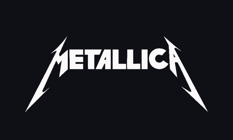
1. Metallica
Logo introduced: 1981
Metallica’s logo was created by James Hetfield himself in the early 1980s, an unusual origin for what became one of the most recognizable marks in metal. Hetfield was not a professional graphic designer, yet the lettering he sketched for the band’s name introduced an effective visual idea: sharply elongated first and last letters that form the now-famous pointed “M” and “A.”
That single gesture gives the logo its character. The aggressive extensions create a blade-like silhouette, while the rest of the wordmark stays clean and highly readable.
This balance is exactly why the design endures. Many metal logos chase extremity and lose clarity along the way. Metallica’s mark does the opposite: it keeps its legibility while still carrying the sharp, weapon-like attitude associated with thrash metal. That combination has allowed it to scale effortlessly from album covers to arena-sized stage backdrops for more than four decades.
Design takeaway: A simple wordmark built around one decisive visual idea can outlast far more complicated designs.