Home
 Articles
 Twos Talks
 Videos
Michelangelo’s Handwriting Is Now a Font
Microsoft has released Michelangelus, a typeface inspired by Michelangelo’s manuscripts. How much of his handwriting survives?
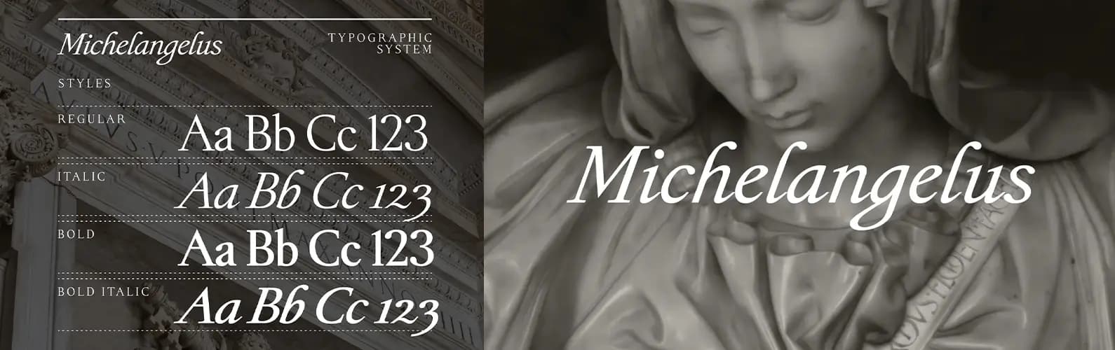
Michelangelo once told his nephew Lionardo that he had thrown one of his nephew’s letters into the fire because he could not read it. Nearly five centuries later, the episode offers an unexpected entry point to Michelangelus, a contemporary serif typeface commissioned by Fabbrica di San Pietro to mark the 400th anniversary of St Peter’s Basilica’s consecration. Italian studio Studiogusto studied more than 300 of Michelangelo’s manuscripts to identify visual qualities that could inform the design.
The Logic of a Handwritten Line
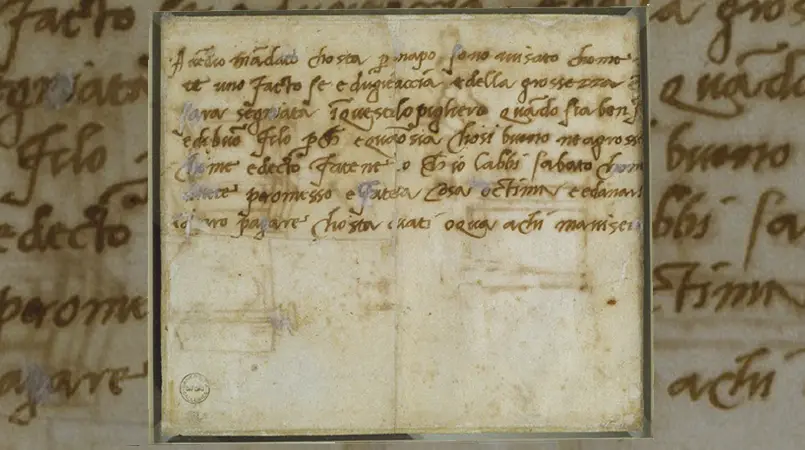
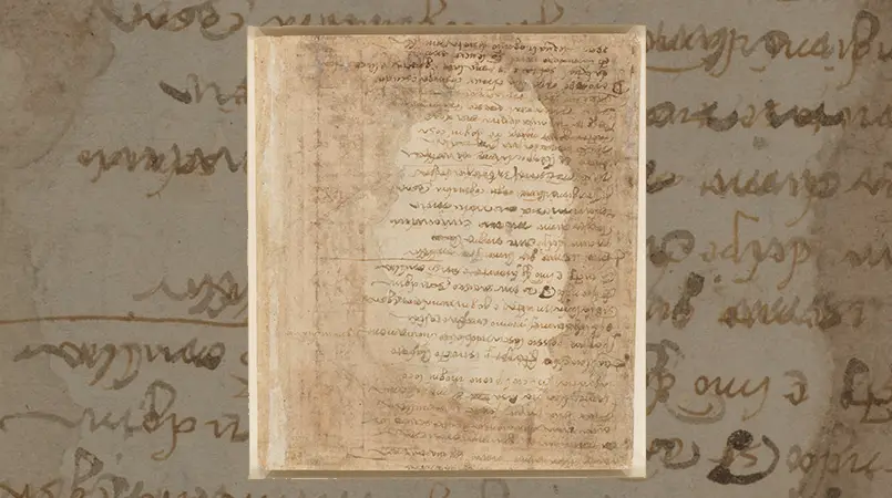
Studiogusto began with the slanted cursive found in Michelangelo’s manuscripts. The designers examined the movement of his pen and changes in stroke thickness. Michelangelo’s signature was an important reference, especially for the lowercase g. The team spent a week refining the letter to preserve its connection to the signature and make it work in a modern typeface.
The manuscripts also reveal a less obvious quality. Michelangelo’s letters did not always run together. At times, he lifted his pen before writing the next one. Those small pauses create a measured rhythm that the Studiogusto team carried into the typeface.
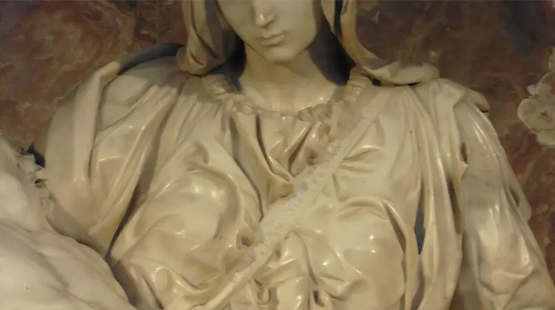
Photo: Maciej Nux, 2017. CC BY-SA 4.0.
The Letters Carved in Stone
The capitals draw on different sources. Studiogusto studied the Roman letters carved into the sash of the Pietà and the Latin inscriptions on the dome of St Peter’s Basilica. These monumental forms provided references for uppercase letters designed to remain legible at an architectural scale.
The historical record did not supply a complete alphabet or set of numerals. Studiogusto had to devise the missing forms to complete the typeface. Some letters therefore have identifiable historical models. Others reflect decisions made by the design team.
A Renaissance Hand, with a Difference
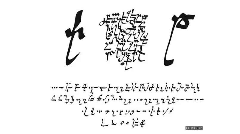
Michelangelo’s handwriting shifted over time within the broader writing culture of Renaissance Italy. Letters from 1496 to 1498 combine features of mercantesca, a cursive script used in merchant correspondence, with elements of humanist writing. In the early sixteenth century, a more consistently humanistic cursive emerged in his letters. Scholars interpret this shift as a deliberate change in style.
Professional humanist scribes such as Bartolomeo Sanvito and Antonio Sinibaldi offer useful points of comparison. Some letterforms, including c and q, resemble those found in their writing. Michelangelo’s lowercase m, n and u, however, tend to be more angular and less rounded than comparable humanist forms. These comparisons place Michelangelo’s handwriting within a wider Renaissance tradition. His more angular lowercase forms distinguish it from comparable examples.
How Much of Michelangelo Survived?
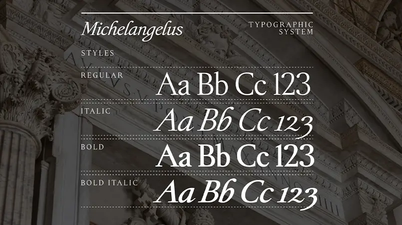
The link to Michelangelo is clearest in selected details. The lowercase g echoes his signature, and the broad counter of the o and the ink-drop detail in the b recall the movement of a quill.
Handwriting records an individual act of writing. A typeface needs a repeatable system of letters. Michelangelus draws on Michelangelo’s cursive in the lowercase and on monumental inscriptions for the capitals. Studiogusto also had to devise forms absent from the historical record. The finished font preserves selected features of his writing within a system built for contemporary use.
Short Answers (FAQ)
Is Michelangelus a direct copy of Michelangelo’s handwriting?
No. It is a contemporary serif typeface inspired by his manuscripts and inscriptions. Some characters draw on historical examples, while others were designed to complete the alphabet.
Who designed Michelangelus?
Italian design studio Studiogusto created the typeface for Fabbrica di San Pietro, in collaboration with Microsoft.