Home
 Articles
 Twos Talks
 Videos
7 Fictional Worlds That Feel Real Because of Their Graphic Design
Sets build the scene. Graphic design reveals the society behind it.

Inside a fictional world, graphic design has a job to do. Signs direct people through a place. Advertising tells them what to want, and forms or interfaces hint at who holds power. Together, these objects make an imaginary society feel as if it exists outside the story. The list starts with a future that feels close to our own and ends aboard a starliner where corporate branding has become the visual language of an entire civilization.
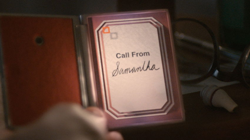
07. Her (2013) | A Future That Feels Familiar
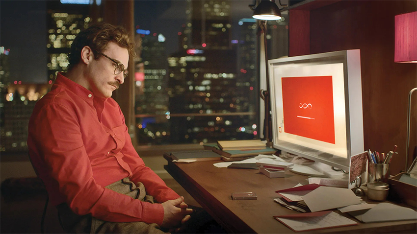
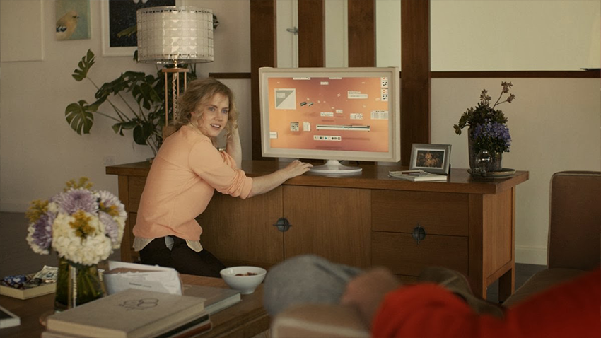
Spike Jonze’s Her imagines a near future where technology has settled into ordinary life. Geoff McFetridge, credited as the film’s “graphical futurist designer,” worked with Jonze and production designer K.K. Barrett to establish the visual language of that future. He created the identity for OS1, the AI operating system purchased by the film’s protagonist, Theodore Twombly, and designed the interfaces Theodore uses throughout the film. His work also appears in a fictional Los Angeles transit map.
McFetridge had no previous experience designing interfaces. He started with physical experiments. He painted wooden models, photographed real objects such as boxes, and made small dioramas with stacked forms and drawings on clear acetate. He treated the computer screen as a frame. McFetridge imagined the interface as a Rothko painting turned on its side. The window controls formed its frame, with the AI at the center. The OS1 symbol grew from a paper sculpture of a triple helix, a three-strand spiral that McFetridge linked to the user, AI, and the universe.
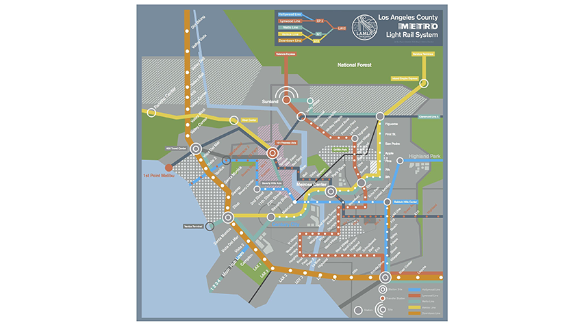
The same attention to the imagined city’s everyday life appears in the transit map. McFetridge drew an ideal Los Angeles network from memory. Its routes lead to the airport, surfing and dirt-biking spots, and the Angeles National Forest. The map appears for only a few seconds. It suggests a city with routines and destinations outside the story’s immediate action.
Design Takeaway
An unobtrusive interface can make powerful technology feel familiar.
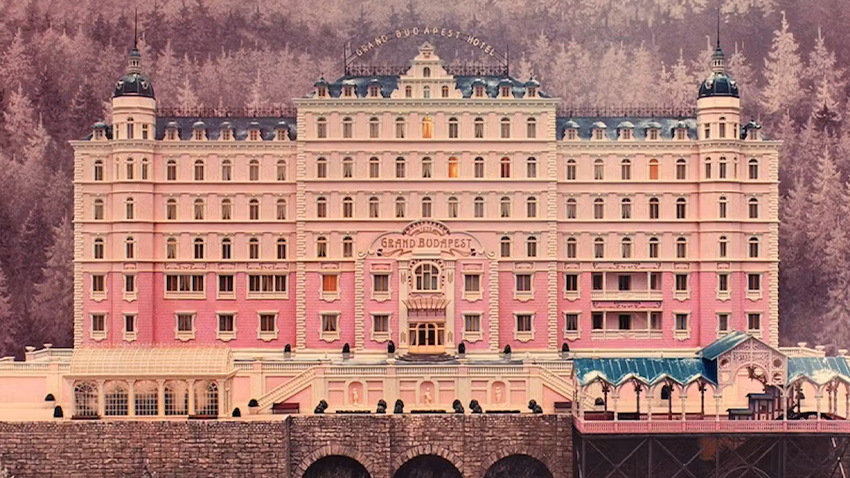
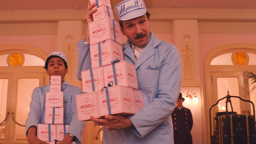
06. The Grand Budapest Hotel (2014) | The Paperwork of an Imaginary Nation
Wes Anderson’s The Grand Budapest Hotel is set in Zubrowka, a fictional Alpine country with its own institutions and public life. Lead graphic designer Annie Atkins built much of that world through graphic props, the printed and handwritten objects made specifically for a film. She worked closely with Anderson and production designers Adam Stockhausen and Anna Pinnock. Their research drew on hundreds of examples of early 20th-century Eastern European design. Atkins created Zubrowka’s passports, banknotes, postage stamps, telegrams, and police reports. The hotel had its own stationery and signage, all consistent with the same imagined country.
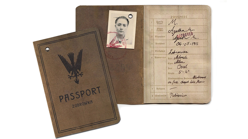
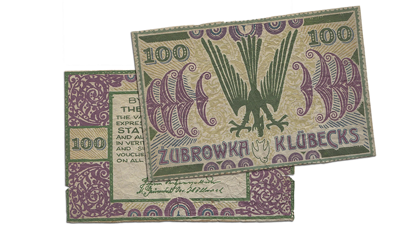
Atkins treated each piece as an artifact with its own history. She used a real 1930s typewriter for typed documents and pen and ink for handwriting. She also aged paper with tea and a hair dryer. Most of the film’s lettering was drawn by hand. The hotel’s rooftop sign, for example, was based on a metal hotel sign from 1930s Cairo that Anderson had found during location scouting. Atkins redrew its lettering with the original’s uneven serifs before the modelmakers reproduced it for the miniature hotel.
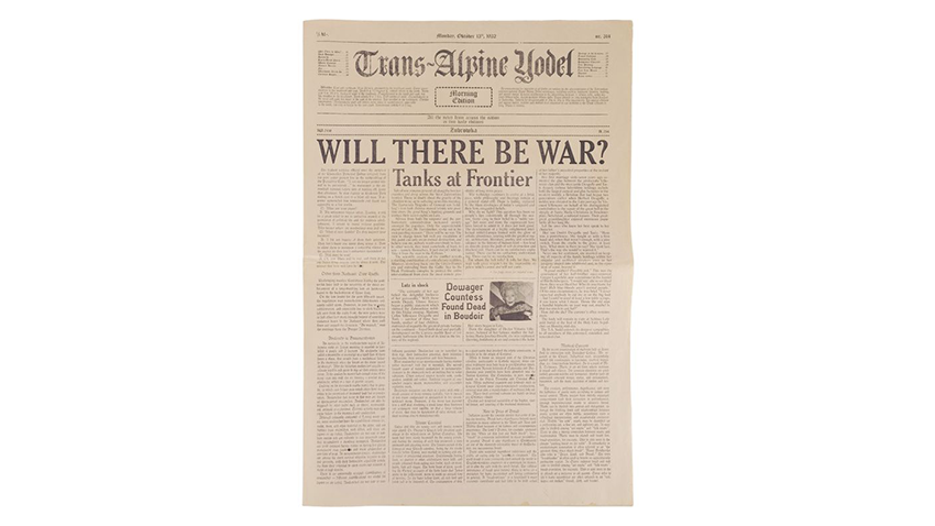
The clearest example of this attention is Zubrowka’s local newspaper, the Trans-Alpine Yodel. Anderson wrote every article, including stories that never appeared on screen. Atkins developed nearly 40 layouts for the newspaper. Each issue carried new stories, dates, and weather reports that followed the plot, and its columns had to fit the film’s changing aspect ratios across different time periods. The newspaper makes Zubrowka feel inhabited. Readers of the newspaper seem to have a daily life of their own, even when the film’s main characters are elsewhere.
Design Takeaway
A fictional country feels real when its paperwork has a past.
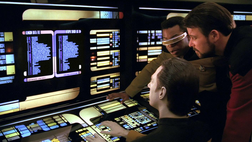
05. Star Trek: The Next Generation (1987–1994) | Building the Interface of the Future
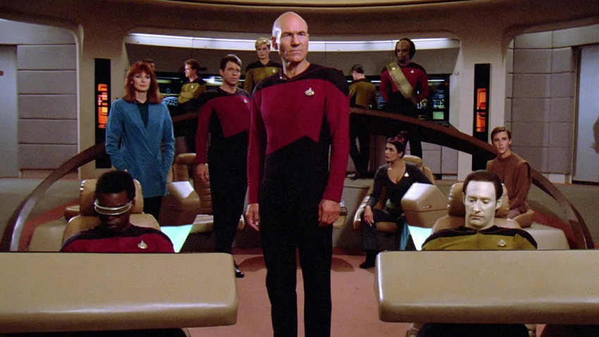
On the bridge of the USS Enterprise-D, the starship at the center of Star Trek: The Next Generation, the future has a graphic language of its own. The computer interface is called LCARS, short for Library Computer Access and Retrieval System. It has rounded panels and color-coded layouts which appear throughout the Enterprise, giving different stations a shared visual identity.
Michael Okuda, the series' lead graphic designer, developed this distinctive look. His route into Star Trek began when he noticed that the circular bridge displays in Star Trek: The Motion Picture still contained rectangular graphics. He sketched a layout that made better use of the round screens and sent it to Paramount. That led to his first assignment on Star Trek IV: The Voyage Home and, later, his work on The Next Generation. Series creator Gene Roddenberry wanted the new ship to feel user-friendly. Okuda interpreted that request as a challenge to organize complex information with clarity. Denise Okuda also joined the graphics department he led and later supervised video playback on monitors and screens, mostly from Deep Space Nine onward.
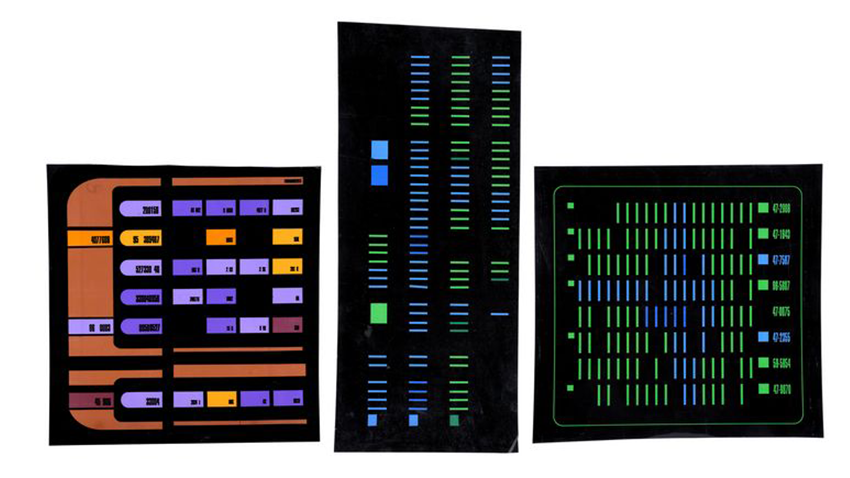
LCARS also had to satisfy the camera. Okuda later explained that many of the computer panels were designed to suggest an organized system in the background of a scene. Most only had to look convincing from the viewer's distance. Fully detailed panels could have taken ten or even fifty times as much work. Some panels were physical graphic transparencies designed to glow when backlit. That consistency makes every station feel like part of a single system.
Design Takeaway
Screen graphics can imply a working system without simulating one.
04. Alien (1979) | The Graphic Language of a Spaceship
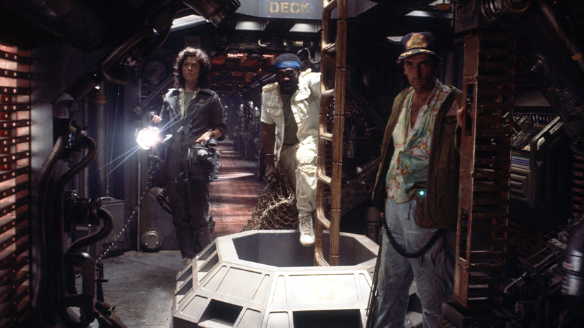
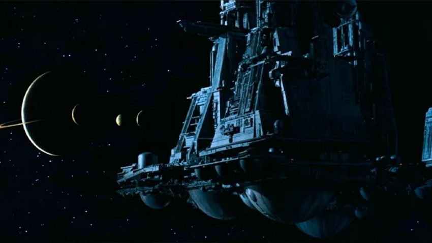
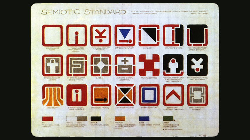
The Nostromo in Ridley Scott’s Alien is a commercial towing ship, and its graphic details reflect the life of a working vessel. Concept artist Ron Cobb designed a set of pictograms for commercial spacecraft. He called it the “Semiotic Standard for All Commercial Trans-Stellar Utility Lifter and Heavy Element Transport Spacecraft,” an imagined sign system for an entire class of vessels. The symbols identify spaces and functions aboard the Nostromo. One even marks the coffee supply. That small detail places an everyday crew routine inside an unfamiliar industrial setting.
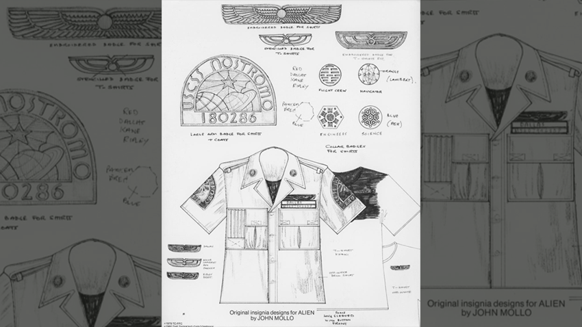
Another layer appears on the crew’s uniforms. Costume designer John Mollo, whose expertise lay in military dress and insignia, designed the Nostromo patches and department badges. The ship logo identifies the vessel, and the winged mark of Weylan-Yutani, the fictional corporation that owns it, appears in rank-specific versions. Smaller insignia distinguish the crew’s technical roles. The company’s winged mark appears on kitchen cabinets, food dispensers, a bowl, and the coffee maker. Most of the ship’s other graphics serve practical functions. This restraint fits production designer Michael Seymour’s aim to make the Nostromo feel like a real, well-used workplace.
Design Takeaway
Standardized pictograms make an industrial spacecraft legible.
03. The Handmaid's Tale (2017–2025) | The Visual Language of Control
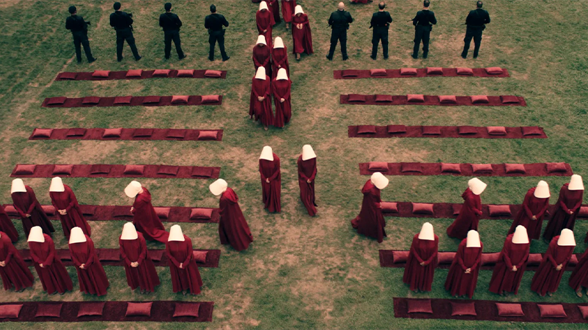
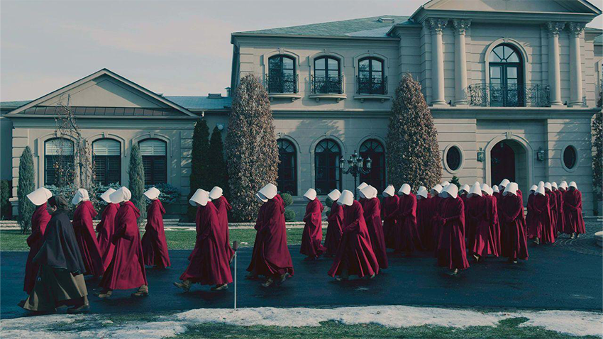
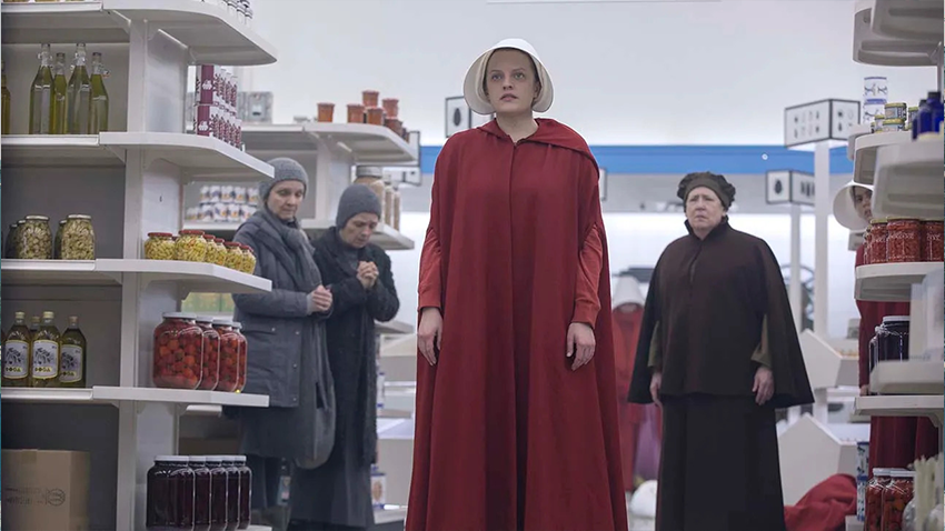
One of the design challenges in Hulu’s The Handmaid’s Tale begins in a grocery store. Gilead, the theocratic state that takes control of much of the former United States, forbids women to read. They still need to identify food and follow household instructions, however. Working in production designer Julie Berghoff’s art department, graphic designers Sean Scoffield and Theresa Shain developed a visual vocabulary for the objects women encounter. For the first-season supermarket, they created hundreds of wordless labels. Symbols identified products and explained instructions such as whether an item was sweetened or needed 30 minutes in the oven.
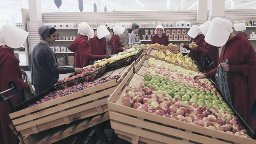

Gilead’s graphic language also appears in its official documents and signage. The few official texts visible in Gilead follow a familiar bureaucratic style. Scoffield told Stylist that the team used Times New Roman or Garamond for government documents and Helvetica or perhaps Arial for signage. These typefaces helped the regime present its authority as a continuation of the past. The pre-Gilead flashbacks use a different visual register. Shain and Scoffield made protest posters by hand and used varied typefaces and colors to preserve the energy of real demonstrations. The contrast separates Gilead’s sterile official graphics from the more spontaneous visual language of resistance.
Design Takeaway
Graphic design can make control feel ordinary, even in the absence of words.
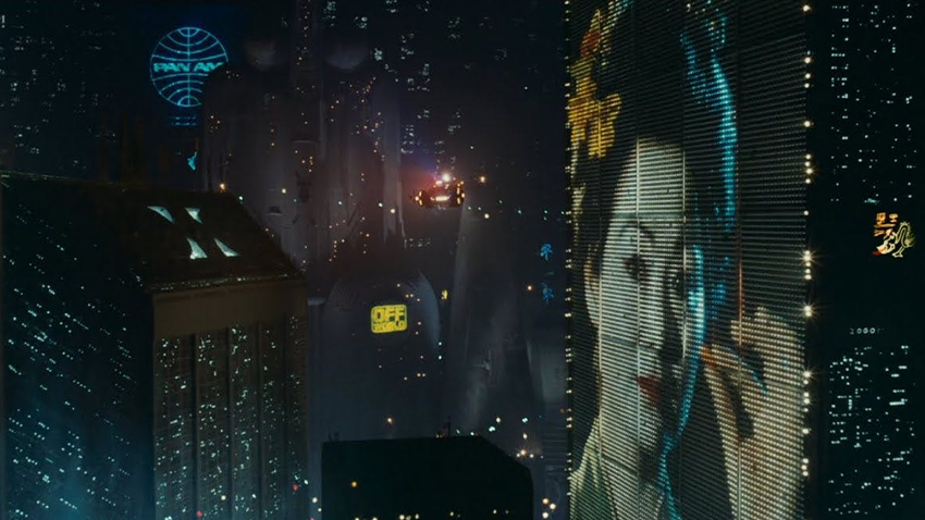
02. Blade Runner (1982) | A City That Speaks Through Advertising
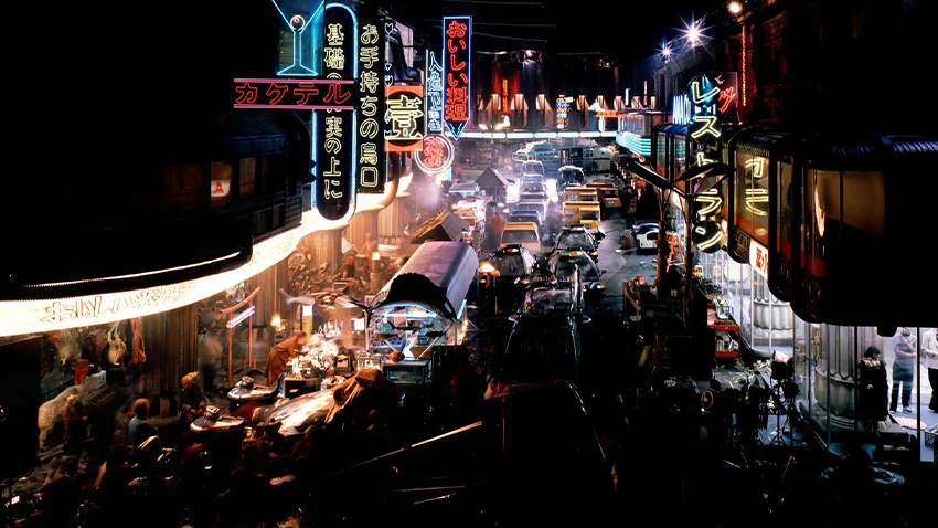
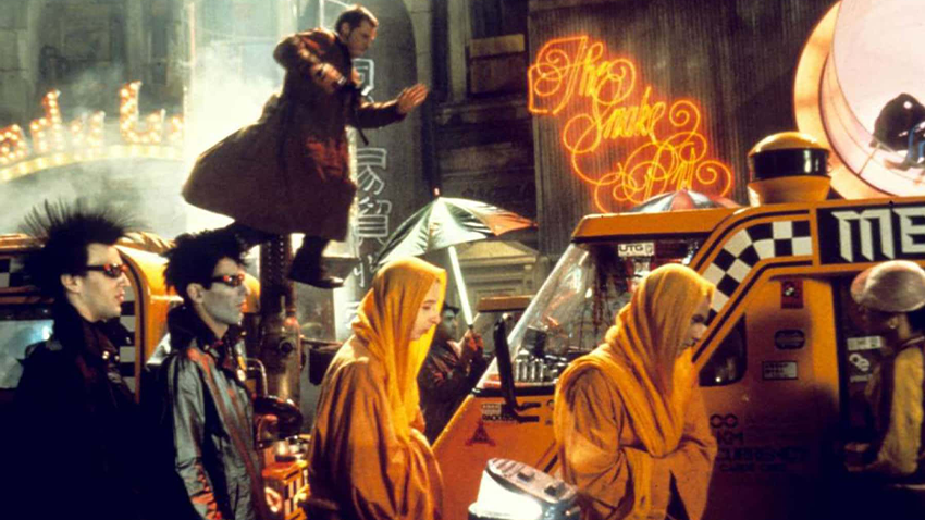
Ridley Scott’s Blade Runner imagines Los Angeles in 2019 as a city crowded with commercial messages. Neon storefront signs compete with enormous video billboards. Familiar brands such as Coca-Cola, TDK and Koss appear beside invented businesses like the White Dragon noodle bar. Advertising has become part of the city’s architecture. Every surface competes for public attention.
Visual futurist Syd Mead developed the film’s concept cityscape, which combined older architectural forms with futuristic additions. Production designer Lawrence G. Paull and art director David Snyder translated those ideas into sets. Tom Southwell, the film’s production illustrator, designed many of its original neon signs and graphic details. Paull asked him to create two neon designs a day for 20 days. The production also reused signs made for Francis Ford Coppola’s One from the Heart (1981), then placed them in new combinations across the streets.
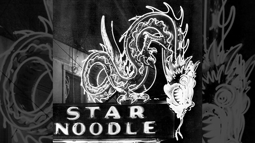
One of Southwell’s best-known designs, the White Dragon noodle-bar sign, had a real-world source. He based the dragon on a photograph of a sign outside the Star Noodle Parlor in Ogden, Utah. The image appeared in Rudi Stern’s Let There Be Neon (1979), a book on neon art. A piece of mid-century American signage found a second life in the film’s imagined future. The city's graphic identity emerges from the collision of competing signs, each rooted in a different commercial history.
Design Takeaway
A city’s graphic identity can grow through competing commercial voices.
01. WALL·E (2008) | One Brand, Three Visual Languages
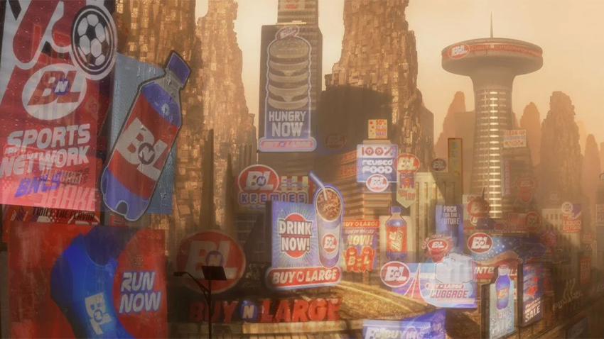
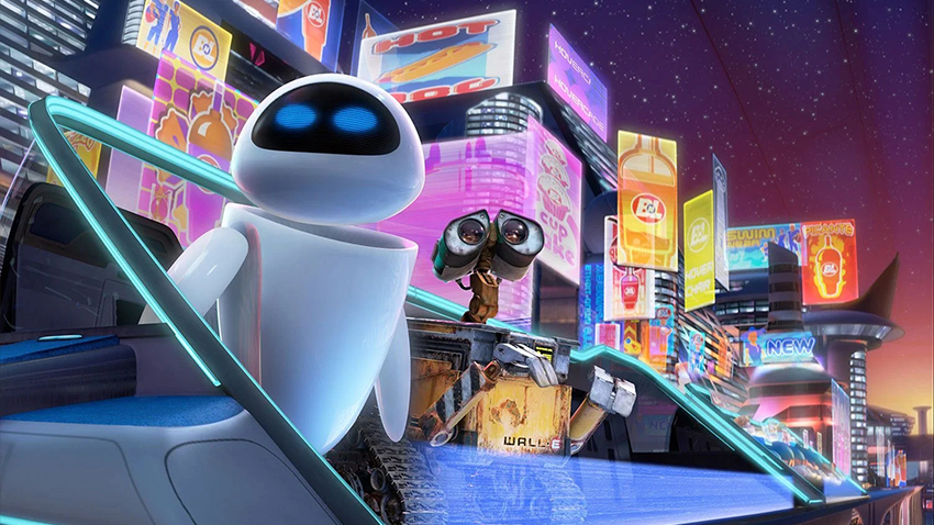
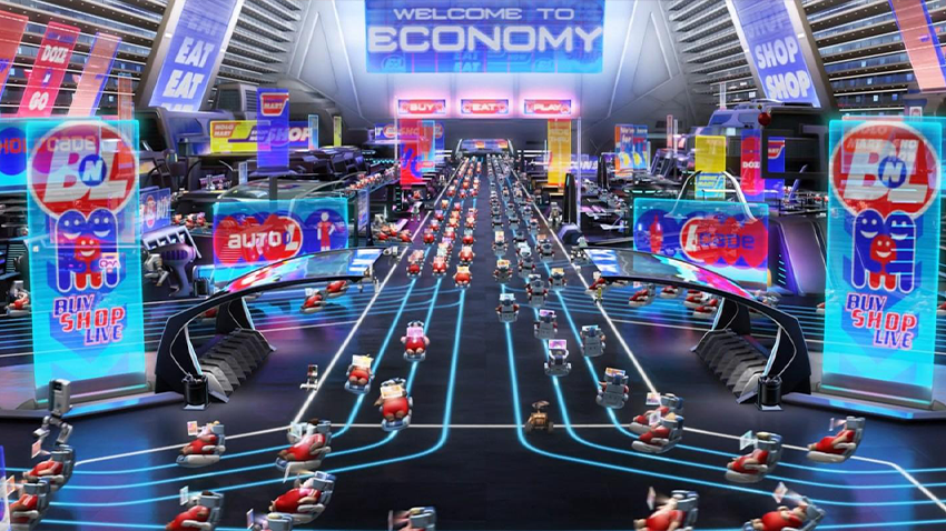
Pixar’s WALL·E imagines a future dominated by Buy n Large (BnL), a fictional megacorporation whose branding appears across everyday products and public spaces. The company's wordmark appears to be a customized version of Futura Extra Bold Oblique, a heavy, slanted sans serif that gives it the familiar look of a mass retailer. The same corporate identity follows humanity aboard the Axiom, the luxury starliner BnL built to carry people away from Earth.
Production designer Ralph Eggleston established the Axiom’s environments. Graphics art director Mark Holmes joined the production late, after Ellen Moon Lee had designed much of Act 1’s graphics. Holmes then developed the ship’s visual system with motion-graphics artist Philip Metschan. Holmes divided the ship’s graphics into three languages: Utility for robot service areas, Passenger for public decks, and Command for the bridge. A style guide helped a team of nearly a dozen designers and motion artists maintain consistency across the ship.
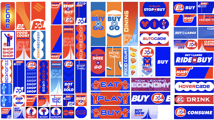
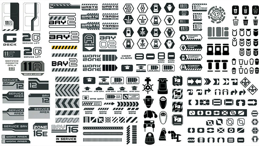
Each language follows WALL·E’s route through the ship. In service areas used by robots, monochrome signs and simple pictograms prioritize function. Passenger spaces bring BnL branding into daily life. Economy Class keeps the graphics restrained, while Coach Class surrounds passengers with bright animated ads and playful lettering. The Lido Deck quiets the visual field again. On the bridge, Command graphics become dense and cryptic, with controls designed to remain unreadable to the human crew.
The progression makes the Axiom’s social hierarchy visible. Passengers live amid the corporation’s advertising, but the command system is deliberately unreadable even to its human operators. BnL’s identity serves as the operating language of the civilization it built.
Design Takeaway
One corporate identity can become the visual language of an entire civilization.
Short Answers (FAQ)
How does graphic design help build fictional worlds?
Graphic design makes fictional societies feel functional and inhabited. Signs, documents, advertisements, maps, and interfaces suggest how people communicate, work, travel, and interact within a world.
What are some examples of graphic design in movies?
Her, The Grand Budapest Hotel, Blade Runner, and WALL·E use graphic design to establish distinct fictional environments. Their visual systems include everything from transit maps and printed documents to commercial signage and corporate identities.
What makes graphic design in a fictional world believable?
Consistency and attention to detail. When typography, symbols, signage, and everyday objects follow a coherent visual logic, they suggest a larger society with its own history, institutions, and routines.
Image Credits
Her (2013)
Film stills: Warner Bros.
Graphic design: Geoff McFetridge.
The Grand Budapest Hotel (2014)
Film stills: Fox Searchlight Pictures.
Graphic props: Annie Atkins.
Star Trek: The Next Generation (1987–1994)
Film stills: Paramount Television.
Graphic design: Michael Okuda and Denise Okuda.
Alien (1979)
Film stills: 20th Century Fox.
Graphic design: Ron Cobb and John Mollo.
The Handmaid's Tale (2017–2025)
Film stills: Hulu / MGM Television.
Graphic design: Sean Scoffield and Theresa Shain.
Blade Runner (1982)
Film stills: Warner Bros.
Graphic design: Syd Mead, Tom Southwell and the production design team.
WALL·E (2008)
Film stills: Pixar Animation Studios.
Graphic design: Ellen Moon Lee, Mark Holmes and Philip Metschan.