Home
Home Articles
 Twos Talks
 Videos
5 Things Designers Rarely Tell You About Famous Logos
Most discussions about famous logos focus on meanings and symbols. Designers look deeper at the principles that shape successful visual identities.

Why do some logos become timeless while thousands of others fade away? Popular discussions usually focus on hidden meanings, clever concepts, or the moment of inspiration behind a famous mark. Designers, however, look deeper into the qualities that make a logo recognizable and effective across decades. Looking at iconic logos through this lens reveals five design principles behind enduring visual identities.
5. A Logo Doesn’t Create a Brand
For many people, a successful logo is the starting point of a successful brand. The assumption is simple: create a memorable symbol, and recognition, trust, and loyalty will follow.
Designers tend to see the relationship differently. A logo is not the source of a brand’s meaning; it is a visual expression of the meaning a brand has already built through its products, services, experiences, and reputation.
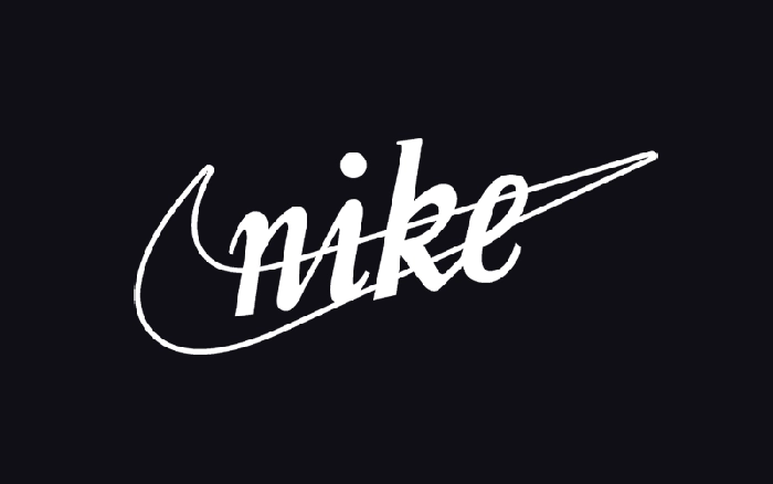
One of the clearest examples is Nike’s Swoosh.
Today, the Swoosh is among the world's most recognizable brand symbols. It has come to symbolize movement, performance, and athletic ambition. But when the mark was introduced in 1971, it was simply a new visual identifier for a relatively young sports company.
The meaning came later. Through decades of athlete partnerships, product innovation, advertising campaigns, and cultural influence, Nike transformed the Swoosh from a simple graphic mark into a symbol loaded with associations. The more accurate analysis is that Nike’s identity gave the logo its power.
As designer and brand consultant Marty Neumeier argues in The Brand Gap, “A brand is not what you say it is. It’s what they say it is.” A logo can influence perception, but it cannot replace the experiences that shape that perception.
Design takeaway
Great logos do not create brand meaning. Brands create meaning for great logos.
4. Great Logos Solve Problems Before They Create Meaning
Hidden meanings and clever concepts are among the first things people notice in famous logos. A memorable story or an interesting idea can make a design more engaging. But designers begin with a different question: Does the logo work?
Before a logo communicates values or creates emotional connections, it has to perform basic functions. It must remain recognizable at different sizes, work across different applications, and maintain clarity in changing contexts.
One of the best examples for this principle is IBM’s identity.
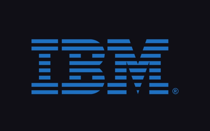
When Paul Rand redesigned IBM’s logo in 1972, the challenge was more than creating a modern symbol for a technology company. IBM needed an identity that could represent a complex organization across multiple industries. The goal was to create an identity system that was clear and consistent across different applications.
Rand introduced the striped IBM wordmark, using horizontal lines to suggest dynamism and technical precision. The success of the logo did not come only from the idea behind the stripes. Its strength came from how effectively the system worked across different environments, from corporate communications to products and digital platforms.
As Paul Rand explained in Design, Form, and Chaos, “Design is the method of putting form and content together.” For Rand, a design succeeds when concept and function work together.
Design takeaway
Great logos succeed when ideas meet function.
3. Great Logos Are Built to Evolve
A common belief about iconic logos is that their success depends on getting everything right from the beginning. The reality is different. Many successful identities have evolved gradually, adapting to new audiences, technologies, and cultural changes.
Designers understand that a logo is part of a larger visual system built to remain relevant while preserving recognition.
A clear example is Apple’s logo.
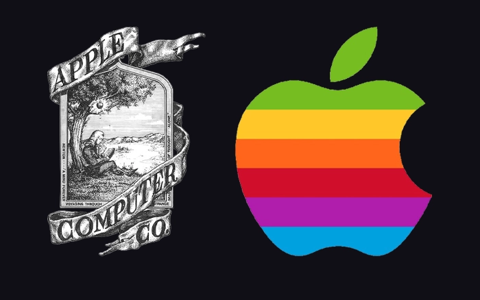
The first Apple logo, created by Ronald Wayne in 1976 and replaced shortly after, was very different from the bitten apple silhouette that became recognizable worldwide. Rob Janoff then created the bitten apple mark that became the foundation of Apple’s identity. But even that symbol continued to change over the decades, moving from a colorful striped version to monochrome variations and adapting to different digital environments.
The important lesson is not that Apple changed its logo frequently. In fact, the core shape remained remarkably consistent. The lesson is that a strong identity can evolve without losing its essential character.
Design takeaway
A flexible identity preserves what people recognize while adapting to new contexts.
2. Great Logos Are Not Designed to Be Beautiful
Visual appeal is one of the easiest ways to judge a logo, but it does not tell the whole story. A successful identity depends on how well a logo performs its role beyond aesthetics.
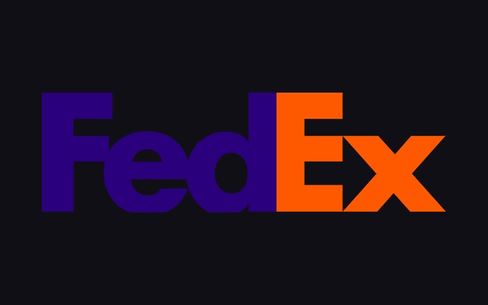
A classic example is FedEx’s logo.
At first glance, the FedEx wordmark appears simple, combining a custom typographic solution with bold colors and clean letterforms. But hidden between the letters E and X is an arrow formed by negative space, suggesting speed, direction, and movement.
The arrow became one of the most celebrated details in logo design history. The success of the FedEx identity comes from how every element serves a clear purpose and supports the company’s core service.
As designer Paul Rand once explained, “The principal role of a logo is to identify.” A logo should help people recognize a brand, not simply add visual decoration.
Design takeaway
The strongest logos remove unnecessary elements to make the essential idea clearer.

1. The Most Memorable Logos Are Not the Most Complex
Complexity can make a logo interesting, but it does not necessarily make it memorable. The logos that remain in people’s minds usually succeed because they communicate a clear idea through a simple and recognizable form.
A classic example is McDonald’s Golden Arches.
The symbol began as a functional architectural element in McDonald’s early restaurant design before becoming the central element of the brand’s visual identity. Over time, the arches evolved into a global symbol that people recognize without needing the brand name beside them.
The strength of the Golden Arches comes from a simple shape that has gained meaning through consistent use and decades of brand experience.
As designer John Maeda argues in The Laws of Simplicity, “Simplicity is about subtracting the obvious and adding the meaningful.”
Design takeaway
Memorable logos focus on what people need to remember.
Short Answers (FAQ)
What makes a logo memorable?
A memorable logo communicates a clear idea through a simple and recognizable form.
Do famous logos become successful because of their design alone?
No. A logo gains power through the brand experiences and associations built around it.
Why do brands redesign their logos?
Successful redesigns help identities adapt to new contexts while preserving recognition.
What is the most important quality of a great logo?
A great logo balances clarity, function, and long-term adaptability.