Home
Home Articles
 Twos Talks
 Videos
5 Design Mistakes That Turned Into Disasters
A confusing ballot, a spacecraft lost in space, and an aircraft interface that misled its pilots all began with a design mistake.
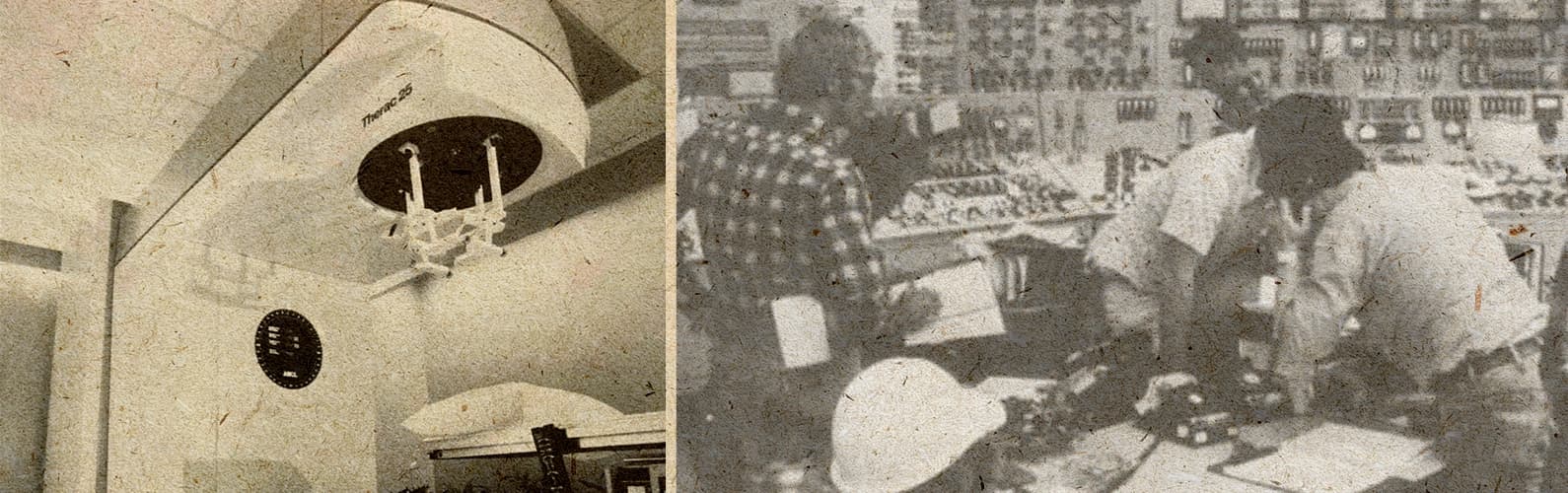
When disasters happen, we usually blame politics, technology, or human error. Design is rarely part of the story. But some of history's most consequential events can be traced back to confusing information, unclear interfaces, or systems that failed to communicate when it mattered most.
While researching this article, we considered cases such as the Titanic, Chernobyl, the Challenger disaster, and the Ford Pinto. Each has been discussed through the lens of design, but none made our final list. We weren't looking for engineering failures. We chose five cases where graphic design, information design, interface design, or system design played a significant role in what happened next

The aircraft was involved in the Air Inter Flight 148 accident in 1992. Photo: Michel Gilliand / Wikimedia Commons
5. Air Inter Flight 148: A Cockpit Display Misled Its Pilots
On January 20, 1992, Air Inter Flight 148 crashed into a mountain near Strasbourg, France, killing 87 people. The aircraft was approaching the airport when the pilots entered a descent setting into the cockpit system that resulted in a much steeper descent than they intended.
The accident exposed a problem in the way critical information was presented inside the cockpit
Where Design Failed
The Airbus A320 used a digital flight display that allowed pilots to select different modes for controlling the aircraft's descent. One setting showed the aircraft's descent rate. Another showed its descent angle. The two options used similar-looking numbers, which made them difficult to distinguish during a critical moment.
The interface provided the necessary information. The difference between the two options was not clear enough when the pilots needed to make a quick decision. Under pressure, pilots had to interpret the information instead of receiving a clear signal from the system.
The accident influenced later cockpit interface design, especially in the way critical information was presented to pilots.
Design Takeaway
Critical interfaces need to make important distinctions immediately visible. Under pressure, users should not have to decode what a system means before making a decision.
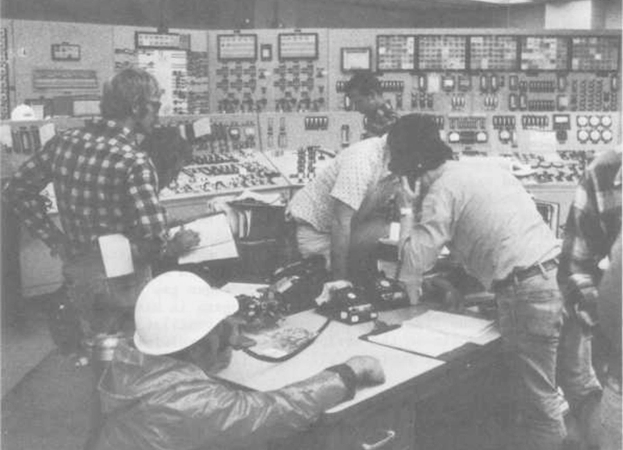
The control room was part of the response to the 1979 accident.
4. Three Mile Island: The Control Room Overwhelmed Its Operators
On March 28, 1979, a partial meltdown occurred at the Three Mile Island nuclear power plant in Pennsylvania. It became one of the most serious accidents in U.S. commercial nuclear power history.
The emergency involved a combination of technical failures and difficult decisions inside the control room. During the crisis, operators struggled to understand what was happening inside the system. A control room filled with alarms and unclear signals made it harder to identify the actual problem at a critical moment.
Where Design Failed
The control room at Three Mile Island was built to provide operators with extensive information about the reactor's condition. During the accident, the amount of information became difficult for operators to process.
Hundreds of alarms appeared within minutes. Some indicators gave operators an incomplete picture of the reactor’s condition. A key warning light showed that a valve had received a command to close, but it did not confirm whether the valve had actually closed. Operators had to interpret multiple signals to understand what was happening inside the reactor.
The accident influenced the design of later complex control rooms. Newer systems placed greater emphasis on information hierarchy, alarm management, and helping operators recognize the most important signals during emergencies.
Design Takeaway
In complex systems, information design helps people recognize what matters most when every signal competes for attention.
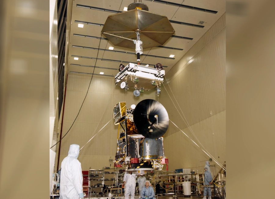
The spacecraft was lost during its Mars orbit insertion in 1999.
3. Mars Climate Orbiter: A System Failed to Communicate
In September 1999, NASA lost the Mars Climate Orbiter as it approached the Red Planet. The spacecraft, designed to study the Martian atmosphere, disappeared after entering an incorrect trajectory and broke apart in the planet’s atmosphere.
The immediate cause was a mismatch between two measurement systems. One team used metric units. Another used imperial units when calculating the spacecraft’s position. Behind the technical error was a deeper failure in how information moved between teams and systems.
Where Design Failed
The Mars Climate Orbiter project involved multiple teams working across different organizations. The software used to navigate the spacecraft depended on data being transferred accurately between these groups. A simple difference in measurement standards passed through the system without being detected.
The problem was the way information was shared and verified across teams.
After the accident, NASA revised its approach to managing information across complex projects, with greater attention to standards and verification.
Design Takeaway
Good system design creates shared standards that prevent misunderstandings before they reach critical stages.
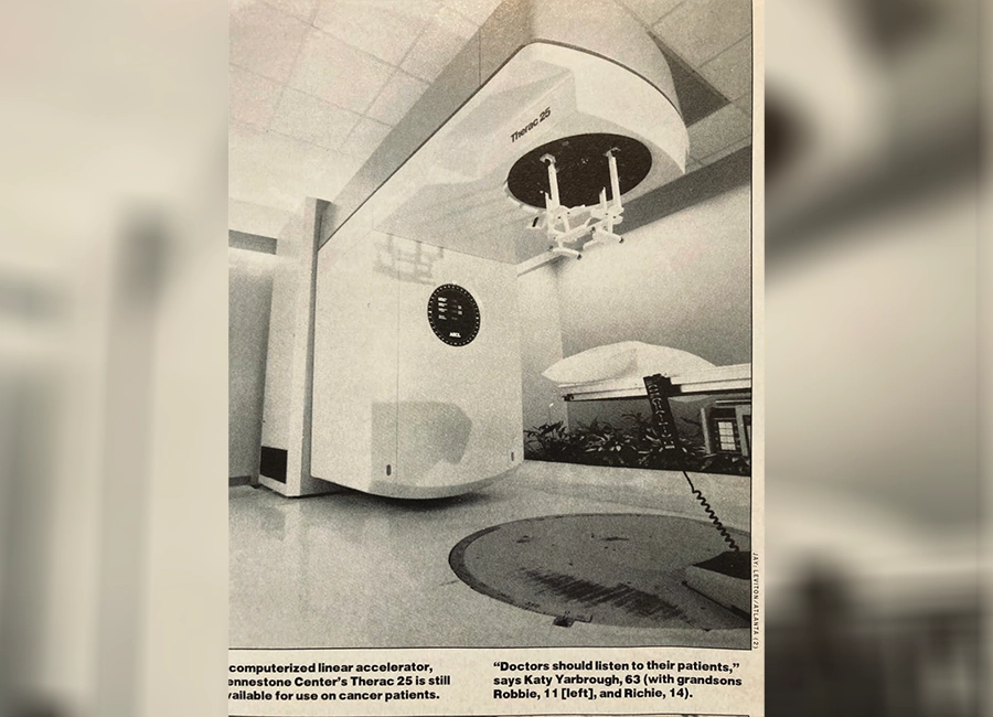
The machine was linked to several radiation overdose accidents between 1985 and 1987.
2. Therac-25: The Interface Hid a Deadly Error
Between 1985 and 1987, several patients receiving radiation therapy from the Therac-25 machine were exposed to massive overdoses of radiation. The incidents caused severe injuries and were linked to several patient deaths.
The machine was designed to deliver precise radiation treatments. However, a series of software and interface problems allowed dangerous errors to occur without giving operators a clear warning.
Where Design Failed
The Therac-25 used software controls extensively during radiation therapy. Its interface gave operators limited visibility into the system’s state during critical moments.
One of the biggest problems was the system’s response to incorrect inputs. When operators made mistakes during setup, the interface displayed vague error messages that did not explain what had gone wrong. In some cases, the machine allowed users to continue instead of preventing a dangerous action.
The software gave operators limited information about the machine’s actual state. They could not easily tell whether the treatment settings were correct before starting the procedure.
Design Takeaway
Safety-critical interfaces should help users prevent errors, not simply report them after they happen.

The ballot design contributed to disputes during the 2000 U.S. presidential election.
1. Butterfly Ballot: The Ballot Design Confused Voters
During the 2000 U.S. presidential election, voters in Palm Beach County, Florida, used a ballot design that became one of the most debated examples of information design failure.
The ballot used a two-column layout with punch holes arranged in the center of the page. While the design was intended to make voting easier, many voters found it difficult to match candidates with the correct holes. The confusing layout contributed to thousands of disputed ballots and became part of the controversy surrounding the election.
Where Design Failed
The Butterfly Ballot was designed around the physical limitations of the voting machine. Its layout did not follow the way voters naturally read information. Candidates’ names appeared on both sides of the page, with punch holes placed in a central column between them.
The visual connection between a candidate’s name and the corresponding voting position was not obvious enough. Some voters may have selected a different candidate than they intended. Others failed to record a presidential vote.
The layout separated information that voters needed to connect. The relationship between a candidate’s name and the correct voting position was not immediately clear. In a process built around a single choice, small moments of confusion can have serious consequences.
Design Takeaway
Information design should follow how people naturally process information, especially when a single mistake can have major consequences.
Short Answers (FAQ)
What is a design mistake?
A design mistake is a flaw in the way information, interfaces, or systems are created that makes them harder, riskier, or less effective to use. Some design mistakes can have consequences far beyond usability.
Can design mistakes cause real-world disasters?
Yes. Design mistakes can cause serious failures when they make information harder to understand, systems harder to use, or decisions harder to make.
What are examples of design mistakes that caused serious failures?
Examples of design mistakes with serious consequences include the Butterfly Ballot, the Therac-25 interface, and the Mars Climate Orbiter’s system communication failure.