 Home
Home Articles
 Twos Talks
 Videos
5 Design Mistakes That Cost Companies Millions
Some of the most expensive branding failures in history, from Tropicana and Gap to Coca-Cola and Pepsi, happened when companies ignored fundamental design principles.
Some of the most expensive branding failures in history happened when companies ignored fundamental design principles such as recognition, brand equity, emotional connection, and strategic alignment, or pursued change without a clear purpose. The consequences can be severe, from lost sales and customer confusion to public backlash and costly reversals. From Tropicana and Gap to Coca-Cola and Pepsi, these cases reveal a simple truth: design is about shaping the way people recognize, remember, and trust brands, not just about aesthetics.

5. When Change Becomes the Goal
Case: Pepsi (2008)
Pepsi introduced a new logo as part of a major rebranding effort that extended across packaging, advertising, and brand communications. The redesign by the Arnell Group kept Pepsi’s familiar red, white, and blue color palette but replaced the symmetrical globe with a more dynamic shape and introduced a new visual system across the brand. The rebrand did not hurt sales, and Pepsi kept the new identity, but its reported cost sparked a debate that continues today: what exactly had changed, and was it worth it?
Why It Became Controversial
The visual changes were relatively subtle.
The rollout came with significant implementation costs.
Critics questioned whether the redesign justified the investment.
Many saw the project as change without a clear purpose.
Design Takeaway
Good design should solve a problem, support a business goal, or improve the user experience. Looking different is not enough. Change alone is not a strategy.
4. Forgetting Emotional Attachment
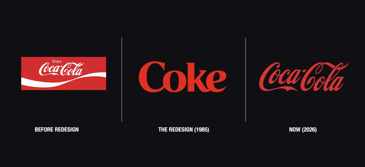
Case: Coca-Cola (1985)
Coca-Cola replaced its original formula with New Coke after taste tests suggested consumers preferred a sweeter alternative. The decision was meant to strengthen the brand’s position against Pepsi, but the reaction was immediate and overwhelmingly negative. Many customers felt that Coca-Cola had abandoned a product they had grown up with, and within months, the company brought back the original formula as Coca-Cola Classic.
Why It Became Controversial
• Consumers felt the company had taken away something familiar.
• Coca-Cola underestimated the emotional value people attached to the original product.
• Public reaction forced the company to reverse course.
Design Takeaway
Brands are built on memories, habits, and emotional connections. When companies change something people deeply identify with, the challenge is understanding what that change means to customers.
3. Solving the Wrong Problem
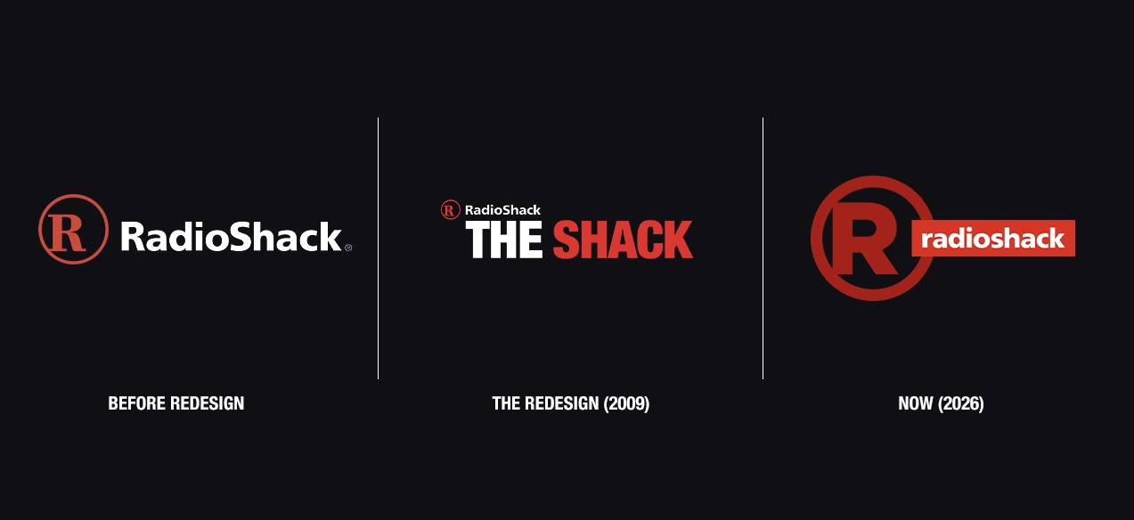
Case: RadioShack (2009)
RadioShack launched a rebranding campaign that encouraged customers to call the company “The Shack.” The goal was to modernize the brand and appeal to younger consumers. The new identity attracted attention, but it did little to address the deeper challenges facing the business, including growing competition from online retailers and changing consumer habits. RadioShack later filed for bankruptcy in 2015 as competition from online retailers continued to intensify.
Why It Became Controversial
• The rebrand focused on perception rather than the company’s core challenges.
• Customers were unclear about what the new identity actually represented.
• A new name could not solve deeper business problems.
Design Takeaway
Design can support a strategy, but it cannot replace one.
2. Ignoring Brand Equity
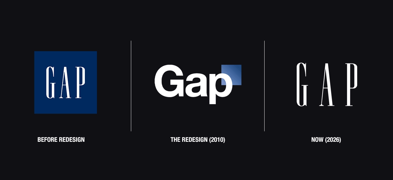
Case: Gap (2010)
Gap replaced its long-standing logo with a simpler design featuring a small blue square, but the response was immediate and deeply negative. Within a week, Gap abandoned the new logo and returned to its previous identity, turning the redesign into one of the most cited branding failures of the digital era.
Why It Became Controversial
• The new logo discarded visual equity built over decades.
• Customers felt the redesign lacked the character of the original identity.
• Gap underestimated how strongly people associated the logo with the brand itself.
Design Takeaway
Brand equity takes years to build and moments to lose. Before changing a familiar identity, companies need to understand the value already attached to it.
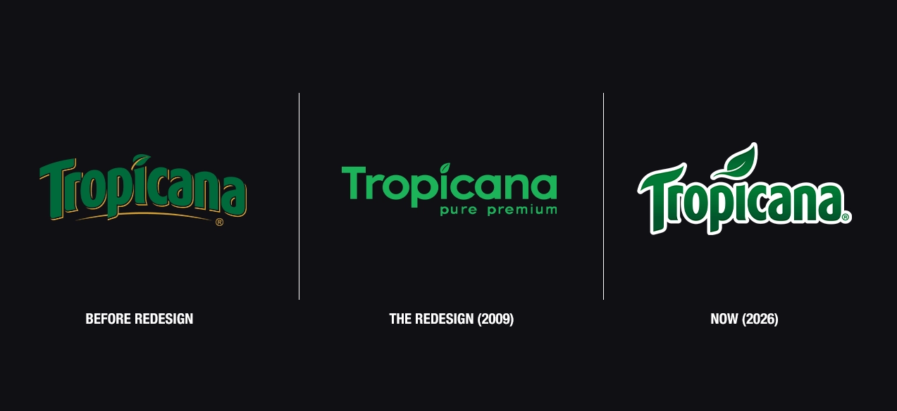
1. Destroying Recognition
Case: Tropicana (2009)
Tropicana redesigned its packaging in 2009 by replacing familiar visual elements that customers had associated with the brand for years. The famous orange with a straw disappeared, the packaging adopted a cleaner look, and many shoppers struggled to recognize the product on store shelves. Following a sharp decline in sales and widespread criticism, Tropicana reversed the redesign within weeks.
Why It Became Controversial
• Customers could no longer identify the product as quickly as before.
• Familiar visual cues were removed without strong replacements.
• The redesign weakened shelf recognition at the point of purchase.
Design Takeaway
Recognition is one of a brand’s most valuable assets. If customers cannot quickly find or identify a product, even a well-executed design can become a business problem.


