Home
Home Articles
 Twos Talks
 Videos
Herb Lubalin: Graphic Designers You Should know About
Herb Lubalin, the visionary designer who gave typography a voice. From Avant Garde magazine to iconic typefaces, discover how Lubalin transformed editorial design and expressive type.

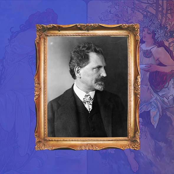
Herb Lubalin (1918–1981) may have seen the world in muted tones due to his color-blindness, but he transformed how typography speaks. He treated type not just as design, but as character, rhythm, and voice. This article explores Lubalin not just as a designer, but as a cultural provocateur who redefined the emotional and editorial possibilities of visual language.
Fast Facts
Date of Birth
March 17, 1918
Place of Birth
New York City, USA
Education
Cooper Union, New York
Known For
Turning typography into expressive visual storytelling; Editorial Design
Big Break
Co-founding Avant Garde magazine and designing its typeface
Design Philosophy
Type should speak, not just be read
Style Keywords
Tight. Bold. Emotional. Clever. Editorial.
Era
Postwar modernism, 1960s–70s counterculture, editorial revolution
Affiliations
ITC (International Typeface Corporation), Cooper Union, Ginzburg Publications
Died
May 24, 1981—New York, USA
Origins
Herb Lubalin was born in Manhattan in 1918. He grew up surrounded by the grit and speed of New York. Color-blind from a young age, he saw the world in muted contrast, which shaped his obsession with form, weight, and structure. If he couldn’t rely on color, he would master space.
In 1935, he began studying at Cooper Union, where his attention turned sharply toward typography, not just as lettering, but as a living medium. Cooper Union later became home to the Herb Lubalin Study Center, preserving one of its most influential alumni.

First Steps
After graduating, Lubalin entered New York’s booming advertising world in the mid-1940s. He was famously fired from one of his earliest jobs for asking for a $2 raise.
Soon after, he joined Sudler & Hennessey, a pharmaceutical ad agency, where he worked from around 1945 to 1964.
Even within the rigid world of medical advertising, Lubalin found space for visual experimentation. His talent for elevating dry content through smart layouts and tight type began to gain attention.

The Breakthrough
In 1964, Lubalin founded his own studio, Lubalin, Inc., and with it, type became image, and image became narrative. This new chapter birthed logos that conveyed emotion through letterform alone:
• Mother & Child: an ampersand nestled into the “C”
• Marriage: letters joined to mirror intimacy
• Families: literal alignment as metaphor
But it was in editorial design that Lubalin truly stood apart. His visual language was assertive, witty, and boundary-pushing, and it began drawing attention beyond advertising. As he began working with publisher Ralph Ginzburg, their collaboration became a turning point, leading to projects that challenged not only visual conventions but also political and cultural boundaries.
Special Story
Design on Trial
One of the most defining and dramatic chapters in Herb Lubalin’s career began with his partnership with Ralph Ginzburg, a radical, countercultural American publisher of the 1960s. As Adrian Shaughnessy, Lubalin’s biographer, explained in Twos Studio’s documentary on Herb Lubalin, “It was the beginning of his relationship with the man called Ralph Ginzburg. Ginzburg was an extraordinary 60s American figure. He was a radical, a counter-culture figure, and he and Lubalin struck up a really powerful relationship where editor and designer came together.”
Their collaboration first took shape with Eros, a high-end quarterly that explored sexuality with a sophisticated editorial approach. But it was Avant Garde magazine that truly cemented Lubalin’s reputation as a groundbreaking editorial designer. This square-format publication was a masterclass in visual storytelling, balancing photography, illustration, and bold typography in a way that blurred the lines between text and image. Out of Avant Garde emerged the now-iconic Avant Garde typeface, designed by Lubalin with Tom Carnase, which remains one of the most innovative and controversial typefaces of its era.
However, their daring editorial vision came with a cost. As Shaughnessy recounts, “There was a problem though; as a consequence of an article published in Avant Garde, Ralph Ginzburg went to jail.” The article, which advocated for interracial love, ran afoul of obscenity laws at the time, and despite years of government scrutiny, this was the charge that finally landed Ginzburg behind bars.
Reflecting on this turbulent period, Lubalin’s wife Rhoda shared a poignant memory with Shaughnessy: “When Ginzburg went to jail, Lubalin said to Rhoda, ‘I should have gone to jail too.’” This remark reveals Lubalin’s profound sense of responsibility and the belief that the roles of editor and designer are inseparable—that design itself can be an act of courage and defiance.
Following this, Lubalin transitioned into the role of editor himself, creating U&lc (Upper and Lower Case), a typographic journal devoted entirely to the exploration of type design and technology during the electronic typesetting boom. U&lc was more than a magazine; it was a celebration of the power of typography as a cultural and artistic force, a testament to how the fusion of editorial vision and design could produce something truly remarkable.
This special chapter in Lubalin’s story underscores the risks and rewards of design that pushes boundaries. It’s a vivid reminder that graphic design is not merely about aesthetics, it can be a tool for social commentary, political challenge, and cultural change.
“I should have gone to jail too.”
— Herb Lubalin, after Ralph Ginzburg’s arrest
Style & Philosophy
Lubalin rejected neutrality. He believed typography had a tone, an energy, even a sense of humor. “Typography can be as expressive as illustration, if not more,” he famously said.
His layouts broke away from modernist orthodoxy: Grids were optional and space was intentional. Letterforms became tools for narrative tension and rhythm. Ligatures weren’t just functional; they were poetic.
His designs were tight yet breathing, playful yet precise. Rather than adopt the sterile clarity of Swiss design, he pursued something more human: typographic storytelling.
“Lubalin rejected neutrality. He believed typography had tone, energy, even a sense of humor.”

Defining Designs
The following works represent key moments in Herb Lubalin’s career. These are some of the designs that shaped his voice and also left a lasting mark on editorial and typographic culture.
Avant Garde Magazine (1968–71)
Where editorial design became typographic performance.
Avant Garde Typeface (1970)
Co-designed with Tom Carnase. Loved, misused, never forgotten.
U&lc Magazine (1973–81)
Lubalin’s typographic playground; wild, smart, influential.
Mother & Child Logo (1965)
One ampersand. One message. Minimalism with meaning.
Marriage Logo (c. 1960s)
Two R’s joined in ligature; intimate, modern, and bold.
Families Logo (c. 1960s)
A typographic metaphor of alignment and connection.
NBC Peacock (Prototype) (1957)
Developed with NBC design director John J. Graham; a lasting symbol of color broadcasting.
PBS Logo (1971)
Still in use today. Clean, conceptual, and human. One of Lubalin’s most enduring public identities.

Why He Still Matters
Herb Lubalin didn’t just design type; he gave it voice. He showed the world that letters could whisper, shout, laugh, or provoke. His layouts spoke with rhythm, nuance, and a visual tone that rewrote the rules of editorial communication.
Through his work at ITC, Lubalin helped bring typefaces out of the hands of elite typesetters and into the toolkits of everyday designers. This shift laid the groundwork for the rise of desktop publishing and gave a new generation the tools to experiment with type more freely.
His influence is clear in the expressive typography of Neville Brody, the rule-breaking energy of David Carson, and the type-led branding that defines much of contemporary design.
Lubalin still matters because he proved something essential:
Typography is not decoration. It is language. And language, when designed with intent, changes everything.
Watch our video on Herb Lubalin here: